Tag Archives: stock market forecasts

Daily High and Low Stock Prices – Falling Knives

The mathematics of random walks form the logical underpinning for the dynamics of prices in stock, currency, futures, and commodity markets.

Once you accept this, what is really interesting is to consider departures from random walk movements of prices. Such distortions can signal underlying biases brought to the table by investors and others with influence in these markets.

“Falling knives” may be an example.

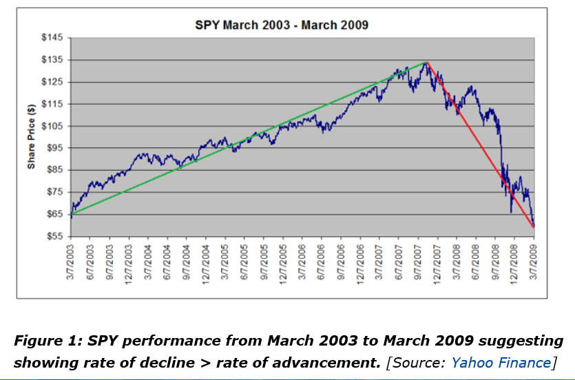
A good discussion is presented in Falling Knives: Do Stocks Really Drop 3 Times Faster Than They Rise?

This article in Seeking Alpha is more or less organized around the following chart.

FallingKnives

The authors argue this classic chart is really the result of a “Black Swan” event – namely the Great Recession of 2008-2009. Outside of unusual deviations, however, they try to show that “the rate of rallies and pullbacks are approximately equal.”

I’ve been exploring related issues and presently am confident that there are systematic differences in the volatility of high and low prices over a range of time periods.

This seems odd to say, since high and low prices exist within the continuum of prices, their only distinguishing feature being that they are extreme values over the relevant interval – a trading day or collection of trading days.

However, the variance or standard deviation of daily percent changes or rates of change of high and low prices are systematically different for high and low prices in many examples I have seen.

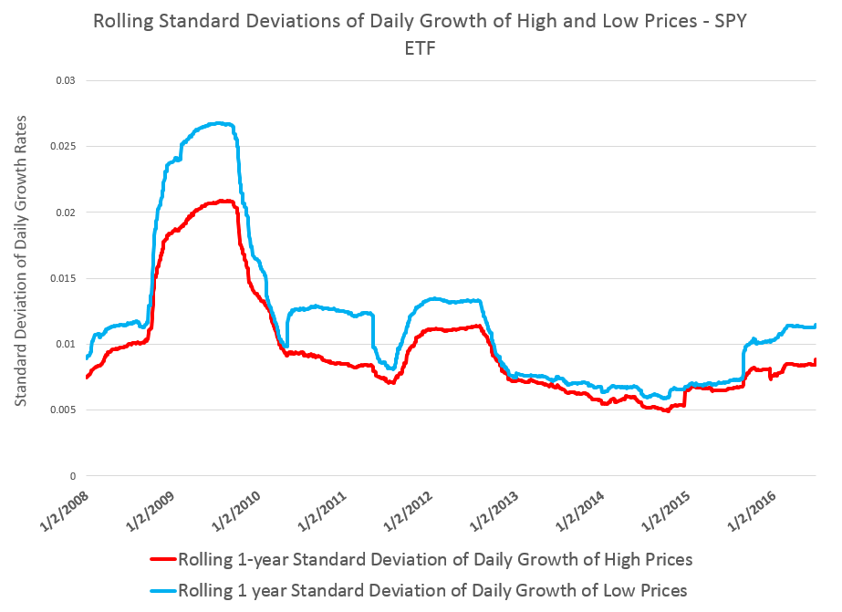
Consider, for example, rates of change of daily high and low prices for the SPY exchange traded fund (ETF) – the security charted in the preceding graph.

RollingSTDEV

This chart shows the standard deviation of daily rates of change of high and low prices for the SPY over rolling annual time windows.

This evidence suggests higher volatility for daily growth or rates of change of low prices is more than something linked just with “Black Swan events.”

Thus, while the largest differences between standard deviations occur in late 2008 through 2009 – precisely the period of the financial crisis – in 2011 and 2012, as well as recently, we see the variance of daily rates of change of low prices significantly higher than those for high prices.

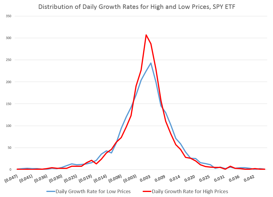
The following chart shows the distribution of these standard deviations of rates of change of daily high and low prices.

STDEVDist

You can see the distribution of the daily growth rates for low prices – the blue line – is fatter in a certain sense, with more instances of somewhat greater standard deviations than the daily growth rates for high prices. As a consequence, too, the distribution of the daily growth rates of low prices shows less concentration near the modal value, which is sharply peaked for both curves.

These are not Gaussian or normal distributions, of course. And I find it interesting that the finance literature, despite decades of recognition of these shapes, does not appear to have a consensus on exactly what types of distributions these are. So I am not going to jump in with my two bits worth, although I’ve long thought that these resemble Laplace Distributions.

In any case, what we have here is quite peculiar, and can be replicated for most of the top 100 ETF’s by market capitalization. The standard deviation of rates of change of current low price to previous low prices generally exceeds the standard deviation of rates of change of high prices, similarly computed.

Some of this might be arithmetic, since by definition high prices are greater numerically than low prices, and we are computing rates of change.

However, it’s easy to dispel the idea that this could account for the types of effects seen with SPY and other securities. You can simulate a random walk, for example, and in thousands of replications with positive prices essentially lose any arithmetic effect of this type in noise.

I believe there is more to this, also.

For example, I find evidence that movements of low prices lead movements of high prices over some time frames.

Investor psychology is probably the most likely explanation, although today we have to take into account the “psychology” of robot trading algorithms. Presumeably, these reflect, in some measure, the predispositions of their human creators.

It’s kind of a puzzle.

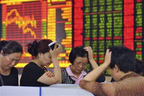
Top image from SGS Swinger BlogSpot

Fractal Markets, Fractional Integration, and Long Memory in Financial Time Series – I

The concepts – ‘fractal market hypothesis,’ ‘fractional integration of time series,’ and ‘long memory and persistence in time series’ – are related in terms of their proponents and history.

I’m going to put up ideas, videos, observations, and analysis relating to these concepts over the next several posts, since, more and more, I think they lead to really fundamental things, which, possibly, have not yet been fully explicated.

And there are all sorts of clear connections with practical business and financial forecasting – for example, if macroeconomic or financial time series have “long memory,” why isn’t this characteristic being exploited in applied forecasting contexts?

And, since it is Friday, here are a couple of relevant videos to start the ball rolling.

Benoit Mandelbrot, maverick mathematician and discoverer of ‘fractals,’ stands at the crossroads in the 1970’s, contributing or suggesting many of the concepts still being intensively researched.

In economics, business, and finance, the self-similarity at all scales idea is trimmed in various ways, since none of the relevant time series are infinitely divisible.

A lot of energy has gone into following Mandelbrot suggestions on the estimation of Hurst exponents for stock market returns.

This YouTube by a Parallax Financial in Redmond, WA gives you a good flavor of how Hurst exponents are being used in technical analysis. Later, I will put up materials on the econometrics involved.

Blog posts are a really good way to get into this material, by the way. There is a kind of formalism – such as all the stuff in time series about backward shift operators and conventional Box-Jenkins – which is necessary to get into the discussion. And the analytics are by no means standardized yet.

Coming Attractions

Well, I have been doing a deep dive into financial modeling, but I want to get back to blogging more often. It gets in your blood, and really helps explore complex ideas.

So- one coming attraction here is going to be deeper discussion of the fractal market hypothesis.

Ladislav Kristoufek writes in a fascinating analysis (Fractal Markets Hypothesis and the Global Financial Crisis:Scaling, Investment Horizons and Liquidity) that,

“..it is known that capital markets comprise of various investors with very different investment horizons { from algorithmically-based market makers with the investment horizon of fractions of a second, through noise traders with the horizon of several minutes, technical traders with the horizons of days and weeks, and fundamental analysts with the monthly horizons to pension funds with the horizons of several years. For each of these groups, the information has different value and is treated variously. Moreover, each group has its own trading rules and strategies, while for one group the information can mean severe losses, for the other, it can be taken a profitable opportunity.”

The mathematician and discoverer of fractals Mandelbrot and investor Peters started the ball rolling, but the idea maybe seemed like a fad of the 1980’s and 1990s.

But, more and more,  new work in this area (as well as my personal research) points to the fact that the fractal market hypothesis is vitally important.

Forget chaos theory, but do notice the power laws.

The latest  fractal market research is rich in mathematics – especially wavelets, which figure in forecasting, but which I have not spent much time discussing here.

There is some beautiful stuff produced in connection with wavelet analysis.

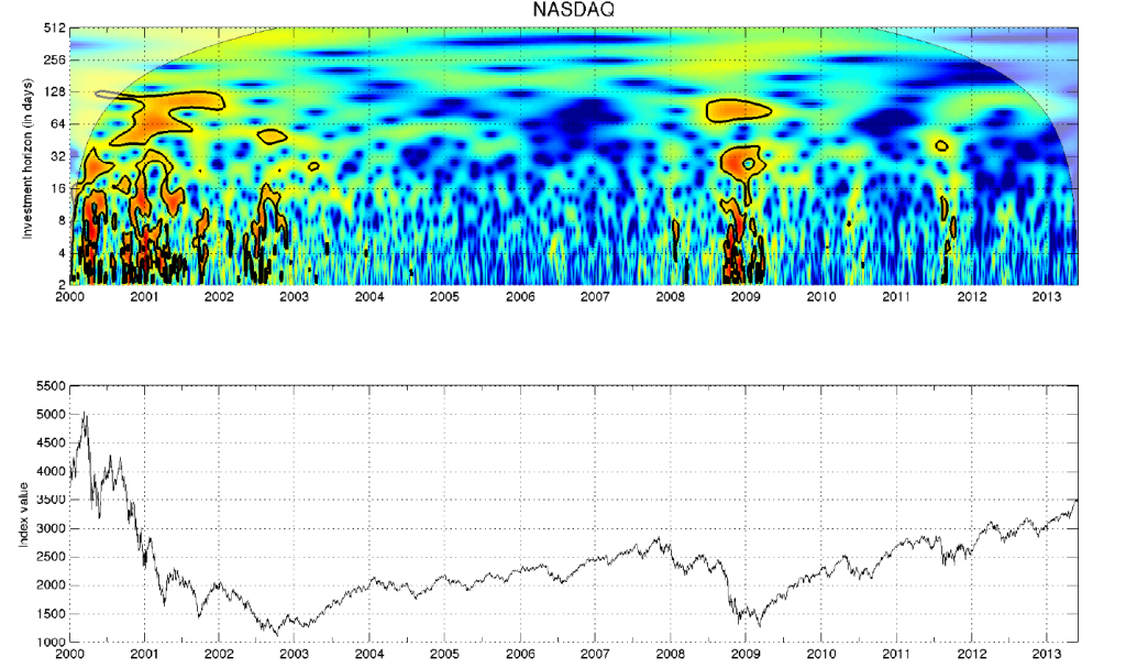
For example, here is a construction from a wavelet analysis of the NASDAQ from another paper by Kristoufek

Wavlet1

The idea is that around 2008, for example, investing horizons collapsed, with long term traders exiting and trading becoming more and more short term. This is associated with problems of liquidity – a concept in the fractal market hypothesis, but almost completely absent from many versions of the so-called “efficient market hypothesis.”

Now, maybe like some physicists, I am open to the discovery of deep keys to phenomena which open doors of interpretation across broad areas of life.

Another coming attraction will be further discussion of forward information on turning points in markets and the business cycle generally.

The current economic expansion is growing long in tooth, pushing towards the upper historically observed lengths of business expansions in the United States.

The basic facts are there for anyone to notice, and almost sound like a litany of complaints about how the last crisis in 2008-2009 was mishandled. But China is decelerating, and the emerging economies do not seem positioned to make up the global growth gap, as in 2008-2009. Interest rates still bounce along the zero bound. With signs of deteriorating markets and employment conditions, the Fed may never find the right time to raise short term rates – or if they plunge ahead will garner virulent outcry. Financial institutions are even larger and more concentrated now than before 2008, so “too big to fail” can be a future theme again.

What is the best panel of financial and macroeconomic data to watch the developments in the business cycle now?

So those are a couple of topics to be discussed in posts here in the future.

And, of course, politics, including geopolitics will probably intervene at various points.

Initially, I started this blog to explore issues I encountered in real-time business forecasting.

But I have wide-ranging interests – being more of a fox than a hedgehog in terms of Nate Silver’s intellectual classification.

I’m a hybrid in terms of my skill set. I’m seriously interested in mathematics and things mathematical. I maybe have a knack for picking through long mathematical arguments to grab the key points. I had a moment of apparent prodigy late in my undergrad college career, when I took graduate math courses and got straight A’s and even A+ scores on final exams and the like.

Mathematics is time consuming, and I’ve broadened my interests into economics and global developments, working around 2002-2005 partly in China.

As a trivia note,  my parents were immigrants to the US from Great Britain , where their families were in some respects connected to the British Empire that more or less vanished after World War II and, in my father’s case, to the Bank of England. But I grew up in what is known as “the West” (Colorado, not California, interestingly), where I became a sort of British cowboy and subsequently, hopefully, have continued to mature in terms of attitudes and understanding.

One Month Forecast of SPY ETF Price Level – Extreme Value Prediction Algorithm (EVPA)

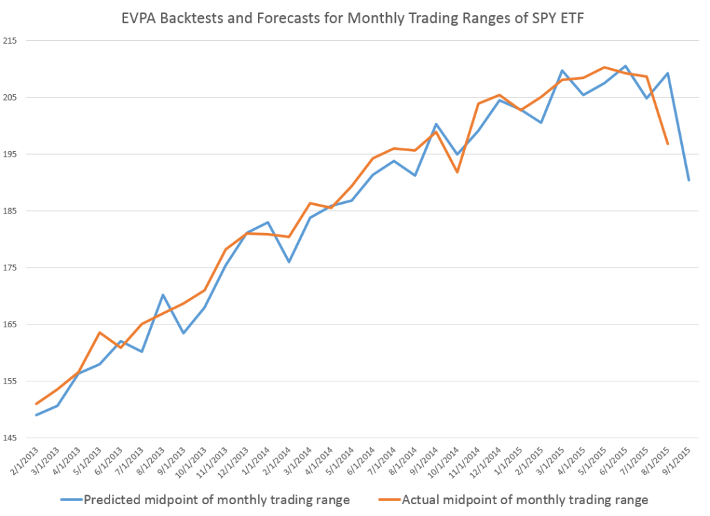
Here is a chart showing backtests and a prediction for the midpoints of the monthly trading ranges of the SPY exchange traded fund.

MonthSPY

The orange line traces out the sequence of actual monthly midpoints of the price range – the average of the high and low price for the month.

The blue line charts the backtests going back to 2013 and a forecast for September 2015 – which is the right-most endpoint of the blue line. The predicted September midpoint is $190.43.

The predictions come from the EVPA, an algorithm backtested to 1994 for the SPY. Since 1994, the forecast accuracy, measured by the MAPE or mean absolute percent error, is 2.4 percent. This significantly improves on a No Change model, one of the alternative forecast benchmarks for this series, and the OOS R2 of the forecast of the midpoint of the monthly trading range is a solid 0.33.

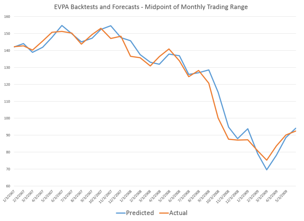
Just from eyeballing the graph above, it seems like there are systematic errors to the downside in the forecasts.

However, the reverse appears to happen, when the SPY prices are falling over a longer period of time.

2008SPYMonth

I would suggest, therefore, that the prediction of about $190 for September is probably going to be higher than the actual number.

Now – disclaimer. This discussion is provided for scientific and entertainment purposes only. We assume no responsibility for any trading actions taken, based on this information. The stock market, particularly now, is volatile. There are lots of balls in the air – China, potential Fed actions on interest rates, more companies missing profit expectations, and so forth – so literally anything may happen.

The EVPA is purely probabilistic. It is right more often than wrong. Its metrics are better than those of alternative forecast models in the cases I have studied. But, withal, it still is a gamble to act on its predictions.

But the performance of the EVPA is remarkable, and I believe further improvements are within reach.

Today’s Stock Market

Shakespeare’s Hamlet says at one point, “There are more things Horatio, than are dreamt of in your philosophy.” This is also a worthy thought when it comes to stock market forecasts.

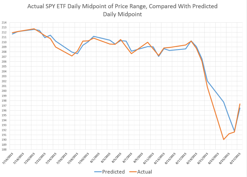
So here is a chart showing recent daily predictions of the midpoint (MP) of the daily price ranges for the SPY exchange traded fund (ETF), compared with the actual dollar value of the midpoint of the trading range for each day.

FlashCrash

The predictions are generated by the EVPA – extreme value prediction algorithm. This is a grown-up version of the idea that ratios, like the ratio between the opening price and the previous high or low, can give us a leg up in predicting the high or low prices (or midpoint) for a trading day.

Note the EVPA is quite accurate up to recent days, when forecast errors amplify at the end of the week of August 21. In fact, in backtests to 1994, EVPA forecasts the daily MP with a mean absolute percent error (MAPE) less that 0.4%.

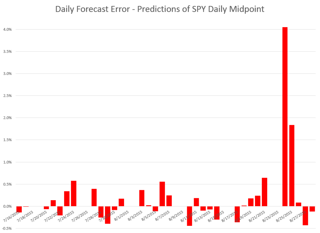
Here is a chart of the forecast errors corresponding to the predicted and actuals in the first chart above.

FCerror

Note the apparently missing bars for some dates are just those forecasts which show such tiny errors they don’t even make it to the display, which is dominated by the forecast error August 24 at about 4 percent.

Note also, the EVPA adjusts quickly, so that by Monday August 28th – when the most dramatic drop in the midpoint (closing price, etc.) occurs – the forecasts (or backcasts) show much lower forecast error (-0.1%).

Where This Is All Going

The EVPA keys off the opening price, which this morning is listed as 198.11 – lower than Friday’s closing price of 199.24.

This should tell you that the predictions for the day are not particularly rosy, and, indeed, the EVPA forecast for the week’s MP of the trading range is almost flat, compared to the midpoint of the trading range for last week. My forecast of the MP for this week is up 0.13%.

What that means, I am not quite sure.

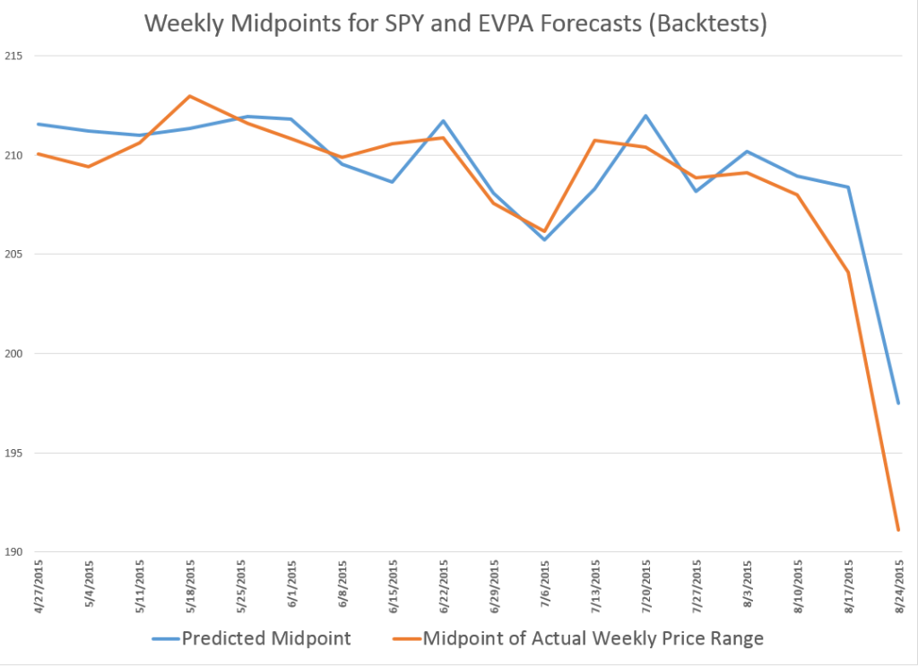
Here is a chart showing the performance of the weekly EVPA forecasts of the SPY MP for recent weeks.

WeeklySPYMP

This chart does not include the forecast for the current week.

What I find really interesting is that, according to this model, the slide in the SPY might have been spotted as early as the second week in August.

The EVPA is an amazing piece of data analytics, but it exists in an environment of enormous complexity. Studies showing that various international stock markets are cointegrated, and the sense of this clearly applies to Chinese and US stock markets. Also, there is talk of pulling the punchbowl of “free money” or zero interest rates, and that seems to have a dampening effect on the trading outlook.

Quite frankly, in recent weeks I have been so absorbed in R programming, testing various approaches, and, as noted in my previous post, weddings, that I have neglected these simple series. No longer. I plan to make these two prediction series automatic with my systems.

We will see.

Back to the Drawing Board

Well, not exactly, since I never left it.

But the US and other markets opened higher today, after round-the-clock negotiations on the Greek debt.

I notice that Jeff Miller of Dash of Insight frequently writes stuff like, We would all like to know the direction of the market in advance. Good luck with that! Second best is planning what to look for and how to react.

Running the EVPA with this morning’s pop up in the opening price of the SPY, I get a predicted high for the day of 210.17 and a predicted low of 207.5. The predicted low for the day will be spot-on, if the current actual low for the trading range holds.

I can think of any number of arguments to the point that the stock market is basically not predictable, because unanticipated events constantly make an impact on prices. I think it would even be possible to invoke Goedel’s Theorem – you know, the one that uses meta-mathematics to show that every axiomatic system of complexity greater than a group is essentially incomplete. There are always new truths.

On the other hand, backtesting the EVPA – extreme value prediction algorithm – is opening up new vistas. I’m appreciative of helpful comments of and discussions with professionals in the finance and stock market investing field.

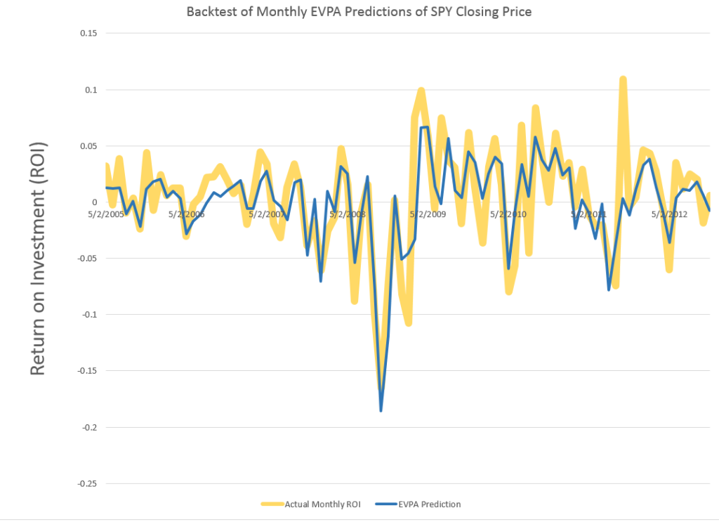
I strain every resource to develop backtests which are out-of-sample (OOS), and recently have found a way to predict closing prices with resources from the EVPA.

MOnthlyROISPYevpa

Great chart. The wider gold lines are the actual monthly ROI for the SPY, based on monthly closing prices. The blue line shows the OOS prediction of these closing prices, based on EVPA metrics. As you can see, the blue line predictions flat out miss or under-predict some developments in the closing prices. At the same time, in other cases, the EVPA predictions show uncanny accuracy, particularly in some of the big dips down.

Recognize this is something new. Rather than, say, predicting developments likely over a range of trading days – the high and low of a month, the  chart above shows predictions for stock prices at specific times, at the closing bell of the market the last trading day of each month.

I calculate the OOS R2 at 0.63 for the above series, which I understand is better than can be achieved with an autoregressive model for the closing prices and associated ROI’s.

I’ve also developed spreadsheets showing profits, after broker fees and short term capital gains taxes, from trading based on forecasts of the EVPA.

But, in addition to guidance for my personal trading, I’m interested in following out the implications of how much the historic prices predict about the prices to come.

Direction of the Market Next Week – July 13

Last Friday, before July 4th, I ran some numbers on the SPY exchange traded fund, looking at backcasts from the EVPA (extreme value prediction algorithm) for the Monday and Tuesday before, when Greece kept the banks closed and defaulted on its IMF payment. I also put up a ten day look forward on the EVPA predictions.

Of course, the SPY is an ETF which tracks the S&P 500.

The EVPA predicted the SPY high and low would drop at the beginning of the following week, beginning July 6, but seemed to suggest some rebound by the end of this week – that is today, July 10.

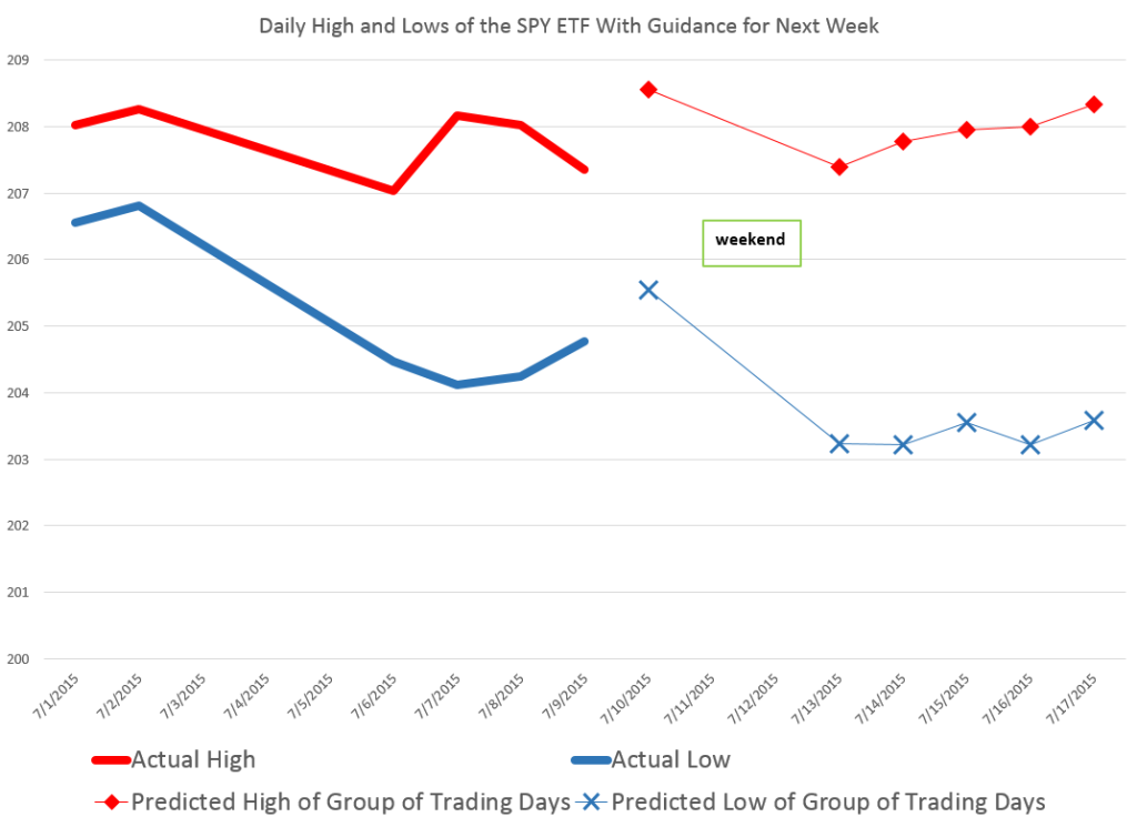
Here is a chart for today and next week with comments on interpreting the forecasts.

NextWeek

So the EVPA predicts the high and low over the current trading day, and aggregations of 2,3,4,.. trading days going forward.

The red diamonds in the chart map out forecasts for the high price of the SPY today, July 10, and for groups of trading days beginning today and ending Monday, July 13, and the rest of the days of next week.

Similarly, the blue crosses map out forecasts for the SPY low prices which are predicted to be reached over 1 day, the next two trading days, the next three trading days, and so forth.

Attentive readers will notice an apparent glitch in the forecasts for the high prices to come – namely that the predicted high of the next two trading days is lower than the predicted high for today – which is, of course, logically impossible.

But, hey, this is econometrics, not logic, and what we need to do is interpret the output of the models against what it is we are looking for.

In this case, a solid reduction in the predicted high of the coming two day period, compared with the prediction of today’s high signals that the high of the SPY is likely to be lower Monday than today.

This is consistent with predictions for the low today and for the next two trading days shown in blue – which indicates lower lows will be reached the second day.

Following that, the EVPA predictions for higher groupings of trading days are inconclusive, given statistical tolerances of the approach.

Note that the predictions of the high and low for today, Friday, July 10, are quite accurate, assuming these bounds have been reached by this point – two o’clock on Wall Street. In percentage error terms, the EVAP forecasts are over-forecasting 0.3% for the high and 0.2% for the low.

Again, the EVPA always keys off the opening price of the period being forecast.

I also have a version of the EVPA which forecasts ahead for the coming week, for two week periods, and so forth.

Leading up to the financial crisis of 2008 and then after the worst in October of that year, the EVPA weekly forecasts clearly highlight turning points.

Currently, weekly forecasts going up to monthly durations do not signal any clear trend in the market, but rather signal increasing volatility.

Chinese Stock Market Collapse

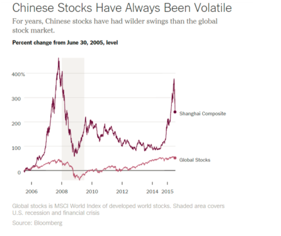
Chinese stocks are more volatile, in terms of percent swings, than stocks on other global markets, as this Bloomberg chart highlights.

ChinaStockVolatileGlobal

So the implication is maybe that the current bursting of the Chinese stock bubble is not such a big deal for the global economy, or perhaps it can be contained – despite signs of correlations between the Global Stocks and Shanghai Composite series.

Facts and Figures

Panic selling hit the major Chinese exchanges in Shanghai and Shenzeng, spreading now to the Hong Kong exchange.

Trades on most companies are limited or frozen, and major indexes continue to drop, despite support from the Chinese government.

Chinese Trading Suspensions Freeze $1.4 Trillion of Shares Amid Rout

The rout in Chinese shares has erased at least $3.2 trillion in value, or twice the size of India’s entire stock market. The Shenzhen Composite Index has led declines with a 38 percent plunge since its June 12 peak, as margin traders unwound bullish bets.

China: The Stock Market Meltdown Continues

Briefly put, there are few alternatives for saving in China. The formal banking system provides negative returns (low deposit yields, lower than inflation typically). Housing is no longer returning positive capital gains — partly as a consequence of deliberate policy actions to moderate a perceived housing bubble. So, what’s left (given you can’t easily save in overseas assets)? Equities. We have a typical boom-bust phenomenon, amplified by underdeveloped financial markets, opacity in valuations, and uncertainty regarding the government’s intentions (and will-power).

Stock Sell-Off Is Unabated in China (New York Times)

Most of the trades on Chinese exchanges are made by “retail traders,” basically individuals speculating on the market. These individuals often are highly leveraged or operating with borrowed money.

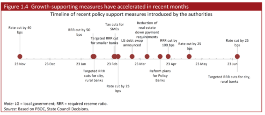
The Chinese markets moved into bubble territory several months back, and when a correction hit and as it accelerated recently, the Chinese government has tried all sorts of stuff, some charted below.

Chinameasures

Public/private funds to buy stocks and slow the fall in their prices have been created, also.

Risks of Contagion

It’s hard for foreign investors to gain access to the Chinese markets, where there are different classes of stocks for Chinese and foreign traders. So, by that light, only a few percent of Chinese stocks are held by foreign interests, and direct linkages between the sharp turn in values in China and elsewhere should be limited.

There may indirect linkages going from the Chinese stock market to the Chinese economy, and then to foreign supplies.

Here’s why the crash in Chinese stocks matters so much to Australia, i.e.  Australian property markets and reduced Chinese demand for iron.

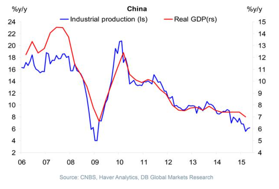
Iron ore demand by China and the drop in Chinese stocks actually seems more related to somewhat independent linkage with the longer term cascade down by Chinese GDP growth, illustrated here (See Ongoing Developments in China).

ChinaGDPgr

But maybe the most dangerous and unpredictable linkage is psychological.

Thus, the Financial Express of India reports Shanghai blues trigger panic selling on Dalal Street, metals feel the heat

How Did BusinessForecastBlog’s Stock Market Forecast Algorithm Perform June 20 and July 1?

As a spinoff from blogging for the past several years, I’ve discovered a way to predict the high and low of stock prices over periods, like one or several days, a week, or other periods.

As a general rule, I can forecast the high and low of the SPY – the exchange traded fund (ETF) which tracks the S&P 500 – with average absolute errors around 1 percent.

Recently, friends asked me – “how did you do Monday?” – referring to June 29th when Greece closed its banks, punting on a scheduled loan payment to the International Monetary Fund (IMF) the following day.

SPY closing prices tumbled more than 2 percent June 30th, the largest daily drop since June 20, 2013.

Performance of the EVPA

I’m now calling my approach the EVPA or extreme value prediction algorithm. I’ve codified procedures and moved from spreadsheets to programming languages, like Matlab and R.

The performance of the EVPA June 29th depends on whether you allow the programs the Monday morning opening price – something I typically build in to the information set. That is, if I am forecasting a week ahead, I trigger the forecast after the opening of that week’s trading, obtaining the opening price for that week.

Given the June 29 opening price for the SPY ($208.05 a share), the EVPA predicts a Monday high and low of 209.25 and 207.11, for percent forecast errors of -0.6% and -1% respectively.

Of course, Monday’s opening price was significantly down from the previous Friday (by -1.1%).

Without Monday’s opening price, the performance of the EVPA degrades somewhat in the face of the surprising incompetence of Eurozone negotiators. The following chart shows forecast errors for predictions of the daily low price, using only the information available at the close of the trading day Friday June 26.

Actual Forecast % Error
29-Jun 205.33 208.71 1.6%
30-Jun 205.28 208.75 1.7%

Forecasts of the high price for one and two-trading day periods average 1 percent errors (over actuals), when generated only with closing information from the previous week.

Where the Market Is Going

So where is the market going?

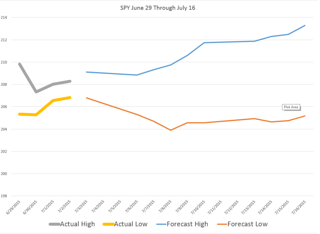
The following chart shows the high and low for Monday through Wednesday of the week of June 30 to July 3, and forecasts for the high and low which will be reached in a nested series of periods from one to ten trading days, starting Wednesday.

WhereGoing

What makes interpretation of these predictions tricky is the fact that they do not pertain to 1, 2, and so forth trading days forward, per se. Rather, they are forecasts for 1 day periods, 2 day periods, 3 day periods, and so forth.

One classic pattern is the highs level, but predictions for the lows drop over increasing groups of trading days. That is a signal for a drop in the averages for the security in question, since highs can be reached initially and still stand for these periods of increasing trading days.

These forecasts offer some grounds for increases in the SPY averages going forward, after an initial decrease through the beginning of the coming week.

Of course the Greek tragedy is by no means over, and there can be more surprises.

Still, I’m frankly amazed at how well the EVPA does, in the humming, buzzing and chaotic confusion of global events.

Out-Of-Sample R2 Values for PVAR Models

Out-of-sample (OOS) R2 is a good metric to apply to test whether your predictive relationship has out-of-sample predictability. Checking this for the version of the proximity variable model which is publically documented, I find OOS R2 of 0.63 for forecasts of daily high prices.

In other words, 63 percent of the variation of the daily growth in high prices for the S&P 500 is explained by four variables, documented in Predictability of the Daily High and Low of the S&P 500 Index.

This is a really high figure for any kind of predictive relationship involving security prices, so I thought I would put the data out there for anyone interested to check.

OOS R2

This metric is often found in connection with efforts to predict daily or other rates of return on securities, and is commonly defined as

OOSR2

See, for example, Campbell and Thompson.

The white paper linked above and downloadable from University of Munich archives shows –

Ratios involving the current period opening price and the high or low price of the previous period are significant predictors of the current period high or low price for many stocks and stock indexes. This is illustrated with daily trading data from the S&P 500 index. Regressions specifying these “proximity variables” have higher explanatory and predictive power than benchmark autoregressive and “no change” models. This is shown with out-of-sample comparisons of MAPE, MSE, and the proportion of time models predict the correct direction or sign of change of daily high and low stock prices. In addition, predictive models incorporating these proximity variables show time varying effects over the study period, 2000 to February 2015. This time variation looks to be more than random and probably relates to investor risk preferences and changes in the general climate of investment risk.

I wanted to provide interested readers with a spreadsheet containing the basic data and computations of this model, which I call the “proximity variable” model. The idea is that the key variables are ratios of nearby values.

And this is sort of an experiment, since I have not previously put up a spreadsheet for downloading on this blog. And please note the spreadsheet data linked below is somewhat different than the original data for the white paper, chiefly by having more recent observations. This does change the parameter estimates for the whole sample, since the paper shows we are in the realm of time-varying coefficients.

So here goes. Check out this link. PVARresponse

Of course, no spreadsheet is totally self-explanatory, so a few words.

First, the price data (open, high, low, etc) for the S&P 500 come from Yahoo Finance, although the original paper used other sources, too.

Secondly, the data matrix for the regressions is highlighted in light blue. The first few rows of this data matrix include the formulas with later rows being converted to numbers, to reduce the size of the file.

If you look in column K below about row 1720, you will find out-of-sample regression forecasts, created by using data from the immediately preceding trading day and before and current day opening price ratios.

There are 35 cases, I believe, in which the high of the day and the opening price are the same. These can easily be eliminated in calculating any metrics, and, doing so, in fact increases the OOS R2.

I’m sympathetic with readers who develop a passion to “show this guy to be all wrong.” I’ve been there, and it may help to focus on computational matters.

However, there is just no question but this approach is novel, and beats both No Change forecasts and a first order autoregressive forecasts (see the white paper) by a considerable amount.

I personally think these ratios are closely watched by some in the community of traders, and that other price signals motivating trades are variously linked with these variables.

My current research goes further than outlined in the white paper – a lot further. At this point, I am tempted to suggest we are looking at a new paradigm in predictability of stock prices. I project “waves of predictability” will be discovered in the movement of ensembles of security prices. These might be visualized like the wave at a football game, if you will. But the basic point is that I reckon we can show how early predictions of these prices changes are self-confirming to a degree, so emerging signs of the changes being forecast in fact intensify the phenomena being predicted.

Think big.

Keep the comments coming.