Category Archives: forecasting research

The Holy Grail of Business Forecasting – Forecasting the Next Downturn

What if you could predict the Chicago Fed National Activity Index (CFNAI), interpolated monthly values of the growth of nominal GDP, the Aruoba-Diebold-Scotti (ADS) Business Conditions Index, and the Kansas City Financial Stress Index (KCFSI) three, five, seven, even twelve months into the future? What if your model also predicted turning points in these US indexes, and also similar macroeconomic variables for countries in Asia and the European Union? And what if you could do all this with data on monthly returns on the stock prices of companies in the financial sector?

That’s the claim of Linda Allen, Turan Bali, and Yi Tang in a fascinating 2012 paper Does Systemic Risk in the Financial Sector Predict Future Economic Downturns?

I’m going to refer to these authors as Bali et al, since it appears that Turan Bali, shown below, did some of the ground-breaking research on estimating parametric distributions of extreme losses. Bali also is the corresponding author.

T_bali

Bali et al develop a new macroindex of systemic risk that predicts future real economic downturns which they call CATFIN.

CATFIN is estimated using both value-at-risk (VaR) and expected shortfall (ES) methodologies, each of which are estimated using three approaches: one nonparametric and two different parametric specifications. All data used to construct the CATFIN measure are available at each point in time (monthly, in our analysis), and we utilize an out-of-sample forecasting methodology. We find that all versions of CATFIN are predictive of future real economic downturns as measured by gross domestic product (GDP), industrial production, the unemployment rate, and an index of eighty-five existing monthly economic indicators (the Chicago Fed National Activity Index, CFNAI), as well as other measures of real macroeconomic activity (e.g., NBER recession periods and the Aruoba-Diebold-Scott [ADS] business conditions index maintained by the Philadelphia Fed). Consistent with an extensive body of literature linking the real and financial sectors of the economy, we find that CATFIN forecasts aggregate bank lending activity.

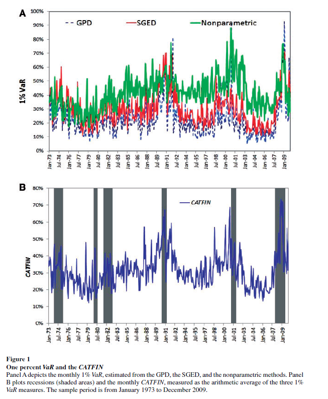
The following graphic illustrates three components of CATFIN and the simple arithmetic average, compared with US recession periods.

CATFIN

Thoughts on the Method

OK, here’s the simple explanation. First, these researchers identify US financial companies based on definitions in Kenneth French’s site at the Tuck School of Business (Dartmouth). There are apparently 500-1000 of these companies for the period 1973-2009. Then, for each month in this period, rates of return of the stock prices of these companies are calculated. Then, three methods are used to estimate 1% value at risk (VaR) – two parametric methods and one nonparametric methods. The nonparametric method is straight-forward –

The nonparametric approach to estimating VaR is based on analysis of the left tail of the empirical return distribution conducted without imposing any restrictions on the moments of the underlying density…. Assuming that we have 900 financial firms in month t , the nonparametric measure of1%VaR is the ninth lowest observation in the cross-section of excess returns. For each month, we determine the one percentile of the cross-section of excess returns on financial firms and obtain an aggregate 1% VaR measure of the financial system for the period 1973–2009.

So far, so good. This gives us the data for the graphic shown above.

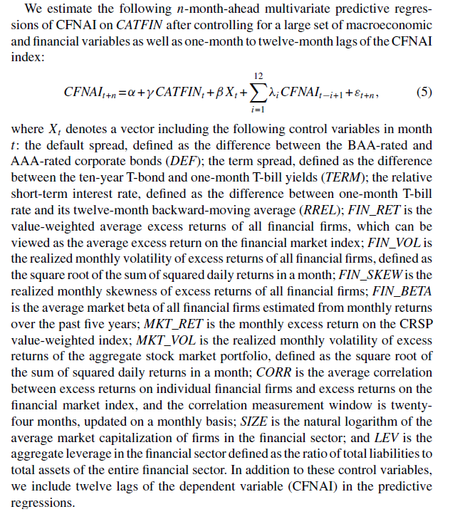
In order to make this predictive, the authors write that –

CATFINEQ

Like a lot of leading indicators, the CATFIN predictive setup “over-predicts” to some extent. Thus, there are there are five instances in which a spike in CATFIN is not followed by a recession, thereby providing a false positive signal of future real economic distress. However, the authors note that in many of these cases, predicted macroeconomic declines may have been averted by prompt policy intervention. Their discussion of this is very interesting, and plausible.

What This Means

The implications of this research are fairly profound – indicating, above all, the priority of the finance sector in leading the overall economy today. Certainly, this consistent with the balance sheet recession of 2008-2009, and probably will continue to be relevant going forward – since nothing really has changed and more concentration of ownership in finance has followed 2008-2009.

I do think that Serena Ng’s basic point in a recent review article probably is relevant – that not all recessions are the same. So it may be that this method would not work as well for, say, the period 1945-1970, before financialization of the US and global economies.

The incredibly ornate mathematics of modeling the tails of return distributions are relevant in this context, incidentally, since the nonparametric approach of looking at the empirical distributions month-by-month could be suspect because of “cherry-picking.” So some companies could be included, others excluded to make the numbers come out. This is much difficult in a complex maximum likelihood estimation process for the location parameters of these obscure distributions.

So the question on everybody’s mind is – WHAT DOES THE CATFIN MODEL INDICATE NOW ABOUT THE NEXT FEW MONTHS? Unfortunately, I am unable to answer that, although I have corresponded with some of the authors to inquire whether any research along such lines can be cited.

Bottom line – very impressive research and another example of how important science can get lost in the dance of prestige and names.

Seasonal Adjustment – A Swirl of Controversies

My reading on procedures followed by the Bureau of Labor Statistics (BLS) and the Bureau of Economic Analysis (BLS) suggests some key US macroeconomic data series are in a profound state of disarray. Never-ending budget cuts to these “non-essential” agencies, since probably the time of Bill Clinton, have taken their toll.

For example, for some years now it has been impossible for independent analysts to verify or replicate real GDP and many other numbers issued by the BEA, since, only SA (seasonally adjusted) series are released, originally supposedly as an “economy measure.” Since estimates of real GDP growth by quarter are charged with political significance in an Election Year, this is a potential problem. And the problem is immediate, since the media naturally will interpret a weak 2nd quarter growth – less than, say, 2.9 percent – as a sign the economy has slipped into recession.

Evidence of Political Pressure on Government Statistical Agencies

John Williams has some fame with his site Shadow Government Statistics. But apart from extreme stances from time to time (“hyperinflation”), he does document the politicization of the BLS Consumer Price Index (CPI).

In a recent white paper called No. 515—PUBLIC COMMENT ON INFLATION MEASUREMENT AND THE CHAINED-CPI (C-CPI), Williams cites Katharine Abraham, former commissioner of the Bureau of Labor Statistics, when she notes,

“Back in the early winter of 1995, Federal Reserve Board Chairman Alan Greenspan testified before the Congress that he thought the CPI substantially overstated the rate of growth in the cost of living. His testimony generated a considerable amount of discussion. Soon afterwards, Speaker of the House Newt Gingrich, at a town meeting in Kennesaw, Georgia, was asked about the CPI and responded by saying, ‘We have a handful of bureaucrats who, all professional economists agree, have an error in their calculations. If they can’t get it right in the next 30 days or so, we zero them out, we transfer the responsibility to either the Federal Reserve or the Treasury and tell them to get it right.’”[v]

Abraham is quoted in newspaper articles as remembering sitting in Republican House Speaker Newt Gingrich’s office:

“ ‘He said to me, If you could see your way clear to doing these things, we might have more money for BLS programs.’ ” [vi]

The “things” in question were to move to quality adjustments for the basket of commodities used to calculate the CPI. The analogue today, of course, is the chained-CPI measure which many suggest is being promoted to slow cost-of-living adjustments in Social Security payments.

Of course, the “real” part in real GDP is linked with the CPI inflation outlook though a process supervised by the BEA.

Seasonal Adjustment Procedures for GDP

Here is a short video by Johnathan H. Wright, a young economist whose Unseasonal Seasonals? is featured in a recent issue of the Brookings Papers on Economic Activity.

Wright’s research is interesting to forecasters, because he concludes that algorithms for seasonally adjusting GDP should be selected based on their predictive performance.

Wright favors state-space models, rather than the moving-average techniques associated with the X-12 seasonal filters that date back to the 1980’s and even the 1960’s.

Given BLS methods of seasonal adjustment, seasonal and cyclical elements are confounded in the SA nonfarm payrolls series, due to sharp drops in employment concentrated in the November 2008 to March 2009 time window.

The upshot – initially this effect pushed reported seasonally adjusted nonfarm payrolls up in the first half of the year and down in the second half of the year, by slightly more than 100,000 in both cases…

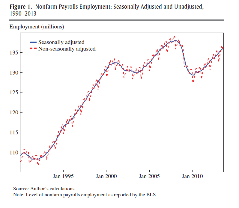
One of his prime exhibits compares SA and NSA nonfarm payrolls, showing that,

The regular within-year variation in employment is comparable in magnitude to the effects of the 1990–1991 and 2001 recessions. In monthly change, the average absolute difference between the SA and NSA number is 660,000, which dwarfs the normal month-over-month variation in the SA data.

SEASnonseas

The basic procedure for this data and most releases since 2008-2009 follows what Wright calls the X-12 process.

The X-12 process focuses on certain types of centered moving averages with a fixed weights, based on distance from the central value.

A critical part of the X-12 process involves estimating the seasonal factors by taking weighted moving averages of data in the same period of different years. This is done by taking a symmetric n-term moving average of m-term averages, which is referred to as an n × m seasonal filter. For example, for n = m = 3, the weights are 1/3 on the year in question, 2/9 on the years before and after, and 1/9 on the two years before and after.16 The filter can be a 3 × 1, 3 × 3, 3 × 5, 3 × 9, 3 × 15, or stable filter. The stable filter averages the data in the same period of all available years. The default settings of the X-12…involve using a 3 × 3, 3 × 5, or 3 × 9 seasonal filter, depending on [various criteria]

Obviously, a problem arises at the beginning and at the end of the time series data. A work-around is to use an ARIMA model to extend the time series back and forward in time sufficiently to calculate these centered moving averages.

Wright shows these arbitrary weights and time windows lead to volatile seasonal adjustments, and that, predictively, the BEA and BLS would be better served with a state-space model based on the Kalman filter.

Loopy seasonal adjustment leads to controversy that airs on the web – such as this piece by Zero Hedge from 2012 which highlights the “ficititious” aspect of seasonal adjustments of highly tangible series, such as the number of persons employed –

What is very notable is that in January, absent BLS smoothing calculation, which are nowhere in the labor force, but solely in the mind of a few BLS employees, the real economy lost 2,689,000 jobs, while net of the adjustment, it actually gained 243,000 jobs: a delta of 2,932,000 jobs based solely on statistical assumptions in an excel spreadsheet!

To their credit, Census now documents an X-13ARIMA-SEATS Seasonal Adjustment Program with software incorporating elements of the SEATS procedure originally developed at the Bank of Spain and influenced by the state space models of Andrew Harvey.

Maybe Wright is getting some traction.

What Is The Point of Seasonal Adjustment?

You can’t beat the characterization, apparently from the German Bundesbank, of the purpose and objective of “seasonal adjustment.”

..seasonal adjustment transforms the world we live in into a world where no seasonal and working-day effects occur. In a seasonally adjusted world the temperature is exactly the same in winter as in the summer, there are no holidays, Christmas is abolished, people work every day in the week with the same intensity (no break over the weekend)..

I guess the notion is that, again, if we seasonally adjust and see a change in direction of a time series, why then it probably is a change in trend, rather than from special uses of a certain period.

But I think most of the professional forecasting community is beyond just taking their cue from a single number. It would be better to have the raw or not seasonally adjusted (NSA) series available with every press release, so analysts can apply their own models.

Stock Market Predictability – Controversy

In the previous post, I drew from papers by Neeley, who is Vice President of the Federal Reserve Bank of St. Louis, David Rapach at St. Louis University and Goufu Zhou at Washington University in St. Louis.

These authors contribute two papers on the predictability of equity returns.

The earlier one – Forecasting the Equity Risk Premium: The Role of Technical Indicators – is coming out in Management Science. Of course, the survey article – Forecasting the Equity Risk Premium: The Role of Technical Indicators – is a chapter in the recent volume 2 of the Handbook of Forecasting.

I go through this rather laborious set of citations because it turns out that there is an underlying paper which provides the data for the research of these authors, but which comes to precisely the opposite conclusion –

The goal of our own article is to comprehensively re-examine the empirical evidence as of early 2006, evaluating each variable using the same methods (mostly, but not only, in linear models), time-periods, and estimation frequencies. The evidence suggests that most models are unstable or even spurious. Most models are no longer significant even insample (IS), and the few models that still are usually fail simple regression diagnostics.Most models have performed poorly for over 30 years IS. For many models, any earlier apparent statistical significance was often based exclusively on years up to and especially on the years of the Oil Shock of 1973–1975. Most models have poor out-of-sample (OOS) performance, but not in a way that merely suggests lower power than IS tests. They predict poorly late in the sample, not early in the sample. (For many variables, we have difficulty finding robust statistical significance even when they are examined only during their most favorable contiguous OOS sub-period.) Finally, the OOS performance is not only a useful model diagnostic for the IS regressions but also interesting in itself for an investor who had sought to use these models for market-timing. Our evidence suggests that the models would not have helped such an investor. Therefore, although it is possible to search for, to occasionally stumble upon, and then to defend some seemingly statistically significant models, we interpret our results to suggest that a healthy skepticism is appropriate when it comes to predicting the equity premium, at least as of early 2006. The models do not seem robust.

This is from Ivo Welch and Amit Goyal’s 2008 article A Comprehensive Look at The Empirical Performance of Equity Premium Prediction in the Review of Financial Studies which apparently won an award from that journal as the best paper for the year.

And, very importantly, the data for this whole discussion is available, with updates, from Amit Goyal’s site now at the University of Lausanne.

AmitGoyal

Where This Is Going

Currently, for me, this seems like a genuine controversy in the forecasting literature. And, as an aside, in writing this blog I’ve entertained the notion that maybe I am on the edge of a new form of or focus in journalism – namely stories about forecasting controversies. It’s kind of wonkish, but the issues can be really, really important.

I also have a “hands-on” philosophy, when it comes to this sort of information. I much rather explore actual data and run my own estimates, than pick through theoretical arguments.

So anyway, given that Goyal generously provides updated versions of the data series he and Welch originally used in their Review of Financial Studies article, there should be some opportunity to check this whole matter. After all, the estimation issues are not very difficult, insofar as the first level of argument relates primarily to the efficacy of simple bivariate regressions.

By the way, it’s really cool data.

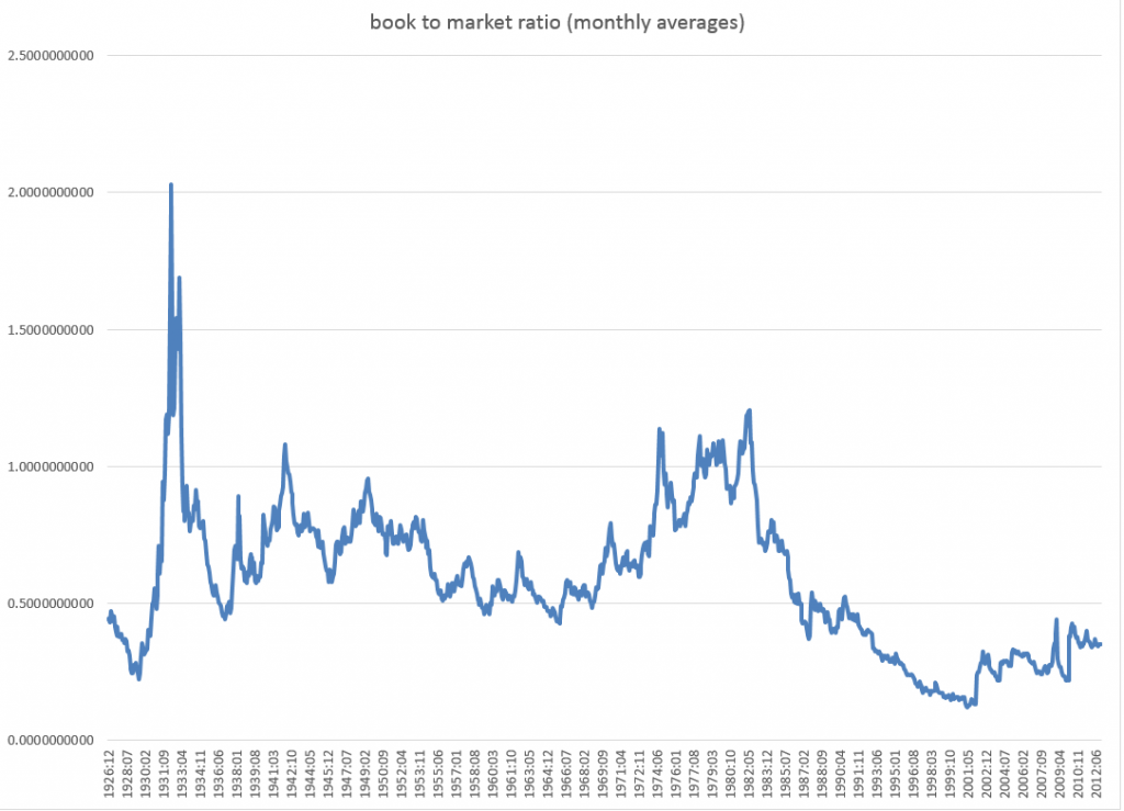
Here is the book-to-market ratio, dating back to 1926.

bmratio

But beyond these simple regressions that form a large part of the argument, there is another claim made by Neeley, Rapach, and Zhou which I take very seriously. And this is that – while a “kitchen sink” model with all, say, fourteen so-called macroeconomic variables does not outperform the benchmark, a principal components regression does.

This sounds really plausible.

Anyway, if readers have flagged updates to this controversy about the predictability of stock market returns, let me know. In addition to grubbing around with the data, I am searching for additional analysis of this point.

Credit Spreads As Predictors of Real-Time Economic Activity

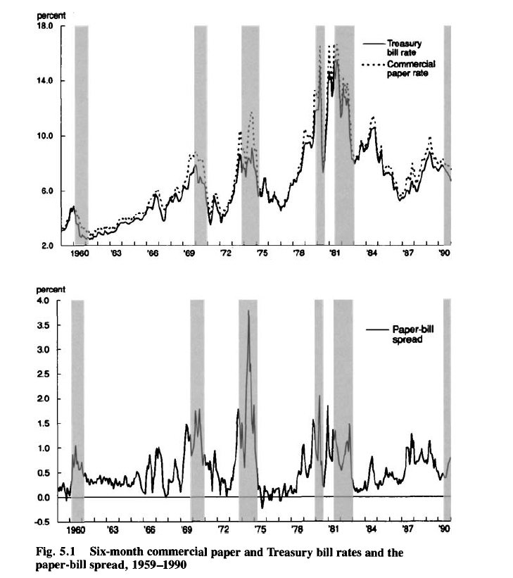
Several distinguished macroeconomic researchers, including Ben Bernanke, highlight the predictive power of the “paper-bill” spread.

The following graphs, from a 1993 article by Benjamin M. Friedman and Kenneth N. Kuttner, show the promise of credit spreads in forecasting recessions – indicated by the shaded blocks in the charts.

CPTBspread

Credit spreads, of course, are the differences in yields between various corporate debt instruments and government securities of comparable maturity.

The classic credit spread illustrated above is the difference between six-month commercial paper rates and 6 month Treasury bill rates.

Recent Research

More recent research underlines the importance of building up credit spreads from metrics relating to individual corporate bonds , rather than a mishmash of bonds with different duration, credit risk and other characteristics.

Credit Spreads as Predictors of Real-Time Economic Activity: A Bayesian Model-Averaging Approach is key research in this regard.

The authors first note that,

the “paper-bill” spread—the difference between yields on nonfinancial commercial paper and comparable-maturity Treasury bills—had substantial forecasting power for economic activity during the 1970s and the 1980s, but its predictive ability vanished in the subsequent decade

They then acknowledge that credit spreads based on indexes of speculative-grade or “junk” corporate bonds work fairly well for the 1990s, but their performance is uneven.

Accordingly, Faust, Gilchrist, Wright, and Zakrajsek (GYZ) write that

In part to address these problems, GYZ constructed 20 monthly credit spread indexes for different maturity and credit risk categories using secondary market prices of individual senior unsecured corporate bonds.. [measuring]..the underlying credit risk by the issuer’s expected default frequency (EDF™), a market-based default-risk indicator calculated by Moody’s/KMV that is more timely that the issuer’s credit rating]

Their findings indicate that these credit spread indexes have substantial predictive power, at both short- and longer-term horizons, for the growth of payroll employment and industrial production. Moreover, they significantly outperform the predictive ability of the standard default-risk indicators, a result that suggests that using “cleaner” measures of credit spreads may, indeed, lead to more accurate forecasts of economic activity.

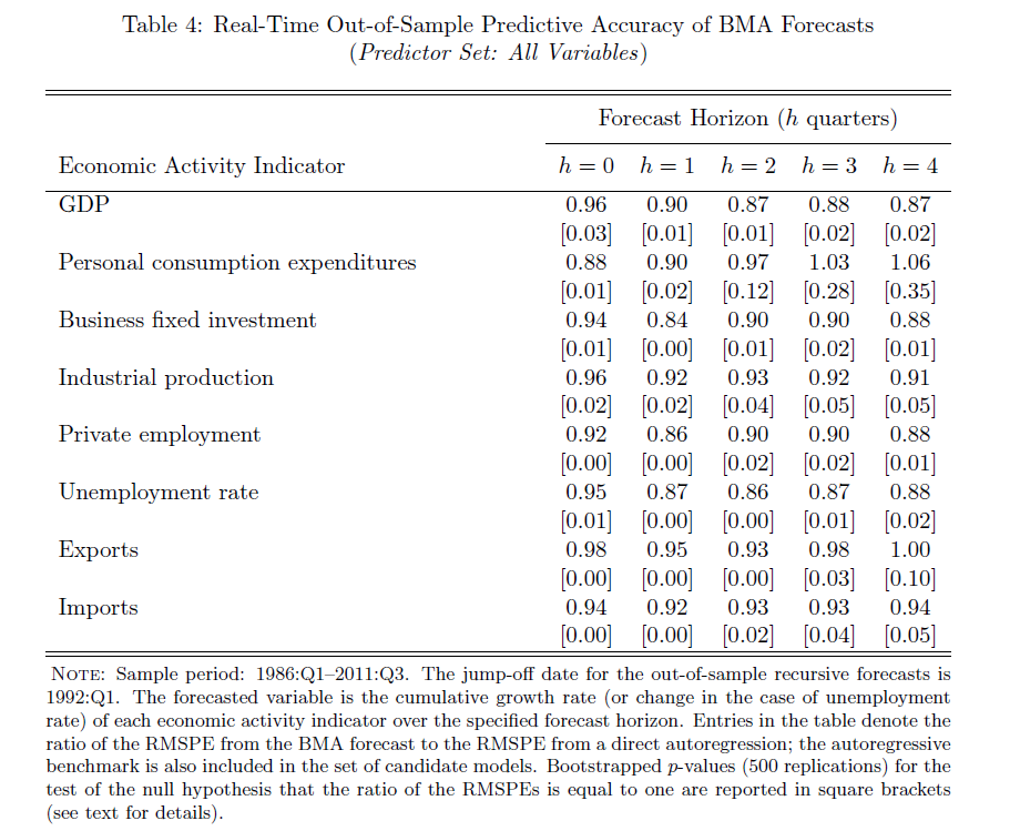
Their research applies credit spreads constructed from the ground up, as it were, to out-of-sample forecasts of

…real economic activity, as measured by real GDP, real personal consumption expenditures (PCE), real business fixed investment, industrial production, private payroll employment, the civilian unemployment rate, real exports, and real imports over the period from 1986:Q1 to 2011:Q3. All of these series are in quarter-over-quarter growth rates (actually 400 times log first differences), except for the unemployment rate, which is simply in first differences

The results are forecasts which significantly beat univariate (autoregressive) model forecass, as shown in the following table.

Cspreadresults

Here BMA is an abbreviation for Bayesian Model Averaging, the author’s method of incorporating these calculated credit spreads in predictive relationships.

Additional research validates the usefulness of credit spreads so constructed for predicting macroeconomic dynamics in several European economies –

We find that credit spreads and excess bond premiums, when used alongside monetary policy tightness indicators and leading indicators of economic performance, are highly significant for predicting the growth in the index of industrial production, employment growth, the unemployment rate and real GDP growth at horizons ranging from one quarter to two years ahead. These results are confirmed for individual countries in the euroarea and for the United Kingdom, and are robust to different measures of the credit spread. It is the unpredictable part associated with the excess bond premium that has greater influence on real activity compared to the predictable part of the credit spread. The implications of our results are that careful selection of the bonds used to construct the credit spreads, excluding those with embedded options and or illiquid secondary markets, delivers a robust indicator of financial market tightness that is distinct from tightness due to monetary policy measures or leading indicators of economic activity.

The Situation Today

A Morgan Stanley Credit Report for fixed income, released March 21, 2014, notes that

Spreads in both IG and HY are at the lowest levels we have seen since 2007, roughly 110bp for IG and 415bp for HY. A question we are commonly asked is how much tighter can spreads go in this cycle

So this is definitely something to watch. 

Interest Rates – 3

Can interest rates be nonstationary?

This seems like a strange question, since interest rates are bounded, except in circumstances, perhaps, of total economic collapse.

“Standard” nonstationary processes, by contrast, can increase or decrease without limit, as can conventional random walks.

But, be careful. It’s mathematically possible to define and study random walks with reflecting barriers –which, when they reach a maximum or minimum, “bounce” back from the barrier.

This is more than esoteric, since the 30 year fixed mortgage rate monthly averages series discussed in the previous post has a curious property. It can be differenced many times, and yet display first order autocorrelation of the resulting series.

This contrasts with the 10 year fixed maturity Treasury bond rates (also monthly averages). After first differencing this Treasury bond series, the resulting residuals do not show statistically significant first order autocorrelation.

Here a stationary stochastic process is one in which the probability distribution of the outcomes does not shift with time, so the conditional mean and conditional variance are, in the strict case, constant. A classic example is white noise, where each element can be viewed as an independent draw from a Gaussian distribution with zero mean and constant variance.

30 Year Fixed Mortgage Monthly Averages – a Nonstationary Time Series?

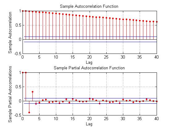
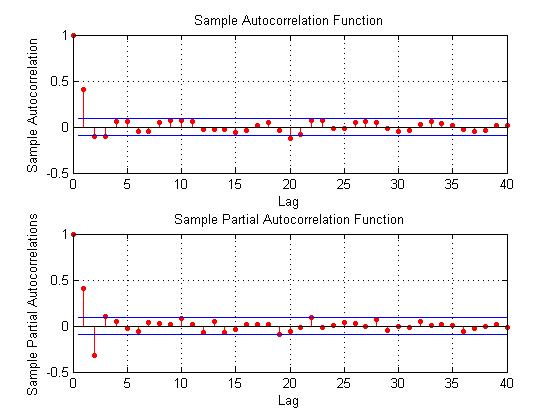
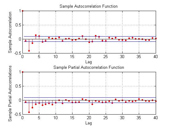
Here are some autocorrelation functions (ACF’s) and partial autocorrelation functions (PACF’s) of the 30 year fixed mortgage monthly averages from April 1971 to January 2014, first differences of this series, and second differences of this series – altogether six charts produced by MATLAB’s plot routines.

Data for this and the following series are downloaded from the St. Louis Fed FRED site.

MLmort0

Here the PACF appears to cut off after 4 periods, but maybe not quite, since there are values for lags which touch the statistical significance boundary further out.

MLmort1

This seems more satisfactory, since there is only one major spike in the ACF and 2-3 initial spikes in the PACF. Again, however, values for lags far out on the horizontal axis appear to touch the boundary of statistical significance.

MLmort2

Here are the ACF and PACF’s of the “difference of the first difference” or the second difference, if you like. This spike at period 2 for the ACF and PACF is intriguing, and, for me, difficult to interpret.

The data series includes 514 values, so we are not dealing with a small sample in conventional terms.

I also checked for seasonal variation – either additive or multiplicative seasonal components or factors. After taking steps to remove this type of variation, if it exists, the same pattern of repeated significance of autocorrelations of differences and higher order differences persists.

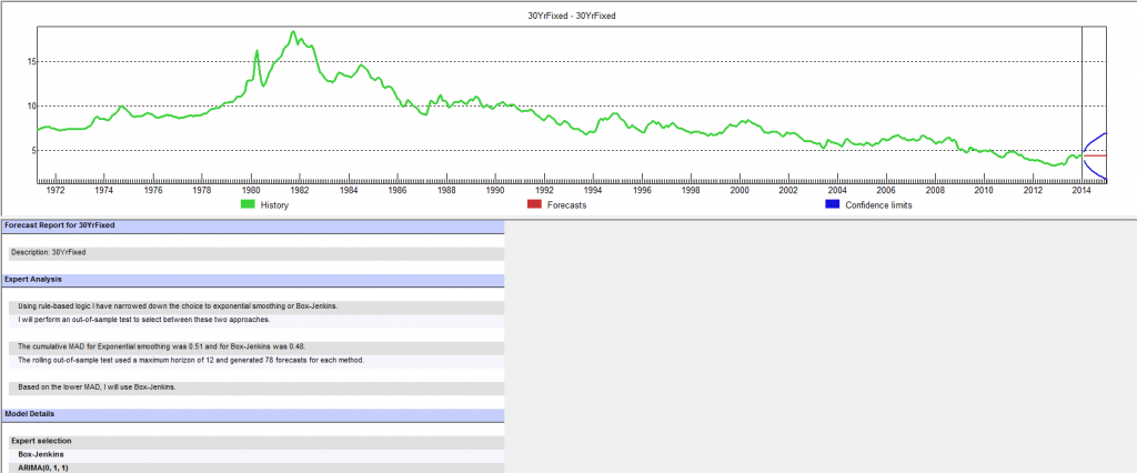
Forecast Pro, a good business workhorse for automatic forecasting, selects ARIMA(0,1,1) as the optimal forecast model for this 30 year fixed interest mortgage monthly averages. In other words, Forecast Pro glosses over the fact that the residuals from an ARIMA(0,1,1) setup still contain significant autocorrelation.

Here is a sample of the output (click to enlarge)

FP30yr

10 Year Treasury Bonds Constant Maturity

The situation is quite different for 10 year Treasury Bonds monthly averages, where the downloaded series starts April 1953 and, again, ends January 2014.

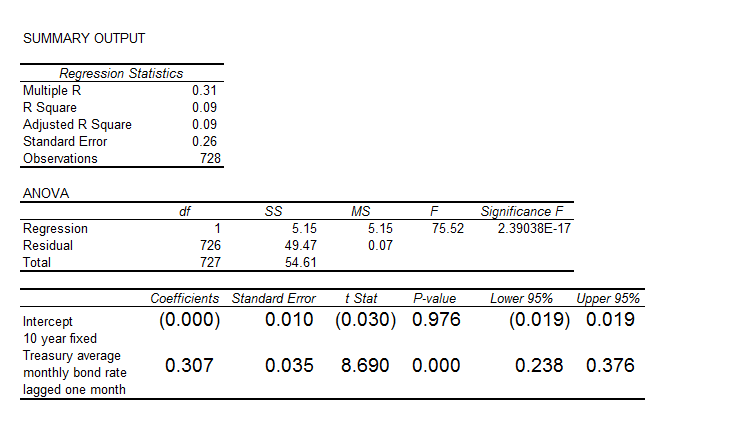
Here is the ordinary least squares (OLS) regression of the first order autocorrelation.

10yrTreasregHere the R2 or coefficient of determination is much lower than for the 30 year fixed mortgage monthly averages, but the first order lagged rate is highly significant statistically.

On the other hand, the residuals of this regression do not exhibit a high degree of first order autocorrelation, falling below the 80 percent significance level.

What Does This Mean?

The closest I have come to formulating an explanation for this weird difference between these two “interest rates” is the discussion in a paper from 2002 –

On Mean Reversion in Real Interest Rates: An Application of Threshold Cointegration

The authors of this research paper from the Institute for Advanced Studies in Vienna acknowledge findings that some interests rates may be nonstationary, at least over some periods of time. Their solution is a nonlinear time series approach, but they highlight several of the more exotic statistical features of interest rates in passing – such as evidence of non-normal distributions, excess kurtosis, conditional heteroskedasticity, and long memory.

In any case, I wonder whether the 30 year fixed mortgage monthly averages might be suitable for some type of boosting model working on residuals and residuals of residuals.

I’m going to try that later on this Spring.

The Worst Bear Market in History – Guest Post

This is a fascinating case study of financial aberration, authored by Bryan Taylor, Ph.D., Chief Economist, Global Financial Data.

**********************************************************

Which country has the dubious distinction of suffering the worst bear market in history?

To answer this question, we ignore countries where the government closed down the stock exchange, leaving investors with nothing, as occurred in Russia in 1917 or Eastern European countries after World War II. We focus on stock markets that continued to operate during their equity-destroying disaster.

There is a lot of competition in this category.  Almost every major country has had a bear market in which share prices have dropped over 80%, and some countries have had drops of over 90%. The Dow Jones Industrial Average dropped 89% between 1929 and 1932, the Greek Stock market fell 92.5% between 1999 and 2012, and adjusted for inflation, Germany’s stock market fell over 97% between 1918 and 1922.

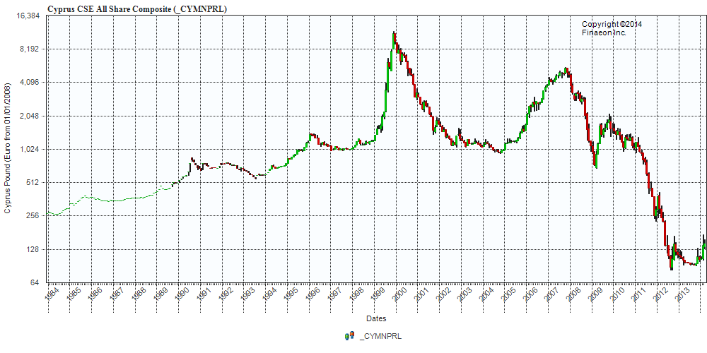
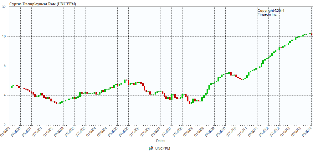
The only consolation to investors is that the maximum loss on their investment is 100%, and one country almost achieved that dubious distinction. Cyprus holds the record for the worst bear market of all time in which investors have lost over 99% of their investment! Remember, this loss isn’t for one stock, but for all the shares listed on the stock exchange.

The Cyprus Stock Exchange All Share Index hit a high of 11443 on November 29, 1999, fell to 938 by October 25, 2004, a 91.8% drop.  The index then rallied back to 5518 by October 31, 2007 before dropping to 691 on March 6, 2009.  Another rally ensued to October 20, 2009 when the index hit 2100, but collapsed from there to 91 on October 24, 2013.  The chart below makes any roller-coaster ride look boring by comparison (click to enlarge).

GFD1

The fall from 11443 to 91 means that someone who invested at the top in 1999 would have lost 99.2% of their investment by 2013.  And remember, this is for ALL the shares listed on the Cyprus Stock Exchange.  By definition, some companies underperform the average and have done even worse, losing their shareholders everything.

For the people in Cyprus, this achievement only adds insult to injury.  One year ago, in March 2013, Cyprus became the fifth Euro country to have its financial system rescued by a bail-out.  At its height, the banking system’s assets were nine times the island’s GDP. As was the case in Iceland, that situation was unsustainable.

Since Germany and other paymasters for Ireland, Portugal, Spain and Greece were tired of pouring money down the bail-out drain, they demanded not only the usual austerity and reforms to put the country on the right track, but they also imposed demands on the depositors of the banks that had created the crisis, creating a “bail-in”.

As a result of the bail-in, debt holders and uninsured depositors had to absorb bank losses. Although some deposits were converted into equity, given the decline in the stock market, this provided little consolation. Banks were closed for two weeks and capital controls were imposed upon Cyprus.  Not only did depositors who had money in banks beyond the insured limit lose money, but depositors who had money in banks were restricted from withdrawing their funds. The impact on the economy has been devastating. GDP has declined by 12%, and unemployment has gone from 4% to 17%.

GFD2

On the positive side, when Cyprus finally does bounce back, large profits could be made by investors and speculators.  The Cyprus SE All-Share Index is up 50% so far in 2014, and could move up further. Of course, there is no guarantee that the October 2013 will be the final low in the island’s fourteen-year bear market.  To coin a phrase, Cyprus is a nice place to visit, but you wouldn’t want to invest there.

The Accuracy of Macroeconomics Forecasts – Survey of Professional Forecasters

The Philadelphia Federal Reserve Bank maintains historic records of macroeconomic forecasts from the Survey of Professional Forecasters (SPF). These provide an outstanding opportunity to assess forecasting accuracy in macroeconomics.

For example, in 2014, what is the chance the “steady as she goes” forecast from the current SPF is going to miss a downturn 1, 2, or 3 quarters into the future?

1-Quarter-Ahead Forecast Performance on Real GDP

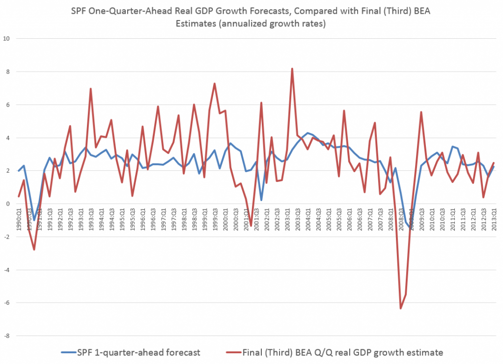
Here is a chart I’ve ginned up for a 1-quarter ahead performance of the SPF forecasts of real GDP since 1990.

SP!1Q

The blue line is the forecast growth rate for real GDP from the SPF on a 1-quarter-ahead basis. The red line is the Bureau of Economic Analysis (BEA) final number for the growth rate for the relevant quarters. The growth rates in both instances are calculated on a quarter-over-quarter basis and annualized.

Side-stepping issues regarding BEA revisions, I used BEA final numbers for the level and growth of real GDP by quarter. This may not completely fair to the SPF forecasters, but it is the yardstick SPF is usually judged by its “consumers.”

Forecast errors for the 1-quarter-ahead forecasts, calculated on this basis, average about 2 percent in absolute value.

They also exhibit significant first order autocorrelation, as is readily suggested by the chart above. So, the SPF tends to under-predict during expansion phases of the business cycle and over-predict during contraction phases.

Currently, the SPF 2014:Q1 forecast for 2014:Q2 is for 3.0 percent real growth of GDP, so maybe it’s unlikely that an average error for this forecast would result in actual 2014:Q2 growth dipping into negative territory.

2-Quarter-Ahead Forecast Performance on Real GDP

Errors for the 2-quarter-ahead SPF forecast, judged against BEA final numbers for real GDP growth, only rise to about 2.14 percent.

However, I am interested in more than the typical forecast error associated with forecasts of real Gross Domestic Product (GDP) on a 1-, 2-, or 3- quarter ahead forecast horizon.

Rather, I’m curious whether the SPF is likely to catch a
downturn over these forecast horizons, given that one will occur.

So if we just look at recessions in this period, in 2001, 2002-2003, and 2008-2009, the performance significantly deteriorates. This can readily be seen in the graph for 1-quarter-ahead forecast errors shown above in 2008 when the consensus SPF forecast indicated a slight recovery for real GDP in exactly the quarter it totally tanked.

Bottom Line

In general, the SPF records provide vivid documentation of the difficulty of predicting turning points in key macroeconomic time series, such as GDP, consumer spending, investment, and so forth. At the same time, the real-time macroeconomic databases provided alongside the SPF records offer interesting opportunities for second- and third-guessing both the experts and the agencies responsible for charting US macroeconomics.

Additional Background

The Survey of Professional Forecasters is the oldest quarterly survey of macroeconomic forecasts in the United States. It dates back to 1968, when it was conducted by the American Statistical Association and the National Bureau of Economic Research (NBER). In 1990, the Federal Reserve Bank of Philadelphia assumed responsibility, and, today, devotes a special section on its website to the SPF, as well “Historical SPF Forecast Data.”

Current and recent contributors to the SPF include “celebrity forecasters” highlighted in other posts here, as well as bank-associated and university-affiliated forecasters.

The survey’s timing is geared to the release of the Bureau of Economic Analysis’ advance report of the national income and product accounts. This report is released at the end of the first month of each quarter. It contains the first estimate of GDP (and components) for the previous quarter. Survey questionnaires are sent after this report is released to the public. The survey’s questionnaires report recent historical values of the data from the BEA’s advance report and the most recent reports of other government statistical agencies. Thus, in submitting their projections, panelists’ information includes data reported in the advance report.

Recent participants include:

Lewis Alexander, Nomura Securities; Scott Anderson, Bank of the West (BNP Paribas Group); Robert J. Barbera, Johns Hopkins University Center for Financial Economics; Peter Bernstein, RCF Economic and Financial Consulting, Inc.; Christine Chmura, Ph.D. and Xiaobing Shuai, Ph.D., Chmura Economics & Analytics; Gary Ciminero, CFA, GLC Financial Economics; Julia Coronado, BNP Paribas; David Crowe, National Association of Home Builders; Nathaniel Curtis, Navigant; Rajeev Dhawan, Georgia State University; Shawn Dubravac, Consumer Electronics Association; Gregory Daco, Oxford Economics USA, Inc.; Michael R. Englund, Action Economics, LLC; Timothy Gill, NEMA; Matthew Hall and Daniil Manaenkov, RSQE, University of Michigan; James Glassman, JPMorgan Chase & Co.; Jan Hatzius, Goldman Sachs; Peter Hooper, Deutsche Bank Securities, Inc.; IHS Global Insight; Fred Joutz, Benchmark Forecasts and Research Program on Forecasting, George Washington University; Sam Kahan, Kahan Consulting Ltd. (ACT Research LLC); N. Karp, BBVA Compass; Walter Kemmsies, Moffatt & Nichol; Jack Kleinhenz, Kleinhenz & Associates, Inc.; Thomas Lam, OSK-DMG/RHB; L. Douglas Lee, Economics from Washington; Allan R. Leslie, Economic Consultant; John Lonski, Moody’s Capital Markets Group; Macroeconomic Advisers, LLC; Dean Maki, Barclays Capital; Jim Meil and Arun Raha, Eaton Corporation; Anthony Metz, Pareto Optimal Economics; Michael Moran, Daiwa Capital Markets America; Joel L. Naroff, Naroff Economic Advisors; Michael P. Niemira, International Council of Shopping Centers; Luca Noto, Anima Sgr; Brendon Ogmundson, BC Real Estate Association; Martin A. Regalia, U.S. Chamber of Commerce; Philip Rothman, East Carolina University; Chris Rupkey, Bank of Tokyo-Mitsubishi UFJ; John Silvia, Wells Fargo; Allen Sinai, Decision Economics, Inc.; Tara M. Sinclair, Research Program on Forecasting, George Washington University; Sean M. Snaith, Ph.D., University of Central Florida; Neal Soss, Credit Suisse; Stephen Stanley, Pierpont Securities; Charles Steindel, New Jersey Department of the Treasury; Susan M. Sterne, Economic Analysis Associates, Inc.; Thomas Kevin Swift, American Chemistry Council; Richard Yamarone, Bloomberg, LP; Mark Zandi, Moody’s Analytics.

Sayings of the Top Macro Forecasters

Yesterday, I posted the latest Bloomberg top twenty US macroeconomic forecaster rankings, also noting whether this current crop made it into the top twenty in previous “competitions” for November 2010-November 2012 or November 2009-November 2011.

It turns out the Bloomberg top twenty is relatively stable. Seven names or teams on the 2014 list appear in both previous competitions. Seventeen made it into the top twenty at least twice in the past three years.

But who are these people and how can we learn about their forecasts on a real-time basis?

Well, as you might guess, this is a pretty exclusive club. Many are Chief Economists and company Directors in investment advisory organizations serving private clients. Several did a stint on the staff of the Federal Reserve earlier in their career. Their public interface is chiefly through TV interviews, especially Bloomberg TV, or other media coverage.

I found a couple of exceptions, however – Michael Carey and Russell Price.

Michael Carey and Crédit Agricole

Michael Carey is Chief Economist North America Crédit Agricole CIB. He ranked 14, 7, and 5, based on his average scores for his forecasts of the key indicators in these three consecutive competitions. He apparently is especially good on employment forecasts.

MikeCarey

Carey is a lead author for a quarterly publication from Crédit Agricole called Prospects Macro.

The Summary for the current issue (1st Quarter 2014) caught my interest –

On the economic trend front, an imperfect normalisation seems to be getting underway. One may talk about a normalisation insofar as – unlike the two previous financial years – analysts have forecast a resumption of synchronous growth in the US, the Eurozone and China. US growth is forecast to rise from 1.8% in 2013 to 2.7%; Eurozone growth is slated to return to positive territory, improving from -0.4% to +1.0%; while Chinese growth is forecast to dip slightly, from 7.7% to 7.2%, which does not appear unwelcome nor requiring remedial measures. The imperfect character of the forecast normalisation quickly emerges when one looks at the growth predictions for 2015. In each of the three regions, growth is not gathering pace, or only very slightly. It is very difficult to defend the idea of a cyclical mechanism of self-sustaining economic acceleration. This observation seems to echo an ongoing academic debate: growth in industrialised countries seems destined to be weak in the years ahead. Partly, this is because structural growth drivers seem to be hampered (by demographics, debt and technology shocks), and partly because real interest rates seem too high and difficult to cut, with money-market rates that are already virtually at zero and low inflation, which is likely to last. For the markets, monetary policies can only be ‘reflationist’. Equities prices will rise until they come upagainst the overvaluation barrier and long-term rates will continue to climb, but without reaching levels justified by growth and inflation fundamentals.

I like that – an “imperfect normalization” (note the British spelling). A key sentence seems to be “It is very difficult to defend the idea of a cyclical mechanism of self-sustaining economic acceleration.”

So maybe the issue is 2015.

The discussion of emerging markets prospects is well-worth quoting also.

At 4.6% (and 4.2% excluding China), average growth in 2013 across all emerging countries seems likely to have been at its lowest since 2002, apart from the crisis year of 2009. Despite the forecast slowdown in China (7.2%, after 7.7%), the overall pace of growth for EMs is likely to pick up slightly in 2014 (to 4.8%, and 4.5% excluding China). The trend is likely to continue through 2015. This modest rebound, despite the poor growth figures expected from Brazil, is due to the slightly improved performance of a few other large emerging economies such as India, and above all Mexico, South Korea and some Central European countries. As regards the content of this growth, it is investment that should improve, on the strength of better growth prospects in the industrialised countries…

The growth differential with the industrialised countries has narrowed to around 3%, whereas it had stood at around 5% between 2003 and 2011…

This situation is unlikely to change radically in 2014. Emerging markets should continue to labour under two constraints. First off, the deterioration in current accounts has worsened as a result of fairly weak external demand, stagnating commodity prices, and domestic demand levels that are still sticky in many emerging countries…Commodity-exporting countries and most Asian exporters of manufactured goods are still generating surpluses, although these are shrinking. Conversely, large emerging countries such as India, Indonesia, Brazil, Turkey and South Africa are generating deficits that are in some cases reaching alarming proportions – especially in Turkey. These imbalances could restrict growth in 2014-15, either by encouraging governments to tighten monetary conditions or by limiting access to foreign financing.

Secondly, most emerging countries are now paying the price for their reluctance to embrace reform in the years of strong global growth prior to the great global financial crisis. This price is today reflected in falling potential growth levels in some emerging countries, whose weaknesses are now becoming increasingly clear. Examples are Russia and its addiction to commodities; Brazil and its lack of infrastructure, low savings rate and unruly inflation; India and its lack of infrastructure, weakening rate of investment and political dependence of the Federal state on the federated states. Unfortunately, the less favourable international situation (think rising interest rates) and local contexts (eg, elections in India and Brazil in 2014) make implementing significant reforms more difficult over the coming quarters. This is having a depressing effect on prospects for growth

I’m subscribing to notices of updates to this and other higher frequency reports from Crédit Agricole.

Russell Price and Ameriprise

Russell Price, younger than Michael Carey, was Number 7 on the current Bloomberg list of top US macro forecasters, ranking 16 the previous year. He has his own monthly publication with Ameriprise called Economic Perspectives.

RussellPrice

The current issue dated January 28, 2014 is more US-centric, and projects a “modest pace of recovery” for the “next 3 to 5 years.” Still, the current issue warns that analyst projections of company profits are probably “overly optimistic.”

I need to read one or two more of the issues to properly evaluate, but Economic Perspectives is definitely a cut above the average riff on macroeconomic prospects.

Another Way To Tap Into Forecasts of the Top Bloomberg Forecasters

The Wall Street Journal’s Market Watch is another way to tap into forecasts from names and teams on the top Bloomberg lists.

The Market Watch site publishes weekly median forecasts based on the 15 economists who have scored the highest in our contest over the past 12 months, as well as the forecasts of the most recent winner of the Forecaster of the Month contest.

The economists in the Market Watch consensus forecast include many currently or recently in the top twenty Bloomberg list – Jim O’Sullivan of High Frequency Economics, Michael Feroli of J.P. Morgan, Paul Edelstein of IHS Global Insight, Brian Jones of Société Générale, Spencer Staples of EconAlpha, Ted Wieseman of Morgan Stanley, Jan Hatzius’s team at Goldman Sachs, Stephen Stanley of Pierpont Securities, Avery Shenfeld of CIBC, Maury Harris’s team at UBS, Brian Wesbury and Robert Stein of First Trust, Jeffrey Rosen of Briefing.com, Paul Ashworth of Capital Economics, Julia Coronado of BNP Paribas, and Eric Green’s team at TD Securities.

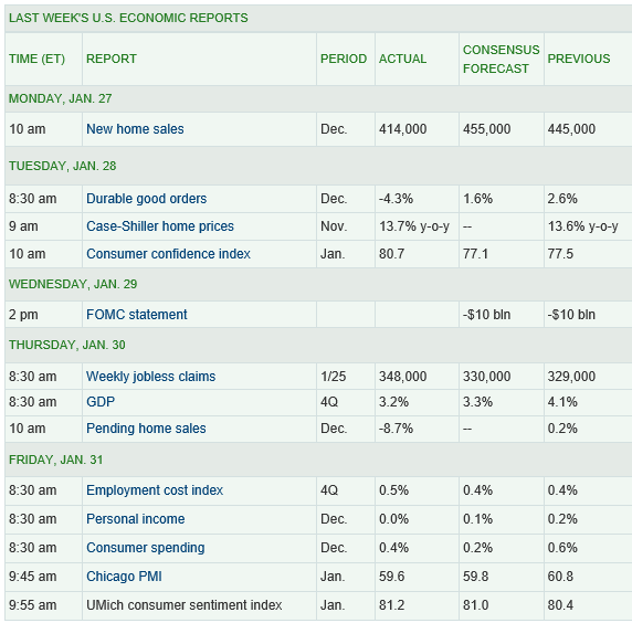
And I like the format of doing retrospectives on these consensus forecasts, in tables such as this:

MarketWatchTable

So what’s the bottom line here? Well, to me, digging deeper into the backgrounds of these top ranked forecasters, finding access to their current thinking is all part of improving competence.

I can think of no better mantra than Malcolm Gladwell’s 10,000 Hour Rule –

Didier Sornette – Celebrity Bubble Forecaster

Professor Didier Sornette, who holds the Chair in Entreprenuerial Risks at ETH Zurich, is an important thinker, and it is heartening to learn the American Association for the Advancement of Science (AAAS) is electing Professor Sornette a Fellow.

It is impossible to look at, say, the historical performance of the S&P 500 over the past several decades, without concluding that, at some point, the current surge in the market will collapse, as it has done previously when valuations ramped up so rapidly and so far.

S&P500recent

Sornette focuses on asset bubbles and has since 1998, even authoring a book in 2004 on the stock market.

At the same time, I think it is fair to say that he has been largely ignored by mainstream economics (although not finance), perhaps because his training is in physical science. Indeed, many of his publications are in physics journals – which is interesting, but justified because complex systems dynamics cross the boundaries of many subject areas and sciences.

Over the past year or so, I have perused dozens of Sornette papers, many from the extensive list at http://www.er.ethz.ch/publications/finance/bubbles_empirical.

This list is so long and, at times, technical, that videos are welcome.

Along these lines there is Sornette’s Ted talk (see below), and an MP4 file which offers an excellent, high level summary of years of research and findings. This MP4 video was recorded at a talk before the International Center for Mathematical Sciences at the University of Edinburgh.

Intermittent criticality in financial markets: high frequency trading to large-scale bubbles and crashes. You have to download the file to play it.

By way of précis, this presentation offers a high-level summary of the roots of his approach in the economics literature, and highlights the role of a central differential equation for price change in an asset market.

So since I know everyone reading this blog was looking forward to learning about a differential equation, today, let me highlight the importance of the equation,

dp/dt = cpd

This basically says that price change in a market over time depends on the level of prices – a feature of markets where speculative forces begin to hold sway.

This looks to be a fairly simple equation, but the solutions vary, depending on the values of the parameters c and d. For example, when c>0 and the exponent d  is greater than one, prices change faster than exponentially and within some finite period, a singularity is indicated by the solution to the equation. Technically, in the language of differential equations this is called a finite time singularity.

Well, the essence of Sornette’s predictive approach is to estimate the parameters of a price equation that derives, ultimately, from this differential equation in order to predict when an asset market will reach its peak price and then collapse rapidly to lower prices.

The many sources of positive feedback in asset pricing markets are the basis for the faster than exponential growth, resulting from d>1. Lots of empirical evidence backs up the plausibility and credibility of herd and imitative behaviors, and models trace out the interaction of prices with traders motivated by market fundamentals and momentum traders or trend followers.

Interesting new research on this topic shows that random trades could moderate the rush towards collapse in asset markets – possibly offering an alternative to standard regulation.

The important thing, in my opinion, is to discard notions of market efficiency which, even today among some researchers, result in scoffing at the concept of asset bubbles and basic sabotage of research that can help understand the associated dynamics.

Here is a TED talk by Sornette from last summer.

Top Forecasting Institutions and Researchers According to IDEAS!

Here is a real goldmine of research on forecasting.

IDEAS! is a RePEc service hosted by the Research Division of the Federal Reserve Bank of St. Louis.

This website compiles rankings on authors who have registered with the RePEc Author Service, institutions listed on EDIRC, bibliographic data collected by RePEc, citation analysis performed by CitEc and popularity data compiled by LogEc – under the category of forecasting.

Here is a list of the top fifteen of the top 10% institutions in the field of forecasting, according to IDEAS!. The institutions are scored based on a weighted sum of all authors affiliated with the respective institutions (click to enlarge).

top15ForecastingSchool

The Economics Department of the University of Wisconsin, the #1 institution, lists 36 researchers who claim affiliation and whose papers are listed under the category forecasting in IDEAS!.

The same IDEAS! Webpage also lists the top 10% authors in the field of forecasting. I extract the top 20 of this list here below. If you click through on an author, you can see their list of publications, many of which often are available as PDF downloads.

IDEASauthors20

This is a good place to start in updating your knowledge and understanding of current thinking and contextual issues relating to forecasting.

The Applied Perspective

For an applied forecasting perspective, there is Bloomberg with this fairly recent video on several top economic forecasters providing services to business and investors.

I believe Bloomberg will release extensive, updated lists of top forecasters by country, based on a two year perspective, in a few weeks.