Category Archives: time series forecasting

Leading Indicators

One value the forecasting community can provide is to report on the predictive power of various leading indicators for key economic and business series.

The Conference Board Leading Indicators

The Conference Board, a private, nonprofit organization with business membership, develops and publishes leading indicator indexes (LEI) for major national economies. Their involvement began in 1995, when they took over maintaining Business Cycle Indicators (BCI) from the US Department of Commerce.

For the United States, the index of leading indicators is based on ten variables: average weekly hours, manufacturing,  average weekly initial claims for unemployment insurance, manufacturers’ new orders, consumer goods and materials, vendor performance, slower deliveries diffusion index,manufacturers’ new orders, nondefense capital goods, building permits, new private housing units, stock prices, 500 common stocks, money supply, interest rate spread, and an index of consumer expectations.

The Conference Board, of course, also maintains coincident and lagging indicators of the business cycle.

This list has been imprinted on the financial and business media mind, and is a convenient go-to, when a commentator wants to talk about what’s coming in the markets. And it used to be that a rule of thumb that three consecutive declines in the Index of Leading Indicators over three months signals a coming recession. This rule over-predicts, however, and obviously, given the track record of economists for the past several decades, these Conference Board leading indicators have questionable predictive power.

Serena Ng Research

What does work then?

Obviously, there is lots of research on this question, but, for my money, among the most comprehensive and coherent is that of Serena Ng, writing at times with various co-authors.

SerenaNg

So in this regard, I recommend two recent papers

Boosting Recessions

Facts and Challenges from the Great Recession for Forecasting and Macroeconomic Modeling

The first paper is most recent, and is a talk presented before the Canadian Economic Association (State of the Art Lecture).

Hallmarks of a Serena Ng paper are coherent and often quite readable explanations of what you might call the Big Picture, coupled with ambitious and useful computation – usually reporting metrics of predictive accuracy.

Professor Ng and her co-researchers apparently have determined several important facts about predicting recessions and turning points in the business cycle.

For example –

  1. Since World War II, and in particular, over the period from the 1970’s to the present, there have been different kinds of recessions. Following Ng and Wright, ..business cycles of the 1970s and early 80s are widely believed to be due to supply shocks and/or monetary policy. The three recessions since 1985, on the other hand, originate from the financial sector with the Great Recession of 2008-2009 being a full-blown balance sheet recession. A balance sheet recession involves, a sharp increase in leverage leaves the economy vulnerable to small shocks because, once asset prices begin to fall, financial institutions, firms, and households all attempt to deleverage. But with all agents trying to increase savings simultaneously, the economy loses demand, further lowering asset prices and frustrating the attempt to repair balance sheets. Financial institutions seek to deleverage, lowering the supply of credit. Households and firms seek to deleverage, lowering the demand for credit.
  2. Examining a monthly panel of 132 macroeconomic and financial time series for the period 1960-2011, Ng and her co-researchers find that .. the predictor set with systematic and important predictive power consists of only 10 or so variables. It is reassuring that most variables in the list are already known to be useful, though some less obvious variables are also identified. The main finding is that there is substantial time variation in the size and composition of the relevant predictor set, and even the predictive power of term and risky spreads are recession specific. The full sample estimates and rolling regressions give confidence to the 5yr spread, the Aaa and CP spreads (relative to the Fed funds rate) as the best predictors of recessions.

So, the yield curve, a old favorite when it comes to forecasting recessions or turning points in the business cycle, performs less well in the contemporary context – although other (limited) research suggests that indicators combining facts about the yield curve with other metrics might be helpful.

And this exercise shows that the predictor set for various business cycles changes over time, although there are a few predictors that stand out. Again,

there are fewer than ten important predictors and the identity of these variables change with the forecast horizon. There is a distinct difference in the size and composition of the relevant predictor set before and after mid-1980. Rolling window estimation reveals that the importance of the term and default spreads are recession specific. The Aaa spread is the most robust predictor of recessions three and six months ahead, while the risky bond and 5yr spreads are important for twelve months ahead predictions. Certain employment variables have predictive power for the two most recent recessions when the interest rate spreads were uninformative. Warning signals for the post 1990 recessions have been sporadic and easy to miss.

Let me throw in my two bits here, before going on in subsequent posts to consider turning points in stock markets and in more micro-focused or industry time series.

At the end of “Boosting Recessions” Professor Ng suggests that higher frequency data may be a promising area for research in this field.

My guess is that is true, and that, more and more, Big Data and data analytics from machine learning will be applied to larger and more diverse sets of macroeconomics and business data, at various frequencies.

This is tough stuff, because more information is available today than in, say, the 1970’s or 1980’s. But I think we know what type of recession is coming – it is some type of bursting of the various global bubbles in stock markets, real estate, and possibly sovereign debt. So maybe more recent data will be highly relevant.

More on the Predictability of Stock and Bond Markets

Research by Lin, Wu, and Zhou in Predictability of Corporate Bond Returns: A Comprehensive Study suggests a radical change in perspective, based on new forecasting methods. The research seems to me to of a piece with a lot of developments in Big Data and the data mining movement generally. Gains in predictability are associated with more extensive databases and new techniques.

The abstract to their white paper, presented at various conferences and colloquia, is straight-forward –

Using a comprehensive data set, we find that corporate bond returns not only remain predictable by traditional predictors (dividend yields, default, term spreads and issuer quality) but also strongly predictable by a new predictor formed by an array of 26 macroeconomic, stock and bond predictors. Results strongly suggest that macroeconomic and stock market variables contain important information for expected corporate bond returns. The predictability of returns is of both statistical and economic significance, and is robust to different ratings and maturities.

Now, in a way, the basic message of the predictability of corporate bond returns is not news, since Fama and French made this claim back in 1989 – namely that default and term spreads can predict corporate bond returns both in and out of sample.

What is new is the data employed in the Lin, Wu, and Zhou (LWZ) research. According to the authors, it involves 780,985 monthly observations spanning from January 1973 to June 2012 from combined data sources, including Lehman Brothers Fixed Income (LBFI), Datastream, National Association of Insurance Commissioners (NAIC), Trade Reporting and Compliance Engine (TRACE) and Mergents Fixed Investment Securities Database (FISD).

There also is a new predictor which LWZ characterize as a type of partial least squares (PLS) formulation, but which is none other than the three pass regression filter discussed in a post here in March.

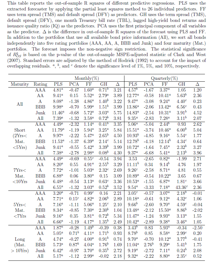
The power of this PLS formulation is evident in a table showing out-of-sample R2 of the various modeling setups. As in the research discussed in a recent post, out-of-sample (OS) R2 is a ratio which measures the improvement in mean square prediction errors (MSPE) for the predictive regression model over the historical average forecast. A negative OS R2 thus means that the MSPE of the benchmark forecast is less than the MSPE of the forecast by the designated predictor formulation.

PLSTableZhou

Again, this research finds predictability varies with economic conditions – and is higher during economic downturns.

There are cross-cutting and linked studies here, often with Goyal’s data and fourteen financial/macroeconomic variables figuring within the estimations. There also is significant linkage with researchers at regional Federal Reserve Banks.

My purpose in this and probably the next one or two posts is to just get this information out, so we can see the larger outlines of what is being done and suggested.

My guess is that the sum total of this research is going to essentially re-write financial economics and has huge implications for forecasting operations within large companies and especially financial institutions.

Stock Market Predictability – Controversy

In the previous post, I drew from papers by Neeley, who is Vice President of the Federal Reserve Bank of St. Louis, David Rapach at St. Louis University and Goufu Zhou at Washington University in St. Louis.

These authors contribute two papers on the predictability of equity returns.

The earlier one – Forecasting the Equity Risk Premium: The Role of Technical Indicators – is coming out in Management Science. Of course, the survey article – Forecasting the Equity Risk Premium: The Role of Technical Indicators – is a chapter in the recent volume 2 of the Handbook of Forecasting.

I go through this rather laborious set of citations because it turns out that there is an underlying paper which provides the data for the research of these authors, but which comes to precisely the opposite conclusion –

The goal of our own article is to comprehensively re-examine the empirical evidence as of early 2006, evaluating each variable using the same methods (mostly, but not only, in linear models), time-periods, and estimation frequencies. The evidence suggests that most models are unstable or even spurious. Most models are no longer significant even insample (IS), and the few models that still are usually fail simple regression diagnostics.Most models have performed poorly for over 30 years IS. For many models, any earlier apparent statistical significance was often based exclusively on years up to and especially on the years of the Oil Shock of 1973–1975. Most models have poor out-of-sample (OOS) performance, but not in a way that merely suggests lower power than IS tests. They predict poorly late in the sample, not early in the sample. (For many variables, we have difficulty finding robust statistical significance even when they are examined only during their most favorable contiguous OOS sub-period.) Finally, the OOS performance is not only a useful model diagnostic for the IS regressions but also interesting in itself for an investor who had sought to use these models for market-timing. Our evidence suggests that the models would not have helped such an investor. Therefore, although it is possible to search for, to occasionally stumble upon, and then to defend some seemingly statistically significant models, we interpret our results to suggest that a healthy skepticism is appropriate when it comes to predicting the equity premium, at least as of early 2006. The models do not seem robust.

This is from Ivo Welch and Amit Goyal’s 2008 article A Comprehensive Look at The Empirical Performance of Equity Premium Prediction in the Review of Financial Studies which apparently won an award from that journal as the best paper for the year.

And, very importantly, the data for this whole discussion is available, with updates, from Amit Goyal’s site now at the University of Lausanne.

AmitGoyal

Where This Is Going

Currently, for me, this seems like a genuine controversy in the forecasting literature. And, as an aside, in writing this blog I’ve entertained the notion that maybe I am on the edge of a new form of or focus in journalism – namely stories about forecasting controversies. It’s kind of wonkish, but the issues can be really, really important.

I also have a “hands-on” philosophy, when it comes to this sort of information. I much rather explore actual data and run my own estimates, than pick through theoretical arguments.

So anyway, given that Goyal generously provides updated versions of the data series he and Welch originally used in their Review of Financial Studies article, there should be some opportunity to check this whole matter. After all, the estimation issues are not very difficult, insofar as the first level of argument relates primarily to the efficacy of simple bivariate regressions.

By the way, it’s really cool data.

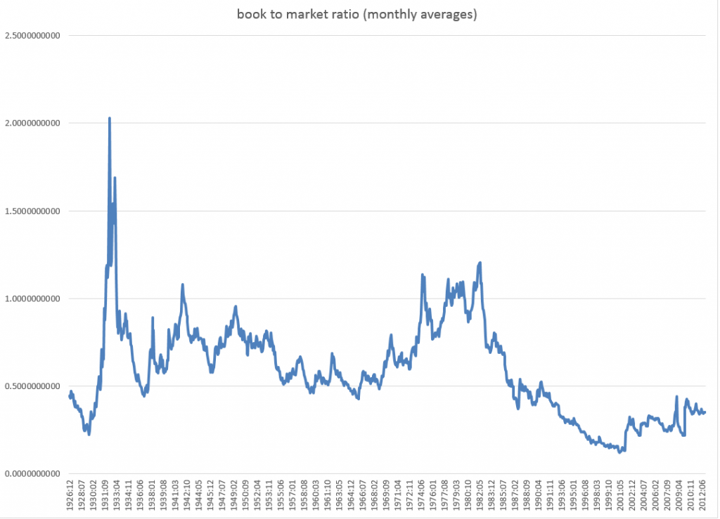
Here is the book-to-market ratio, dating back to 1926.

bmratio

But beyond these simple regressions that form a large part of the argument, there is another claim made by Neeley, Rapach, and Zhou which I take very seriously. And this is that – while a “kitchen sink” model with all, say, fourteen so-called macroeconomic variables does not outperform the benchmark, a principal components regression does.

This sounds really plausible.

Anyway, if readers have flagged updates to this controversy about the predictability of stock market returns, let me know. In addition to grubbing around with the data, I am searching for additional analysis of this point.

More on Automatic Forecasting Packages – Autobox Gold Price Forecasts

Yesterday, my post discussed the statistical programming language R and Rob Hyndman’s automatic forecasting package, written in R – facts about this program, how to download it, and an application to gold prices.

In passing, I said I liked Hyndman’s disclosure of his methods in his R package and “contrasted” that with leading competitors in the automatic forecasting market space –notably Forecast Pro and Autobox.

This roused Tom Reilly, currently Senior Vice-President and CEO of Automatic Forecast Systems – the company behind Autobox.

62_tom

Reilly, shown above, wrote  –

You say that Autobox doesn’t disclose its methods.  I think that this statement is unfair to Autobox.  SAS tried this (Mike Gilliland) on the cover of his book showing something purporting to a black box.  We are a white box.  I just downloaded the GOLD prices and recreated the problem and ran it. If you open details.htm it walks you through all the steps of the modeling process.  Take a look and let me know your thoughts.  Much appreciated!

AutoBox Gold Price Forecast

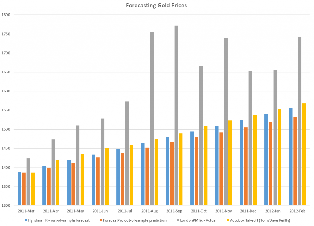
First, disregarding the issue of transparency for a moment, let’s look at a comparison of forecasts for this monthly gold price series (London PM fix).

A picture tells the story (click to enlarge).

ABFPHcomp

So, for this data, 2007 to early 2011, Autobox dominates. That is, all forecasts are less than the respective actual monthly average gold prices. Thus, being linear, if one forecast method is more inaccurate than another for one month, that method is less accurate than the forecasts generated by this other approach for the entire forecast horizon.

I guess this does not surprise me. Autobox has been a serious contender in the M-competitions, for example, usually running just behind or perhaps just ahead of Forecast Pro, depending on the accuracy metric and forecast horizon. (For a history of these “accuracy contests” see Markridakis and Hibon’s article on M3).

And, of course, this is just one of many possible forecasts that can be developed with this time series, taking off from various ending points in the historic record.

The Issue of Transparency

In connection with all this, I also talked with Dave Reilly, a founding principal of Autobox, shown below.

DaveReilly

Among other things, we went over the “printout” Tom Reilly sent, which details the steps in the estimation of a final time series model to predict these gold prices.

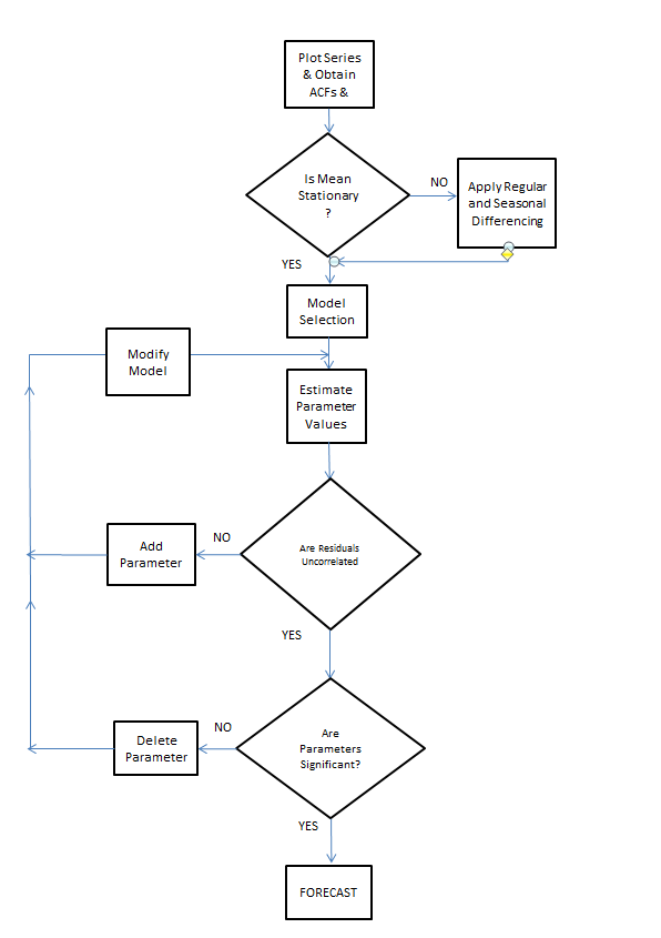
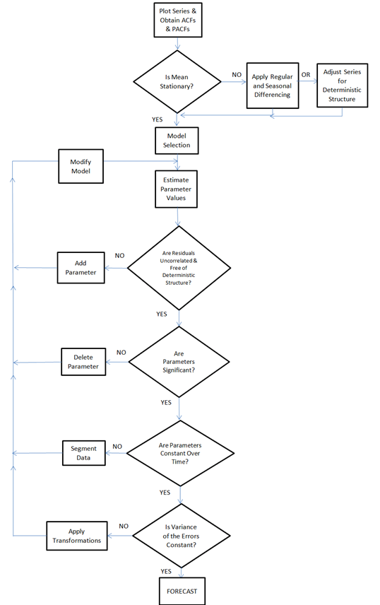
A blog post on the Autobox site is especially pertinent, called Build or Make your own ARIMA forecasting model? This discussion contains two flow charts which describe the process of building a time series model, I reproduce here, by kind permission.

The first provides a plain vanilla description of Box-Jenkins modeling.

Rflowchart1

The second flowchart adds steps revised for additions by Tsay, Tiao, Bell, Reilly & Gregory Chow (ie chow test).

Rflowchart2

Both start with plotting the time series to be analyzed and calculating the autocorrelation and partial autocorrelation functions.

But then additional boxes are added for accounting for and removing “deterministic” elements in the time series and checking for the constancy of parameters over the sample.

The analysis run Tom Reilly sent suggests to me that “deterministic” elements can mean outliers.

Dave Reilly made an interesting point about outliers. He suggested that the true autocorrelation structure can be masked or dampened in the presence of outliers. So the tactic of specifying an intervention variable in the various trial models can facilitate identification of autoregressive lags which otherwise might appear to be statistically not significant.

Really, the point of Autobox model development is to “create an error process free of structure.” That a Dave Reilly quote.

So, bottom line, Autobox’s general methods are well-documented. There is no problem of transparency with respect to the steps in the recommended analysis in the program. True, behind the scenes, comparisons are being made and alternatives are being rejected which do not make it to the printout of results. But you can argue that any commercial software has to keep some kernel of its processes proprietary.

I expect to be writing more about Autobox. It has a good track record in various forecasting competitions and currently has a management team that actively solicits forecasting challenges.

Forecasting Housing Markets – 2

I am interested in business forecasting “stories.” For example, the glitch in Google’s flu forecasting program.

In real estate forecasting, the obvious thing is whether quantitative forecasting models can (or, better yet, did) forecast the collapse in housing prices and starts in the recent 2008-2010 recession (see graphics from the previous post).

There are several ways of going at this.

Who Saw The Housing Bubble Coming?

One is to look back to see whether anyone saw the bursting of the housing bubble coming and what forecasting models they were consulting.

That’s entertaining. Some people, like Ron Paul, and Nouriel Roubini, were prescient.

Roubini earned the soubriquet Dr. Doom for an early prediction of housing market collapse, as reported by the New York Times:

On Sept. 7, 2006, Nouriel Roubini, an economics professor at New York University, stood before an audience of economists at the International Monetary Fund and announced that a crisis was brewing. In the coming months and years, he warned, the United States was likely to face a once-in-a-lifetime housing bust, an oil shock, sharply declining consumer confidence and, ultimately, a deep recession. He laid out a bleak sequence of events: homeowners defaulting on mortgages, trillions of dollars of mortgage-backed securities unraveling worldwide and the global financial system shuddering to a halt. These developments, he went on, could cripple or destroy hedge funds, investment banks and other major financial institutions like Fannie Mae and Freddie Mac.

NR

Roubini was spot-on, of course, even though, at the time, jokes circulated such as “even a broken clock is right twice a day.” And my guess is his forecasting model, so to speak, is presented in Crisis Economics: A Crash Course in the Future of Finance, his 2010 book with Stephen Mihm. It is less a model than whole database of tendencies, institutional facts, areas in which Roubini correctly identifies moral hazard.

I think Ron Paul, whose projections of collapse came earlier (2003), was operating from some type of libertarian economic model.  So Paul testified before House Financial Services Committee on Fannie Mae and Freddy Mac, that –

Ironically, by transferring the risk of a widespread mortgage default, the government increases the likelihood of a painful crash in the housing market,” Paul predicted. “This is because the special privileges granted to Fannie and Freddie have distorted the housing market by allowing them to attract capital they could not attract under pure market conditions. As a result, capital is diverted from its most productive use into housing. This reduces the efficacy of the entire market and thus reduces the standard of living of all Americans.

On the other hand, there is Ben Bernanke, who in a CNBC interview in 2005 said:

7/1/05 – Interview on CNBC 

INTERVIEWER: Ben, there’s been a lot of talk about a housing bubble, particularly, you know [inaudible] from all sorts of places. Can you give us your view as to whether or not there is a housing bubble out there?

BERNANKE: Well, unquestionably, housing prices are up quite a bit; I think it’s important to note that fundamentals are also very strong. We’ve got a growing economy, jobs, incomes. We’ve got very low mortgage rates. We’ve got demographics supporting housing growth. We’ve got restricted supply in some places. So it’s certainly understandable that prices would go up some. I don’t know whether prices are exactly where they should be, but I think it’s fair to say that much of what’s happened is supported by the strength of the economy.

Bernanke was backed by one of the most far-reaching economic data collection and analysis operations in the United States, since he was in 2005 a member of the Board of Governors of the Federal Reserve System and Chairman of the President’s Council of Economic Advisors.

So that’s kind of how it is. Outsiders, like Roubini and perhaps Paul, make the correct call, but highly respected and well-placed insiders like Bernanke simply cannot interpret the data at their fingertips to suggest that a massive bubble was underway.

I think it is interesting currently that Roubini, in March, promoted the idea that Yellen Is Creating another huge Bubble in the Economy

But What Are the Quantitative Models For Forecasting the Housing Market?

In a long article in the New York Times in 2009, How Did Economists Get It So Wrong?, Paul Krugman lays the problem at the feet of the efficient market hypothesis –

When it comes to the all-too-human problem of recessions and depressions, economists need to abandon the neat but wrong solution of assuming that everyone is rational and markets work perfectly.

Along these lines, it is interesting that the Zillow home value forecast methodology builds on research which, in one set of models, assumes serial correlation and mean reversion to a long-term price trend.

Zillow

Key research in housing market dynamics includes Case and Shiller (1989) and Capozza et al (2004), who show that the housing market is not efficient and house prices exhibit strong serial correlation and mean reversion, where large market swings are usually followed by reversals to the unobserved fundamental price levels.

Based on the estimated model parameters, Capozza et al are able to reveal the housing market characteristics where serial correlation, mean reversion, and oscillatory, convergent, or divergent trends can be derived from the model parameters.

Here is an abstract from critical research underlying this approach done in 2004.

An Anatomy of Price Dynamics in Illiquid Markets: Analysis and Evidence from Local Housing Markets

This research analyzes the dynamic properties of the difference equation that arises when markets exhibit serial correlation and mean reversion. We identify the correlation and reversion parameters for which prices will overshoot equilibrium (“cycles”) and/or diverge permanently from equilibrium. We then estimate the serial correlation and mean reversion coefficients from a large panel data set of 62 metro areas from 1979 to 1995 conditional on a set of economic variables that proxy for information costs, supply costs and expectations. Serial correlation is higher in metro areas with higher real incomes, population growth and real construction costs. Mean reversion is greater in large metro areas and faster growing cities with lower construction costs. The average fitted values for mean reversion and serial correlation lie in the convergent oscillatory region, but specific observations fall in both the damped and oscillatory regions and in both the convergent and divergent regions. Thus, the dynamic properties of housing markets are specific to the given time and location being considered.

The article is not available for free download so far as I can determine. But it is based on earler research, dating back to the later 1990’s in the pdf The Dynamic Structure of Housing Markets.

The more recent Housing Market Dynamics: Evidence of Mean Reversion and Downward Rigidity by Fannie Mae researchers, lists a lot of relevant research on the serial correlation of housing prices, which is usually locality-dependent.

In fact, the Zillow forecasts are based on ensemble methods, combining univariate and multivariate models – a sign of modernity in the era of Big Data.

So far, though, I have not found a truly retrospective study of the housing market collapse, based on quantitative models. Perhaps that is because only the Roubini approach works with such complex global market phenomena.

We are left, thus, with solid theoretical foundations, validated by multiple housing databases over different time periods, that suggests that people invest in housing based on momentum factors – and that this fairly obvious observation can be shown statistically, too.

Interest Rates – 1

Let’s focus on forecasting interest rates.

The first question, of course, is “which interest rate”?

So, there is a range of interest rates from short term rates to rates on longer term loans and bonds. The St. Louis Fed data service FRED lists 719 series under “interest rates.”

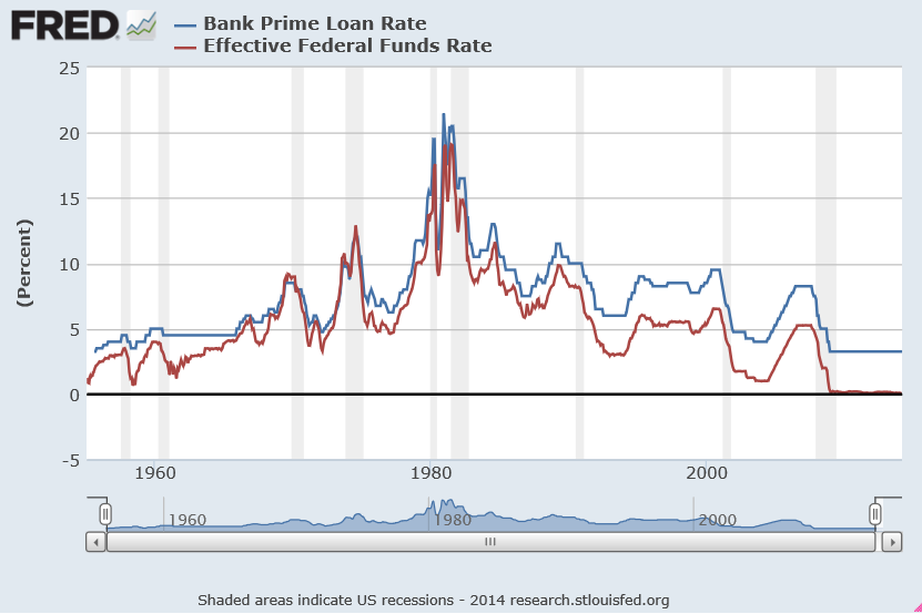
Interest rates, however, tend to move together over time, as this chart on the bank prime rate of interest and the federal funds rate shows.

IratesFRED1

There’s a lot in this chart.

There is the surge in interest rates at the beginning of the 1980’s. The prime rate rocketed to more than 20 percent, or, in the words of the German Chancellor at the time higher “than any year since the time of Jesus Christ.” This ramp-up in interest rates followed actions of the US Federal Reserve Bank under Paul Volcker – extreme and successful tactics to break the back of inflation running at a faster and faster pace in the 1970’s.

Recessions are indicated on this graph with shaded areas.

Also, almost every recession in this more than fifty year period is preceded by a spike in the federal funds rate – the rate under the control of or targeted by the central bank.

Another feature of this chart is the federal funds rate is almost always less than the prime rate, often by several percentages.

This makes sense because the federal funds rate is a very short term interest rate – on overnight loans by depository institutions in surplus at the Federal Reserve to banks in deficit at the end of the business day – surplus and deficit with respect to the reserve requirement.

The interest rate the borrowing bank pays the lending bank is negotiated, and the weighted average across all such transactions is the federal funds effective rate. This “effective rate” is subject to targets set by the Federal Reserve Open Market Committee. Fed open market operations influence the supply of money to bring the federal funds effective rate in line with the federal funds target rate.

The prime rate, on the other hand, is the underlying index for most credit cards, home equity loans and lines of credit, auto loans, and personal loans. Many small business loans are also indexed to the prime rate. The term of these loans is typically longer than “overnight,” i.e. the prime rate applies to longer term loans.

The Yield Curve

The relationship between interest rates on shorter term and longer term loans and bonds is a kind of predictive relationship. It is summarized in the yield curve.

The US Treasury maintains a page Daily Treasury Yield Curve Rates which documents the yield on a security to its time to maturity .. based on the closing market bid yields on actively traded Treasury securities in the over-the-counter market.

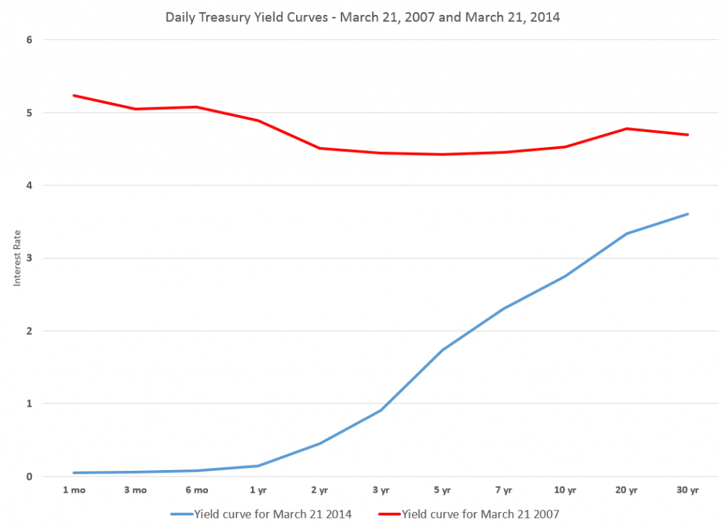
The current yield curve is shown by the blue line in the chart below, and can be contrasted with a yield curve seven years previously, prior to the financial crisis of 2008-09 shown by the red line.

YieldCurve

Treasury notes on this curve report that –

These market yields are calculated from composites of quotations obtained by the Federal Reserve Bank of New York. The yield values are read from the yield curve at fixed maturities, currently 1, 3 and 6 months and 1, 2, 3, 5, 7, 10, 20, and 30 years. This method provides a yield for a 10 year maturity, for example, even if no outstanding security has exactly 10 years remaining to maturity.

Short term yields are typically less than longer term yields because there is an opportunity cost in tying up money for longer periods.

However, on occasion, there is an inversion of the yield curve, as shown for March 21, 2007 in the chart.

Inversion of the yield curve is often a sign of oncoming recession – although even the Fed authorities, who had some hand in causing the increase in the short term rates at the time, appeared clueless about what was coming in Spring 2007.

Current Prospects for Interest Rates

Globally, we have experienced an extraordinary period of low interest rates with short term rates hovering just at the zero bound. Clearly, this cannot go on forever, so the longer term outlook is for interest rates of all sorts to rise.

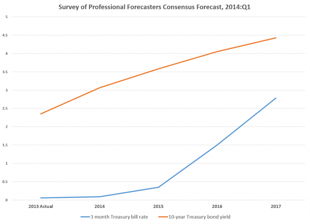
The Survey of Professional Forecasters develops consensus forecasts of key macroeconomic indicators, such as interest rates.

The latest survey, from the first quarter of 2014, includes the following consensus projections for the 3-month Treasury bill and the 10-year Treasury bond rates.

SPFforecast

Bankrate.com has short articles predicting mortgage rates, car loans, credit card rates, and bonds over the next year or two. Mortgage rates might rise to 5 percent by the end of 2014, but that is predicated on a strong recovery in the economy, according to this site.

As anyone participating in modern civilization knows, a great deal depends on the actions of the US Federal Reserve bank. Currently, the Fed influences both short and longer term interest rates. Short term rates are keyed closely to the federal funds rate. Longer term rates are influenced by Fed Quantitative Easing (QE) programs of bond-buying. The Fed’s bond buying is scheduled to be cut back step-by-step (“tapering”) about $10 billion per month.

Actions of the Bank of Japan and the European central bank in Frankfurt also bear on global prospects and impacts of higher interest rates.

Interest rates, however, are not wholly controlled by central banks. Capital markets have a dynamic all their own, which makes forecasting interest rates an increasingly relevant topic.

Forecasting the Price of Gold – 2

Searching “forecasting gold prices” on Google lands on a number of ARIMA (autoregressive integrated moving average) models of gold prices. Ideally, researchers focus on shorter term forecast horizons with this type of time series model.

I take a look at this approach here, moving onto multivariate approaches in subsequent posts.

Stylized Facts

These ARIMA models support stylized facts about gold prices such as: (1) gold prices constitute a nonstationary time series, (2) first differencing can reduce gold price time series to a stationary process, and, usually, (3) gold prices are random walks.

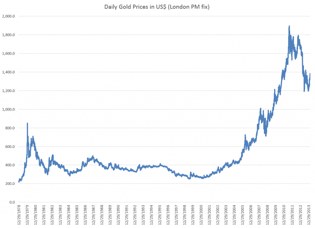
For example, consider daily gold prices from 1978 to the present.

DailyGold

This chart, based World Gold Council data and the London PM fix, shows gold prices do not fluctuate about a fixed level, but can move in patterns with a marked trend over several years.

The trick is to reduce such series to a mean stationary series through appropriate differencing and, perhaps, other data transformations, such as detrending and taking out seasonal variation. Guidance in this is provided by tools such as the autocorrelation function (ACF) and partial autocorrelation function (PACF) of the time series, as well as tests for unit roots.

Some Terminology

I want to talk about specific ARIMA models, such as ARIMA(0,1,1) or ARIMA(p,d,q), so it might be a good idea to review what this means.

Quickly, ARIMA models are described by three parameters: (1) the autoregressive parameter p, (2) the number of times d the time series needs to be differenced to reduce it to a mean stationary series, and (3) the moving average parameter q.

ARIMA(0,1,1) indicates a model where the original time series yt is differenced once (d=1), and which has one lagged moving average term.

If the original time series is yt, t=1,2,..n, the first differenced series is zt=yt-yt-1, and an ARIMA(0,1,1) model looks like,

zt = θ1εt-1

or converting back into the original series yt,

yt = μ + yt-1 + θ1εt-1

This is a random walk process with a drift term μ, incidentally.

As a note in the general case, the p and q parameters describe the span of the lags and moving average terms in the model.  This is often done with backshift operators Lk (click to enlarge)  

LagOperator

So you could have a sum of these backshift operators of different orders operating against yt or zt to generate a series of lags of order p. Similarly a sum of backshift operators of order q can operate against the error terms at various times. This supposedly provides a compact way of representing the general model with p lags and q moving average terms.

Similar terminology can indicate the nature of seasonality, when that is operative in a time series.

These parameters are determined by considering the autocorrelation function ACF and partial autocorrelation function PACF, as well as tests for unit roots.

I’ve seen this referred to as “reading the tea leaves.”

Gold Price ARIMA models

I’ve looked over several papers on ARIMA models for gold prices, and conducted my own analysis.

My research confirms that the ACF and PACF indicates gold prices (of course, always defined as from some data source and for some trading frequency) are, in fact, random walks.

So this means that we can take, for example, the recent research of Dr. M. Massarrat Ali Khan of College of Computer Science and Information System, Institute of Business Management, Korangi Creek, Karachi as representative in developing an ARIMA model to forecast gold prices.

Dr. Massarrat’s analysis uses daily London PM fix data from January 02, 2003 to March 1, 2012, concluding that an ARIMA(0,1,1) has the best forecasting performance. This research also applies unit root tests to verify that the daily gold price series is stationary, after first differencing. Significantly, an ARIMA(1,1,0) model produced roughly similar, but somewhat inferior forecasts.

I think some of the other attempts at ARIMA analysis of gold price time series illustrate various modeling problems.

For example there is the classic over-reach of research by Australian researchers in An overview of global gold market and gold price forecasting. These academics identify the nonstationarity of gold prices, but attempt a ten year forecast, based on a modeling approach that incorporates jumps as well as standard ARIMA structure.

A new model proposed a trend stationary process to solve the nonstationary problems in previous models. The advantage of this model is that it includes the jump and dip components into the model as parameters. The behaviour of historical commodities prices includes three differ- ent components: long-term reversion, diffusion and jump/dip diffusion. The proposed model was validated with historical gold prices. The model was then applied to forecast the gold price for the next 10 years. The results indicated that, assuming the current price jump initiated in 2007 behaves in the same manner as that experienced in 1978, the gold price would stay abnormally high up to the end of 2014. After that, the price would revert to the long-term trend until 2018.

As the introductory graph shows, this forecast issued in 2009 or 2010 was massively wrong, since gold prices slumped significantly after about 2012.

So much for long-term forecasts based on univariate time series.

Summing Up

I have not referenced many ARIMA forecasting papers relating to gold price I have seen, but focused on a couple – one which “gets it right” and another which makes a heroically wrong but interesting ten year forecast.

Gold prices appear to be random walks in many frequencies – daily, monthly average, and so forth.

Attempts at superimposing long term trends or even jump patterns seem destined to failure.

However, multivariate modeling approaches, when carefully implemented, may offer some hope of disentangling longer term trends and changes in volatility. I’m working on that post now.

Granger Causality

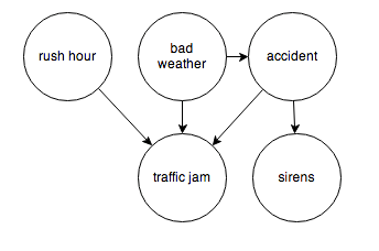
After review, I have come to the conclusion that from a predictive and operational standpoint, causal explanations translate to directed graphs, such as the following:

causegraph

And I think it is interesting the machine learning community focuses on causal explanations for “manipulation” to guide reactive and interactive machines, and that directed graphs (or perhaps a Bayesian networks) are a paramount concept.

Keep that thought, and consider “Granger causality.”

This time series concept is well explicated in C.W.J. Grangers’ 2003 Nobel Prize lecture – which motivates its discovery and links with cointegration.

An earlier concept that I was concerned with was that of causality. As a postdoctoral student in Princeton in 1959–1960, working with Professors John Tukey and Oskar Morgenstern, I was involved with studying something called the “cross-spectrum,” which I will not attempt to explain. Essentially one has a pair of inter-related time series and one would like to know if there are a pair of simple relations, first from the variable X explaining Y and then from the variable Y explaining X. I was having difficulty seeing how to approach this question when I met Dennis Gabor who later won the Nobel Prize in Physics in 1971. He told me to read a paper by the eminent mathematician Norbert Wiener which contained a definition that I might want to consider. It was essentially this definition, somewhat refined and rounded out, that I discussed, together with proposed tests in the mid 1960’s.

The statement about causality has just two components: 1. The cause occurs before the effect; and 2. The cause contains information about the effect that that is unique, and is in no other variable.

A consequence of these statements is that the causal variable can help forecast the effect variable after other data has first been used. Unfortunately, many users concentrated on this forecasting implication rather than on the original definition. At that time, I had little idea that so many people had very fixed ideas about causation, but they did agree that my definition was not “true causation” in their eyes, it was only “Granger causation.” I would ask for a definition of true causation, but no one would reply. However, my definition was pragmatic and any applied researcher with two or more time series could apply it, so I got plenty of citations. Of course, many ridiculous papers appeared.

When the idea of cointegration was developed, over a decade later, it became clear immediately that if a pair of series was cointegrated then at least one of them must cause the other. There seems to be no special reason why there two quite different concepts should be related; it is just the way that the mathematics turned out

In the two-variable case, suppose we have time series Y={y1,y2,…,yt} and X = {x1,..,xt}. Then, there are, at the outset, two cases, depending on whether Y and X are stationary or nonstationary. The classic case is where we have an autoregressive relationship for yt,

yt = a0+a1yt-1+..+akyt-k

and this relationship can be shown to be a weaker predictor than


yt = a0+a1yt-1+..+akyt-k + b0+b1xt-1+..+bmxt-m

In this case, we say that X exhibits Granger causality with respect to Y.

Of course, if Y and X are nonstationary time series, autoregressive predictive equations make no sense, and instead we have the case of cointegration of time series, where in the two-variable case,

yt=φxt-1+ut

and the series of residuals ut are reduced to a white noise process.

So these cases follow what good old Wikipedia says,

A time series X is said to Granger-cause Y if it can be shown, usually through a series of t-tests and F-tests on lagged values of X (and with lagged values of Y also included), that those X values provide statistically significant information about future values of Y.

There are a number of really interesting extensions of this linear case, discussed in a recent survey paper.

Stern points out that the main enemies or barriers to establishing causal relations are endogeneity and omitted variables.

So I find that margin loans and the level of the S&P 500 appear to be mutually interrelated. Thus, it is forecasts of the S&P 500 can be improved with lagged values of margin loans, and you can improve forecasts of the monthly total of margin loans with lagged values of the S&P 500 – at least over broad ranges of time and in the period since 2008. The predictions of the S&P 500 with lagged values of margin loans, however, are marginally more powerful or accurate predictions.

Stern gives a colorful example where an explanatory variable is clearly exogenous and appears to have a significant effect on the dependent variable and yet theory suggests that the relationship is spurious and due to omitted variables that happen to be correlated with the explanatory variable in question.

Westling (2011) regresses national economic growth rates on average reported penis lengths and other variables and finds that there is an inverted U shape relationship between economic growth and penis length from 1960 to 1985. The growth maximizing length was 13.5cm, whereas the global average was 14.5cm. Penis length would seem to be exogenous but the nature of this relationship would have changed over time as the fastest growing region has changed from Europe and its Western Offshoots to Asia. So, it seems that the result is likely due to omitted variables bias.

Here Stern notes that Westling’s data indicates penis length is lowest in Asia and greatest in Africa with Europe and its Western Offshoots having intermediate lengths.

There’s a paper which shows stock prices exhibit Granger causality with respect to economic growth in the US, but vice versa does not obtain. This is a good illustration of the careful ste-by-step in conducting this type of analysis, and how it is in fact fraught with issues of getting the number of lags exactly right and avoiding big specification problems.

Just at the moment when it looks as if the applications of Granger causality are petering out in economics, neuroscience rides to the rescue. I offer you a recent article from a journal in computation biology in this regard – Measuring Granger Causality between Cortical Regions from Voxelwise fMRI BOLD Signals with LASSO.

Here’s the Abstract:

Functional brain network studies using the Blood Oxygen-Level Dependent (BOLD) signal from functional Magnetic Resonance Imaging (fMRI) are becoming increasingly prevalent in research on the neural basis of human cognition. An important problem in functional brain network analysis is to understand directed functional interactions between brain regions during cognitive performance. This problem has important implications for understanding top-down influences from frontal and parietal control regions to visual occipital cortex in visuospatial attention, the goal motivating the present study. A common approach to measuring directed functional interactions between two brain regions is to first create nodal signals by averaging the BOLD signals of all the voxels in each region, and to then measure directed functional interactions between the nodal signals. Another approach, that avoids averaging, is to measure directed functional interactions between all pairwise combinations of voxels in the two regions. Here we employ an alternative approach that avoids the drawbacks of both averaging and pairwise voxel measures. In this approach, we first use the Least Absolute Shrinkage Selection Operator (LASSO) to pre-select voxels for analysis, then compute a Multivariate Vector AutoRegressive (MVAR) model from the time series of the selected voxels, and finally compute summary Granger Causality (GC) statistics from the model to represent directed interregional interactions. We demonstrate the effectiveness of this approach on both simulated and empirical fMRI data. We also show that averaging regional BOLD activity to create a nodal signal may lead to biased GC estimation of directed interregional interactions. The approach presented here makes it feasible to compute GC between brain regions without the need for averaging. Our results suggest that in the analysis of functional brain networks, careful consideration must be given to the way that network nodes and edges are defined because those definitions may have important implications for the validity of the analysis.

So Granger causality is still a vital concept, despite its probably diminishing use in econometrics per se.

Let me close with this thought and promise a future post on the Kaggle and machine learning competitions on identifying the direction of causality in pairs of variables without context.

Correlation does not imply causality—you’ve heard it a thousand times. But causality does imply correlation.

Boosting Time Series

If you learned your statistical technique more than ten years ago, consider it necessary to learn a whole bunch of new methods. Boosting is certainly one of these.

Let me pick a leading edge of this literature here – boosting time series predictions.

Results

Let’s go directly to the performance improvements.

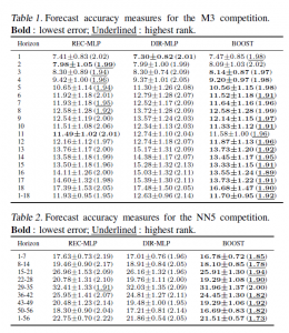
In Boosting multi-step autoregressive forecasts, (Souhaib Ben Taieb and Rob J Hyndman, International Conference on Machine Learning (ICML) 2014) we find the following Table applying boosted time series forecasts to two forecasting competition datasets –

HyndmanTable1

The three columns refer to three methods for generating forecasts over horizons of 1-18 periods (M3 Competition and 1-56 period (Neural Network Competition). The column labeled BOOST is, as its name suggests, the error metric for a boosted time series prediction. Either by the lowest symmetric mean absolute percentage error or a rank criterion, BOOST usually outperforms forecasts produced recursively from an autoregressive (AR) model, or forecasts from an AR model directly mapped onto the different forecast horizons.

There were a lot of empirical time series involved in these two datasets –

The M3 competition dataset consists of 3003 monthly, quarterly, and annual time series. The time series of the M3 competition have a variety of features. Some have a seasonal component, some possess a trend, and some are just fluctuating around some level. The length of the time series ranges between 14 and 126. We have considered time series with a range of lengths between T = 117 and T = 126. So, the number of considered time series turns out to be M = 339. For these time series, the competition required forecasts for the next H = 18 months, using the given historical data. The NN5 competition dataset comprises M = 111 time series representing roughly two years of daily cash withdrawals (T = 735 observations) at ATM machines at one of the various cities in the UK. For each time series, the  competition required to forecast the values of the next H = 56 days (8 weeks), using the given historical data.

This research, notice of which can be downloaded from Rob Hyndman’s site, builds on the methodology of Ben Taieb and Hyndman’s recent paper in the International Journal of Forecasting A gradient boosting approach to the Kaggle load forecasting competition. Ben Taieb and Hyndman’s submission came in 5th out of 105 participating teams in this Kaggle electric load forecasting competition, and used boosting algorithms.

Let me mention a third application of boosting to time series, this one from Germany. So we have Robinzonov, Tutz, and Hothorn’s Boosting Techniques for Nonlinear Time Series Models (Technical Report Number 075, 2010 Department of Statistics University of Munich) which focuses on several synthetic time series and predictions of German industrial production.

Again, boosted time series models comes out well in comparisons.

GErmanIndustrialProd

GLMBoost or GAMBoost are quite competitive at these three forecast horizons for German industrial production.

What is Boosting?

My presentation here is a little “black box” in exposition, because boosting is, indeed, mathematically intricate, although it can be explained fairly easily at a very general level.

Weak predictors and weak learners play an important role in bagging and boosting –techniques which are only now making their way into forecasting and business analytics, although the machine learning community has been discussing them for more than two decades.

Machine learning must be a fascinating field. For example, analysts can formulate really general problems –

In an early paper, Kearns and Valiant proposed the notion of a weak learning algorithm which need only achieve some error rate bounded away from 1/2 and posed the question of whether weak and strong learning are equivalent for efficient (polynomial time) learning algorithms.

So we get the “definition” of boosting in general terms:

Boosting algorithms are procedures that “boost” low-accuracy weak learning algorithms to achieve arbitrarily high accuracy.

And a weak learner is a learning method that achieves only slightly better than chance correct classification of binary outcomes or labeling.

This sounds like the best thing since sliced bread.

But there’s more.

For example, boosting can be understood as a functional gradient descent algorithm.

Now I need to mention that some of the most spectacular achievements in boosting come in classification. A key text is the recent book Boosting: Foundations and Algorithms (Adaptive Computation and Machine Learning series) by Robert E. Schapire and Yoav Freund. This is a very readable book focusing on AdaBoost, one of the early methods and its extensions. The book can be read on Kindle and is starts out –

boostingquote

So worth the twenty bucks or so for the download.

The papers discussed above vis a vis boosting time series apply p-splines in an effort to estimate nonlinear effects in time series. This is really unfamiliar to most of us in the conventional econometrics and forecasting communities, so we have to start conceptualizing stuff like “knots” and component-wise fitting algortihms.

Fortunately, there is a canned package for doing a lot of the grunt work in R, called mboost.

Bottom line, I really don’t think time series analysis will ever be the same.