Tag Archives: predictive analytics

Global Energy Forecasting Competitions

The 2012 Global Energy Forecasting Competition was organized by an IEEE Working Group to connect academic research and industry practice, promote analytics in engineering education, and prepare for forecasting challenges in the smart grid world. Participation was enhanced by alliance with Kaggle for the load forecasting track. There also was a second track for wind power forecasting.

Hundreds of people and many teams participated.

This year’s April/June issue of the International Journal of Forecasting (IJF) features research from the winners.

Before discussing the 2012 results, note that there’s going to be another competition – the Global Energy Forecasting Competition 2014 – scheduled for launch August 15 of this year. Professor Tao Hong, a key organizer, describes the expansion of scope,

GEFCom2014 (www.gefcom.org) will feature three major upgrades: 1) probabilistic forecasts in the form of predicted quantiles; 2) four tracks on demand, price, wind and solar; 3) rolling forecasts with incremental data update on weekly basis.

Results of the 2012 Competition

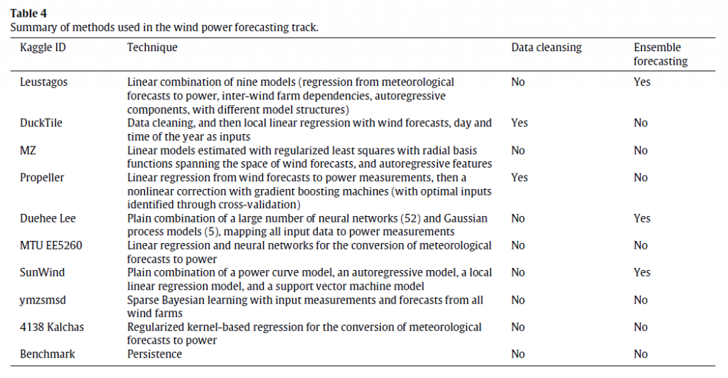
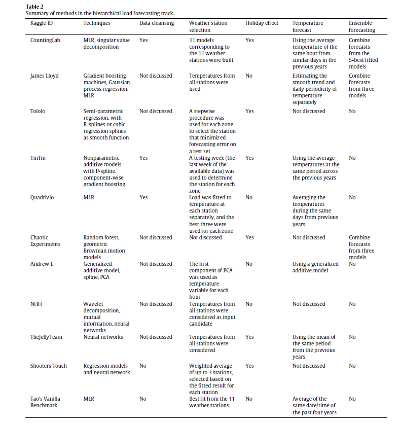
The IJF has an open source article on the competition. This features a couple of interesting tables about the methods in the load and wind power tracks (click to enlarge).

hload

The error metric is WRMSE, standing for weighted root mean square error. One week ahead system (as opposed to zone) forecasts received the greatest weight. The top teams with respect to WRMSE were Quadrivio, CountingLab, James Lloyd, and Tololo (Électricité de France).

wind

The top wind power forecasting teams were Leustagos, DuckTile, and MZ based on overall performance.

Innovations in Electric Power Load Forecasting

The IJF overview article pitches the hierarchical load forecasting problem as follows:

participants were required to backcast and forecast hourly loads (in kW) for a US utility with 20 zones at both the zonal (20 series) and system (sum of the 20 zonal level series) levels, with a total of 21 series. We provided the participants with 4.5 years of hourly load and temperature history data, with eight non-consecutive weeks of load data removed. The backcasting task is to predict the loads of these eight weeks in the history, given actual temperatures, where the participants are permitted to use the entire history to backcast the loads. The forecasting task is to predict the loads for the week immediately after the 4.5 years of history without the actual temperatures or temperature forecasts being given. This is designed to mimic a short term load forecasting job, where the forecaster first builds a model using historical data, then develops the forecasts for the next few days.

One of the top entries is by a team from Électricité de France (EDF) and is written up under the title GEFCom2012: Electric load forecasting and backcasting with semi-parametric models.

This is behind the International Journal of Forecasting paywall at present, but some of the primary techniques can be studied in a slide set by Yannig Goulde.

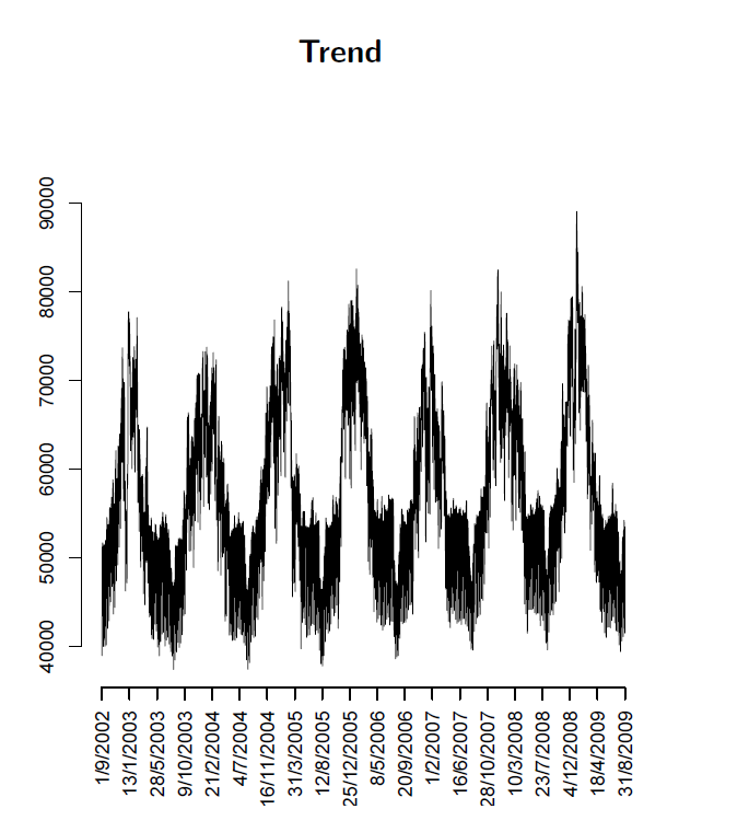
This is an interesting deck because it maps key steps in using semi-parametric models and illustrates real world system power load or demand data, as in this exhibit of annual variation showing the trend over several years.

trend

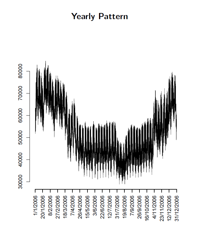
Or this exhibit showing annual variation.

annual

What intrigues me about the EDF approach in the competition and, apparently, more generally in their actual load forecasting, is the use of splines and knots. I’ve seen this basic approach applied in other time series contexts, for example, to facilitate bagging estimates.

So these competitions seem to provide solid results which can be applied in a real-world setting.

Top image from Triple-Curve

Bayesian Reasoning and Intuition

In thinking about Bayesian methods, I wanted to focus on whether and how Bayesian probabilities are or can be made “intuitive.”

Or are they just numbers plugged into a formula which sometimes is hard to remember?

A classic example of Bayesian reasoning concerns breast cancer and mammograms.

 1%   of the women at age forty who participate in routine screening have breast    cancer
 80%   of women with breast cancer will get positive mammograms.
 9.6%   of women with no breast cancer will also get positive mammograms

Question – A women in this age group has a positive mammogram in a routine screening. What is the probability she has cancer?

There is a tendency for intuition to anchor on the high percentage of women with breast cancer with positive mammograms – 80 percent. In fact, this type of scenario elicits significant over-estimates of cancer probabilities among mammographers!

Bayes Theorem, however, shows that the probability of women with a positive mammogram having cancer is an order of magnitude less than the percent of women with breast cancer and positive mammograms.

By the Formula

Recall Bayes Theorem –

BayesThm

Let A stand for the event a women has breast cancer, and B denote the event that a women tests positive on the mammogram.

We need the conditional probability of a positive mammogram, given that a woman has breast cancer, or P(B|A). In addition, we need the prior probability that a woman has breast cancer P(A), as well as the probability of a positive mammogram P(B).

So we know P(B|A)=0.8, and P(B|~A)=0.096, where the tilde ~ indicates “not”.

For P(B) we can make the following expansion, based on first principles –

P(B)=P(B|A)P(A)+P(B|~A)P(B)= P(B|A)P(A)+P(B|~A)(1-P(A))=0.10304

Either a woman has cancer or does not have cancer. The probability of a woman having cancer is P(A), so the probability of not having cancer is 1-P(A). These are mutually exclusive events, that is, and the probabilities sum to 1.

Putting the numbers together, we calculate the probability of a forty-year-old women with a positive mammogram having cancer is 0.0776.

So this woman has about an 8 percent chance of cancer, even though her mammogram is positive.

Survey after survey of physicians shows that this type of result in not very intuitive. Many doctors answer incorrectly, assigning a much higher probability to the woman having cancer.

Building Intuition

This example is the subject of a 2003 essay by Eliezer Yudkowsky – An Intuitive Explanation of Bayes’ Theorem.

As An Intuitive (and Short) Explanation of Bayes’ Theorem notes, Yudkowsky’s intuitive explanation is around 15,000 words in length.

For a shorter explanation that helps build intuition, the following table is useful, showing the crosstabs of women in this age bracket who (a) have or do not have cancer, and (b) who test positive or negative.

Testtable

The numbers follow from our original data. The percentage of women with cancer who test positive is given as 80 percent, so the percent with cancer who test negative must be 20 percent, and so forth.

Now let’s embed the percentages of true and false positives and negatives into the table, as follows:

Testtable2

So 1 percent of forty year old women (who have routine screening) have cancer. If we multiply this 1 percent by the percent of women who have cancer and test positive, we get .008 or the chances of a true positive. Then, the chance of getting any type of positive result is .008+.99*.096=.008+.0954=0.10304.

The ratio then of the chances of a true positive to the chance of any type of positive result is 0.07763 – exactly the result following from Bayes Theorem!

CoolClips_cart0781

This may be an easier two-step procedure than trying to develop conditional probabilities directly, and plug them into a formula.

Allen Downey lists other problems of this type, with YouTube talks on Bayesian stuff that are good for beginners.

Closing Comments

I have a couple more observations.

First, this analysis is consistent with a frequency interpretation of probability.

In fact, the 1 percent figure for women who are forty getting cancer could be calculated from cause of death data and Census data. Similarly with the other numbers in the scenario.

So that’s interesting.

Bayes theorem is, in some phrasing, true by definition (of conditional probability). It can just be tool for reorganizing data about observed frequencies.

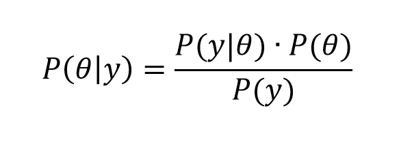
The magic comes when we transition from events to variables y and parameters θ in a version like,

Bayes2

What is this parameter θ? It certainly does not exist in “event” space in the same way as does the event of “having cancer and being a forty year old woman.” In the batting averages example, θ is a vector of parameter values of a Beta distribution – parameters which encapsulate our view of the likely variation of a batting average, given information from the previous playing season. So I guess this is where we go into “belief space”and subjective probabilities.

In my view, the issue is always whether these techniques are predictive.

Top picture courtesy of Siemens

Some Ways in Which Bayesian Methods Differ From the “Frequentist” Approach

I’ve been doing a deep dive into Bayesian materials, the past few days. I’ve tried this before, but I seem to be making more headway this time.

One question is whether Bayesian methods and statistics informed by the more familiar frequency interpretation of probability can give different answers.

I found this question on CrossValidated, too – Examples of Bayesian and frequentist approach giving different answers.

Among other things, responders cite YouTube videos of John Kruschke – the author of Doing Bayesian Data Analysis A Tutorial With R and BUGS

Here is Kruschke’s “Bayesian Estimation Supercedes the t Test,” which, frankly, I recommend you click on after reading the subsequent comments here.

I guess my concern is not just whether Bayesian and the more familiar frequentist methods give different answers, but, really, whether they give different predictions that can be checked.

I get the sense that Kruschke focuses on the logic and coherence of Bayesian methods in a context where standard statistics may fall short.

But I have found a context where there are clear differences in predictive outcomes between frequentist and Bayesian methods.

This concerns Bayesian versus what you might call classical regression.

In lecture notes for a course on Machine Learning given at Ohio State in 2012, Brian Kulis demonstrates something I had heard mention of two or three years ago, and another result which surprises me big-time.

Let me just state this result directly, then go into some of the mathematical details briefly.

Suppose you have a standard ordinary least squares (OLS) linear regression, which might look like,

linreg

where we can assume the data for y and x are mean centered. Then, as is well, known, assuming the error process ε is N(0,σ) and a few other things, the BLUE (best linear unbiased estimate) of the regression parameters w is –

regressionformulaNow Bayesian methods take advantage of Bayes Theorem, which has a likelihood function and a prior probability on the right hand side of the equation, and the resulting posterior distribution on the left hand side of the equation.

What priors do we use for linear regression in a Bayesian approach?

Well, apparently, there are two options.

First, suppose we adopt priors for the predictors x, and suppose the prior is a normal distribution – that is the predictors are assumed to be normally distributed variables with various means and standard deviations.

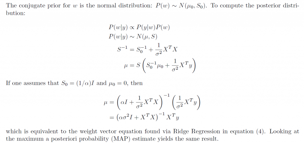
In this case, amazingly, the posterior distribution for a Bayesian setup basically gives the equation for ridge regression.

ridgebayes

On the other hand, assuming a prior which is a Laplace distribution gives a posterior distribution which is equivalent to the lasso.

This is quite stunning, really.

Obviously, then, predictions from an OLS regression, in general, will be different from predictions from a ridge regression estimated on the same data, depending on the value of the tuning parameter λ (See the post here on this).

Similarly with a lasso regression – different forecasts are highly likely.

Now it’s interesting to question which might be more accurate – the standard OLS or the Bayesian formulations. The answer, of course, is that there is a tradeoff between bias and variability effected here. In some situations, ridge regression or the lasso will produce superior forecasts, measured, for example, by root mean square error (RMSE).

This is all pretty wonkish, I realize. But it conclusively shows that there can be significant differences in regression forecasts between the Bayesian and frequentist approaches.

What interests me more, though, is Bayesian methods for forecast combination. I am still working on examples of these procedures. But this is an important area, and there are a number of studies which show gains in forecast accuracy, measured by conventional metrics, for Bayesian model combinations.

Predicting Season Batting Averages, Bernoulli Processes – Bayesian vs Frequentist

Recently, Nate Silver boosted Bayesian methods in his popular book The Signal and the Noise – Why So Many Predictions Fail – But Some Don’t. I’m guessing the core application for Silver is estimating batting averages. Silver first became famous with PECOTA, a system for forecasting the performance of Major League baseball players.

Let’s assume a player’s probability p of getting a hit is constant over a season, but that it varies from year to year. He has up years, and down years. And let’s compare frequentist (gnarly word) and Bayesian approaches at the beginning of the season.

The frequentist approach is based on maximum likelihood estimation with the binomial formula

binomial

Here the n and the k in parentheses at the beginning of the expression stand for the combination of n things taken k at a time. That is, the number of possible ways of interposing k successes (hits) in n trials (times at bat) is the combination of n things taken k at a time (formula here).

If p is the player’s probability of hitting at bat, then the entire expression is the probability the player will have k hits in n times at bat.

The Frequentist Approach

There are a couple of ways to explain the frequentist perspective.

One is that this binomial expression is approximated to a higher and higher degree of accuracy by a normal distribution. This means that – with large enough n – the ratio of hits to total times at bat is the best estimate of the probability of a player hitting at bat – or k/n.

This solution to the problem also can be shown to follow from maximizing the likelihood of the above expression for any n and k. The large sample or asymptotic and maximum likelihood solutions are numerically identical.

The problem comes with applying this estimate early on in the season. So if the player has a couple of rough times at bat initially, the frequentist estimate of his batting average for the season at that point is zero.

The Bayesian Approach

The Bayesian approach is based on the posterior probability distribution for the player’s batting average. From Bayes Theorem, this is a product of the likelihood and a prior for the batting average.

Now generally, especially if we are baseball mavens, we have an idea of player X’s batting average. Say we believe it will be .34 – he’s going to have a great season, and did last year.

In this case, we can build that belief or information into a prior that is a beta distribution with two parameters α and β that generate a mean of α/(α+β).

In combination with the binomial likelihood function, this beta distribution prior combines algebraically into a closed form expression for another beta function with parameters which are adjusted by the values of k and n-k (the number of strike-outs). Note that walks (also being hit by the ball) do not count as times at bat.

This beta function posterior distribution then can be moved back to the other side of the Bayes equation when there is new information – another hit or strikeout.

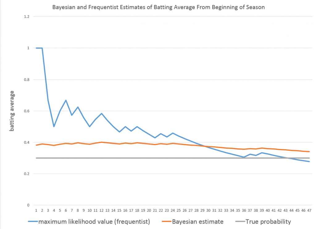
Taking the average of the beta posterior as the best estimate of p, then, we get successive approximations, such as shown in the following graph.

BAyesbatting

So the player starts out really banging ‘em, and the frequentist estimate of his batting average for that season starts at 100 percent. The Bayesian estimate on the other hand is conditioned by a belief that his batting average should be somewhere around 0.34. In fact, as the grey line indicates, his actual probability p for that year is 0.3. Both the frequentist and Bayesian estimates converge towards this value with enough times at bat.

I used α=33 and β=55 for the initial values of the Beta distribution.

See this for a great discussion of the intuition behind the Beta distribution.

This, then, is a worked example showing how Bayesian methods can include prior information, and have small sample properties which can outperform a frequentist approach.

Of course, in setting up this example in a spreadsheet, it is possible to go on and generate a large number of examples to explore just how often the Bayesian estimate beats the frequentist estimate in the early part of a Bernoulli process.

Which goes to show that what you might call the classical statistical approach – emphasizing large sample properties, covering all cases, still has legs.

Machine Learning and Next Week

Here is a nice list of machine learning algorithms. Remember, too, that they come in two or three flavors – supervised, unsupervised, semi-supervised, and reinforcement learning.

MachineLearning

An objective of mine is to cover each of these techniques with an example or two, with special reference to their relevance to forecasting.

I got this list, incidentally, from an interesting Australian blog Machine Learning Mastery.

The Coming Week

Aligned with this marvelous list, I’ve decided to focus on robotics for a few blog posts coming up.

This is definitely exploratory, but recently I heard a presentation by an economist from the National Association of Manufacturers (NAM) on manufacturing productivity, among other topics. Apparently, robotics is definitely happening on the shop floor – especially in the automobile industry, but also in semiconductors and electronics assembly.

And, as mankind pushes the envelope, drilling for oil in deeper and deeper areas offshore and handling more and more radioactive and toxic material, the need for significant robotic assistance is definitely growing.

I’m looking for indices and how to construct them – how to guage the line between merely automatic and what we might more properly call robotic.

Dimension Reduction With Principal Components

The method of principal components regression has achieved new prominence in machine learning, data reduction, and forecasting over the last decade.

It’s highly relevant in the era of Big Data, because it facilitates analyzing “fat” or wide databases. Fat databases have more predictors than observations. So you might have ten years of monthly data on sales, but 1000 potential predictors, meaning your database would be 120 by 1001 – obeying here the convention of stating row depth first and the number of columns second.

After a brief discussion of these Big Data applications and some elements of principal components, I illustrate dimension reduction with a violent crime database from the UC Irvine Machine Learning Repository.

Dynamic Factor Models

In terms of forecasting, a lot of research over the past decade has focused on “many predictors” and reducing the dimensionality of “fat” databases. Key names are James Stock and Mark Watson (see also) and Bai.

Stock and Watson have a white paper that has been updated several times, which can be found in PDF format at this link

stock watson generalized shrinkage June _2012.pdf

They write in the June 2012 update,

We find that, for most macroeconomic time series, among linear estimators the DFM forecasts make efficient use of the information in the many predictors by using only a small number of estimated factors. These series include measures of real economic activity and some other central macroeconomic series, including some interest rates and monetary variables. For these series, the shrinkage methods with estimated parameters fail to provide mean squared error improvements over the DFM. For a small number of series, the shrinkage forecasts improve upon DFM forecasts, at least at some horizons and by some measures, and for these few series, the DFM might not be an adequate approximation. Finally, none of the methods considered here help much for series that are notoriously difficult to forecast, such as exchange rates, stock prices, or price inflation.

Here DFM refers to dynamic factor models, essentially principal components models which utilize PC’s for lagged data.

Note also that this type of autoregressive or classical time series approach does not work well, in Stock and Watson’s judgment, for “series that are notoriously difficult to forecast, such as exchange rates, stock prices, or price inflation.”

Presumably, these series are closer to being random walks in some configuration.

Intermediate Level Concepts

Essentially, you can take any bundle of data and compute the principal components. If you mean-center and (in most cases) standardize the data, the principal components divide up the variance of this data, based on the size of their associated eigenvalues. The associated eigenvectors can be used to transform the data into an equivalent and same size set of orthogonal vectors. Really, the principal components operate to change the basis of the data, transforming it into an equivalent representation, but one in which all the variables have zero correlation with each other.

The Wikipaedia article on principal components is useful, but there is no getting around the fact that principal components can only really be understood with matrix algebra.

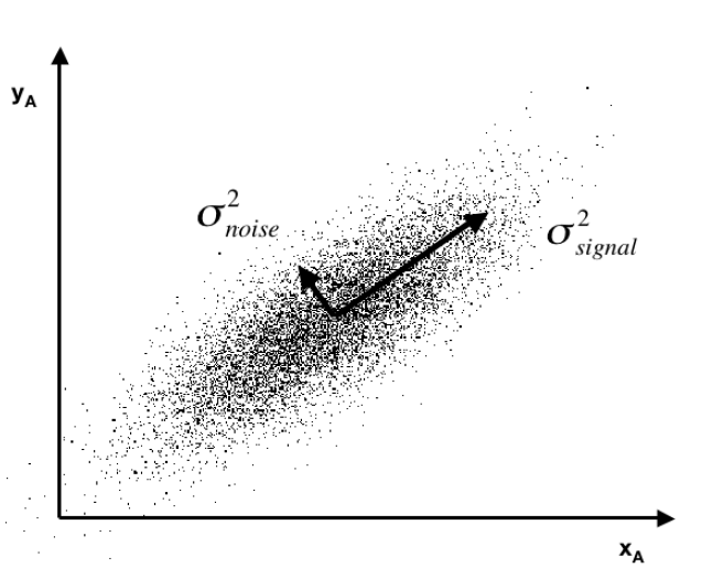
Often you see a diagram, such as the one below, showing a cloud of points distributed around a line passing through the origin of a coordinate system, but at an acute angle to those coordinates.
pcpic

This illustrates dimensionality reduction with principal components. If we express all these points in terms of this rotated set of coordinates, one of these coordinates – the signal – captures most of the variation in the data. Projections of the datapoints onto the second principal component, therefore, account for much less variance.

Principal component regression characteristically specifies only the first few principal components in the regression equation, knowing that, typically, these explain the largest portion of the variance in the data.

An Application to Crime Data

Looking for some non-macroeconomic data to illustrate principal components (PC) regression, I found the Communities and Crime Data Set in the University of California at Irving Machine Learning Repository.

The data do not illustrate “many predictors” in the sense of more predictors than observations.

Here, the crime and other data comprise 128 variables, including a violent crime variable, which are collated for 1994 cities. That is, there are more observations than predictors.

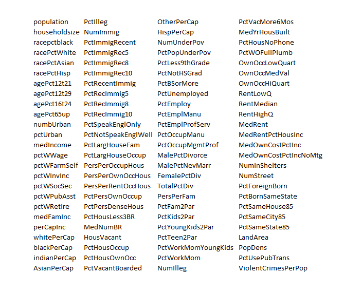
The variables included in the dataset involve the community, such as the percent of the population considered urban, and the median family income, and involving law enforcement, such as per capita number of police officers, and percent of officers assigned to drug units. The per capita violent crimes variable was calculated using population and the sum of crime variables considered violent crimes in the United States: murder, rape, robbery, and assault.

I standardize the data, dropping variables with a lot of missing values. That leaves me 100 variables, including the violent crime metric.

This table gives you a flavor of the variables included – you have to interpret the abbreviations
crime

I developed a comparison of OLS regression with principal components regression, finding that principal component regression can outperform OLS in out-of-sample predictions of violent crimes per capita.

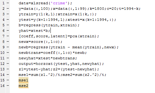
The Matlab program to carry out this analysis is as follows:
Matalbp

So I used a training set of 1800 cities, and developed OLS and PC regressions to predict violent crime per capita in the remaining 194 cities.  I calculate the  principal components (coeff) from a training set (xtrain) comprised of the first 1800 cities. Then, I select the first twenty pc’s  and translate them back to weightings on all 99 variables for application to the test set (xtest). I also calculate OLS regression coefficients on xtrain.

The mean square prediction error (mse1) of the OLS regression was 0.35 and the mean square prediction error (mse2) of the PC regression was 0.34 – really a marginal difference but large enough to make the point.

What’s really interesting is that I had to use the first twenty (20) principal components to achieve this improvement. Thus, this violent crime database has a quite diverse characteristic, compared with many socioeconomic datasets I have seen, where, as noted above, the first few principal components explain most of the variation in the data.

This method – PC regression – is especially good when there are predictors which are closely correlated (“multicollinearity”) as often is the case with market research surveys of consumer attitudes and income and wealth variables.

The bottom line here is that principal compoments can facilitate data reduction or regression regularization. Quite often, this can improve the prediction capabilities of a regression, when compared with an OLS regression using all the variables. The PC regression assigns higher weights to the most important predictors, in effect performing a kind of variable selection – although the coefficients or pc’s may not zero out variables per se.

I am continuing to work on this data with an eye to implementing k-fold cross-validation as a way of estimating the optimal number of principal components which should be used in the PC regressions.

The Tibshirani’s – Statistics and Machine Learning Superstars

As regular readers of this blog know, I’ve migrated to a weekly (or potentially longer) topic focus, and this week’s topic is variable selection.

And the next planned post in the series will compare and contrast ridge regression and the LASSO (least absolute shrinkage and selection operator). There also are some new results for the LASSO. But all this takes time and is always better when actual computations can be accomplished to demonstrate points.

But in researching this, I’ve come to a deeper appreciation of the Tibshiranis.

Robert Tibshirani was an early exponent of the LASSO and has probably, as much as anyone, helped integrate the LASSO into standard statistical procedures.

Here’s his picture from Wikipedia.

RobertTib2

You might ask why put his picuture up, and my answer is that Professor Robert Tibshirani (Stanford) has a son Ryan Tibshirani, whose picture is just below.

Ryan Tibsharani has a great Data Mining course online from Carnegie Mellon, where he is an Assistant Professor.

RyanTib

Professor Ryan Tibshirani’s Spring 2013 a Data Mining course can be found at http://www.stat.cmu.edu/~ryantibs/datamining/

Reviewing Ryan Tibsharani’s slides is very helpful in getting insight into topics like cross validation, ridge regression and the LASSO.

And let us not forget Professor Ryan Tibshirani is author of essential reading about how to pick your target in darts, based on your skill level (hint – don’t go for the triple-20 unless you are good).

Free Books on Machine Learning and Statistics

Robert Tibshirani et al’s text – Elements of Statistical Learning is now in the 10th version and is available online free here.

But the simpler An Introduction to Statistical Leaning is also available for an online download of a PDF file here. This is the corrected 4th printing. The book, which I have been reading today, is really dynamite – an outstanding example of scientific exposition and explanation.

These guys and their collaborators are truly gifted teachers. They create windows into new mathematical and statistical worlds, as it were.

Selecting Predictors – the Specification Problem

I find toy examples helpful in exploratory work.

So here is a toy example showing the pitfalls of forward selection of regression variables, in the presence of correlation between predictors. In other words, this is an example of the specification problem.

Suppose the true specification or regression is –

y = 20x1-11x2+10x3

and the observations on x2 and x3 in the available data are correlated.

To produce examples of this system, I create columns of random numbers in which the second and third columns are correlated with a correlation coefficient of around 0.6. I also add a random error term with zero mean and constant variance of 10. Then, after generating the data and the error terms, I apply the coefficients indicated above and estimate values for the dependent variable y.

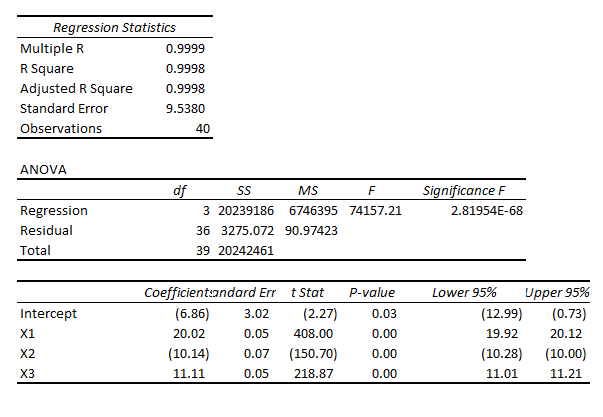
Then, specifying all three variables,  x1, x2, and x3, I estimate regressions which characteristically have coefficient values not far from the (20,-11, 10), such as,

spregThis, of course, is a regression output from Microsoft Excel, where I developed this simple Monte Carlo simulation which has 40 “observations.”

If you were lucky enough to estimate this regression initially, you well might stop and not bother about dropping variables to estimate other potentially competing models.

However, if you start with fewer variables, you encounter a significant difficulty.

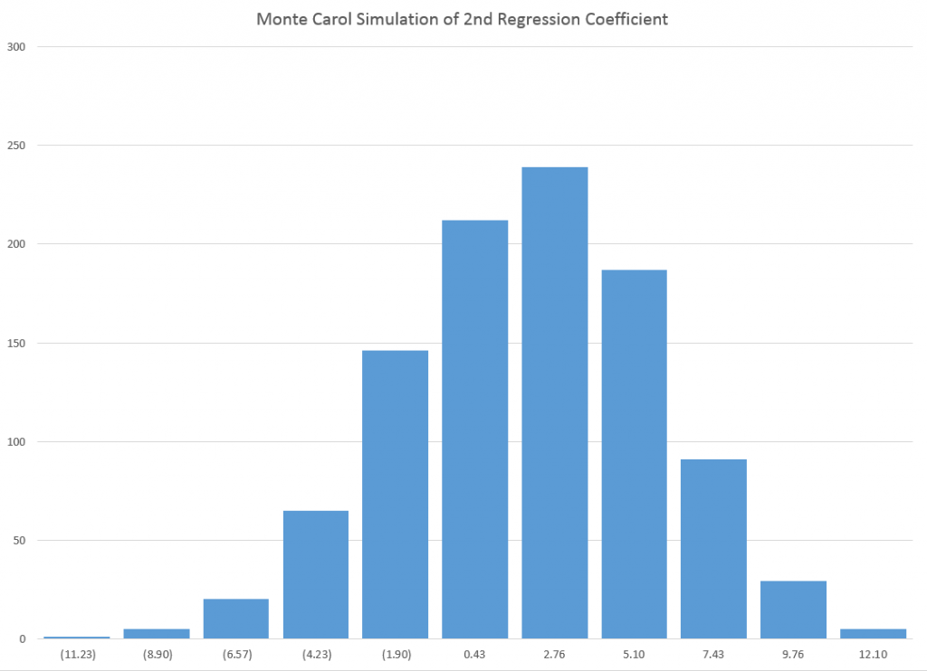
Here is the distribution of x2 in repeated estimates of a regression with explanatory variables x1 and x2 –

coeff2

As you can see, the various estimates of the value of this coefficient, whose actual or true value is -11, are wide of the mark. In fact, none of the 1000 estimates in this simulation proved to be statistically significant at standard levels.

Using some flavors of forward regression, therefore, you well might decide to drop x2 in the specification and try including x3.

But you would have the same type of problem in that case, too, since x2 and x3 are correlated.

I sometimes hear people appealing to stability arguments in the face of the specification problem. In other words, they strive to find a stable set of core predictors, believing that if they can do this, they will have controlled as effectively as they can for this problem of omitted variables which are correlated with other variables that are included in the specification.

More on the Predictability of Stock and Bond Markets

Research by Lin, Wu, and Zhou in Predictability of Corporate Bond Returns: A Comprehensive Study suggests a radical change in perspective, based on new forecasting methods. The research seems to me to of a piece with a lot of developments in Big Data and the data mining movement generally. Gains in predictability are associated with more extensive databases and new techniques.

The abstract to their white paper, presented at various conferences and colloquia, is straight-forward –

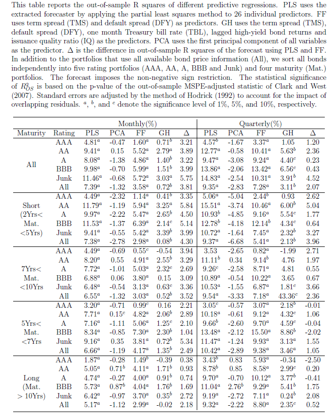
Using a comprehensive data set, we find that corporate bond returns not only remain predictable by traditional predictors (dividend yields, default, term spreads and issuer quality) but also strongly predictable by a new predictor formed by an array of 26 macroeconomic, stock and bond predictors. Results strongly suggest that macroeconomic and stock market variables contain important information for expected corporate bond returns. The predictability of returns is of both statistical and economic significance, and is robust to different ratings and maturities.

Now, in a way, the basic message of the predictability of corporate bond returns is not news, since Fama and French made this claim back in 1989 – namely that default and term spreads can predict corporate bond returns both in and out of sample.

What is new is the data employed in the Lin, Wu, and Zhou (LWZ) research. According to the authors, it involves 780,985 monthly observations spanning from January 1973 to June 2012 from combined data sources, including Lehman Brothers Fixed Income (LBFI), Datastream, National Association of Insurance Commissioners (NAIC), Trade Reporting and Compliance Engine (TRACE) and Mergents Fixed Investment Securities Database (FISD).

There also is a new predictor which LWZ characterize as a type of partial least squares (PLS) formulation, but which is none other than the three pass regression filter discussed in a post here in March.

The power of this PLS formulation is evident in a table showing out-of-sample R2 of the various modeling setups. As in the research discussed in a recent post, out-of-sample (OS) R2 is a ratio which measures the improvement in mean square prediction errors (MSPE) for the predictive regression model over the historical average forecast. A negative OS R2 thus means that the MSPE of the benchmark forecast is less than the MSPE of the forecast by the designated predictor formulation.

PLSTableZhou

Again, this research finds predictability varies with economic conditions – and is higher during economic downturns.

There are cross-cutting and linked studies here, often with Goyal’s data and fourteen financial/macroeconomic variables figuring within the estimations. There also is significant linkage with researchers at regional Federal Reserve Banks.

My purpose in this and probably the next one or two posts is to just get this information out, so we can see the larger outlines of what is being done and suggested.

My guess is that the sum total of this research is going to essentially re-write financial economics and has huge implications for forecasting operations within large companies and especially financial institutions.

Stock Market Predictability – Controversy

In the previous post, I drew from papers by Neeley, who is Vice President of the Federal Reserve Bank of St. Louis, David Rapach at St. Louis University and Goufu Zhou at Washington University in St. Louis.

These authors contribute two papers on the predictability of equity returns.

The earlier one – Forecasting the Equity Risk Premium: The Role of Technical Indicators – is coming out in Management Science. Of course, the survey article – Forecasting the Equity Risk Premium: The Role of Technical Indicators – is a chapter in the recent volume 2 of the Handbook of Forecasting.

I go through this rather laborious set of citations because it turns out that there is an underlying paper which provides the data for the research of these authors, but which comes to precisely the opposite conclusion –

The goal of our own article is to comprehensively re-examine the empirical evidence as of early 2006, evaluating each variable using the same methods (mostly, but not only, in linear models), time-periods, and estimation frequencies. The evidence suggests that most models are unstable or even spurious. Most models are no longer significant even insample (IS), and the few models that still are usually fail simple regression diagnostics.Most models have performed poorly for over 30 years IS. For many models, any earlier apparent statistical significance was often based exclusively on years up to and especially on the years of the Oil Shock of 1973–1975. Most models have poor out-of-sample (OOS) performance, but not in a way that merely suggests lower power than IS tests. They predict poorly late in the sample, not early in the sample. (For many variables, we have difficulty finding robust statistical significance even when they are examined only during their most favorable contiguous OOS sub-period.) Finally, the OOS performance is not only a useful model diagnostic for the IS regressions but also interesting in itself for an investor who had sought to use these models for market-timing. Our evidence suggests that the models would not have helped such an investor. Therefore, although it is possible to search for, to occasionally stumble upon, and then to defend some seemingly statistically significant models, we interpret our results to suggest that a healthy skepticism is appropriate when it comes to predicting the equity premium, at least as of early 2006. The models do not seem robust.

This is from Ivo Welch and Amit Goyal’s 2008 article A Comprehensive Look at The Empirical Performance of Equity Premium Prediction in the Review of Financial Studies which apparently won an award from that journal as the best paper for the year.

And, very importantly, the data for this whole discussion is available, with updates, from Amit Goyal’s site now at the University of Lausanne.

AmitGoyal

Where This Is Going

Currently, for me, this seems like a genuine controversy in the forecasting literature. And, as an aside, in writing this blog I’ve entertained the notion that maybe I am on the edge of a new form of or focus in journalism – namely stories about forecasting controversies. It’s kind of wonkish, but the issues can be really, really important.

I also have a “hands-on” philosophy, when it comes to this sort of information. I much rather explore actual data and run my own estimates, than pick through theoretical arguments.

So anyway, given that Goyal generously provides updated versions of the data series he and Welch originally used in their Review of Financial Studies article, there should be some opportunity to check this whole matter. After all, the estimation issues are not very difficult, insofar as the first level of argument relates primarily to the efficacy of simple bivariate regressions.

By the way, it’s really cool data.

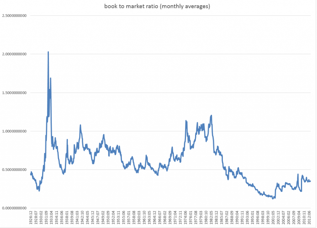
Here is the book-to-market ratio, dating back to 1926.

bmratio

But beyond these simple regressions that form a large part of the argument, there is another claim made by Neeley, Rapach, and Zhou which I take very seriously. And this is that – while a “kitchen sink” model with all, say, fourteen so-called macroeconomic variables does not outperform the benchmark, a principal components regression does.

This sounds really plausible.

Anyway, if readers have flagged updates to this controversy about the predictability of stock market returns, let me know. In addition to grubbing around with the data, I am searching for additional analysis of this point.