The Future of Digital- I

The recent Business Insider presentation on the “Digital
Future
” is outstanding. The slides are a paean to digital media, mobile, and more specifically Android, which appears to have won the platform wars – at least for the time being.

Here are some highlights.

BI charts the global internet population at just less than three billion, a figure which includes, however, almost all the more affluent consumers.

New media – Apple, Google, Amazon, Facebook, Yahoo – dominate the old media – 21st Century Fox, CBS, Viacom, Time Warner, Comcast, and Disney.

Multiple devices and screens are key to the new media landscape from a hardware standpoint. As “connected devices,” smartphones and tablets now dominate PC’s. Sales of smartphones are still booming, and tablets are cannibalizing PCF’s.

SMartPhonesPCs

Demand for “phablets” is skyrocketing, especially in Asia. PC manufacturers are taking a hit.

BI estimates one fifth of internet traffic is now via mobile devices.

The Chinese smartphone users are now twice the size of US market.

But it is with respect to the “platform wars” that the BI presentation takes the strongest stand. Their estimates suggest 80 percent of smartphones run Android, and 60 percent of tables.

platformstats1

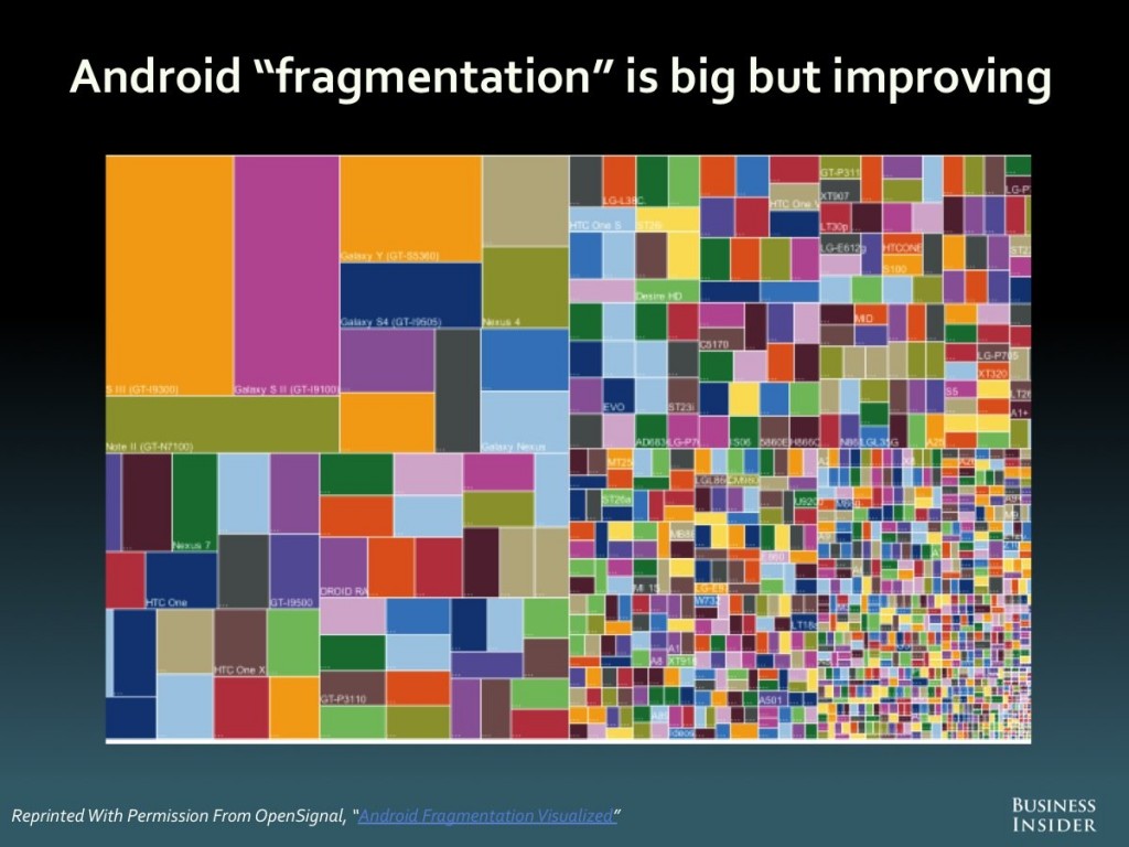
They say Android has caught up in the app development department. The exhibit showing the “fragmentation” of Android caught my eye.

Androidfrag

US digital advertising is now bigger than TV, and, according to BI, shows a 20 percent CAGR 2002-2012.

Advertising

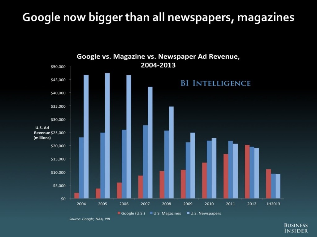
Newspaper ads have plummeted, as Google takes the lion’s share of digital advertising.

GoogleversusROWads

Here’ the link.

http://www.businessinsider.com/the-future-of-digital-2013-2013-11?op=1

You can convert the 134 slides in the BI presentation to a PDF file, if you register for a trial membership to BI services.

I’ll have more to say about these topics soon.

Links – February 14

Global Economy

Yellen Says Recovery in Labor Market Far From Complete – Highlights of Fed Chair Yellen’s recent testimony before the House Financial Services Committee. Message – continuity, steady as she goes unless a there is a major change in outlook.

OECD admits overstating growth forecasts amid eurozone crisis and global crash The Paris-based organisation said it repeatedly overestimated growth prospects for countries around the world between 2007 and 2012. The OECD revised down forecasts at the onset of the financial crisis, but by an insufficient degree, it said….

The biggest forecasting errors were made when looking at the prospects for the next year, rather than the current year.

10 Books for Understanding China’s Economy

Information Technology (IT)

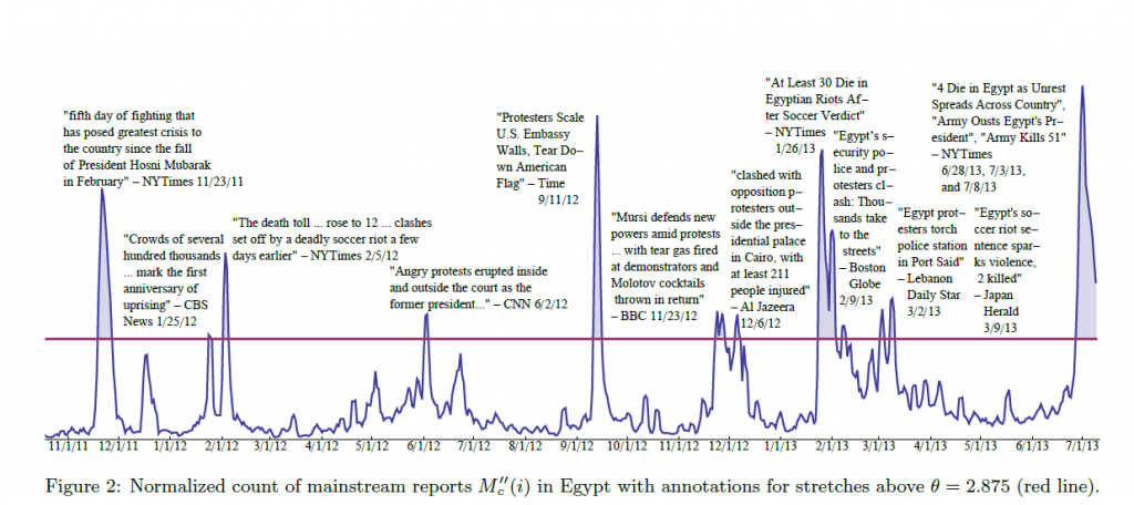
Predicting Crowd Behavior with Big Public Data

SocialMediaEgypt

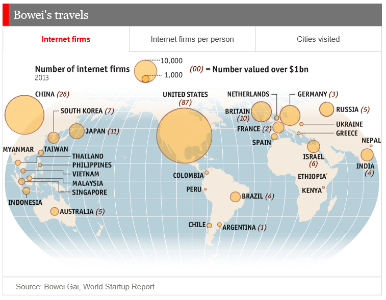
Internet startups

WorldStartups

Alternative Technology

World’s Largest Rooftop Farm Documents Incredible Growth High Above Brooklyn

Power Laws

Zipf’s Law

George Kingsley Zipf (1902-1950) was an American linguist with degrees from Harvard, who had the distinction of being a University Lecturer – meaning he could give any course at Harvard University he wished to give.

At one point, Zipf hired students to tally words and phrases, showing, in a long enough text, if you count the number of times each word appears, the frequency of words is, up to a scaling constant, 1/n, where n is the rank. So second most frequent word occurs approximately ½ as often as the first; the tenth most frequent word occurs 1/10 as often as the first item, and so forth.

In addition to documenting this relationship between frequency and rank in other languages, including Chinese, Zipf discussed applications to income distribution and other phenomena.

More General Power Laws

Power laws are everywhere in the social, economic, and natural world.

Xavier Gabaix with NYU’s Stern School of Business writes the essence of this subject is the ability to extract a general mathematical law from highly diverse details.

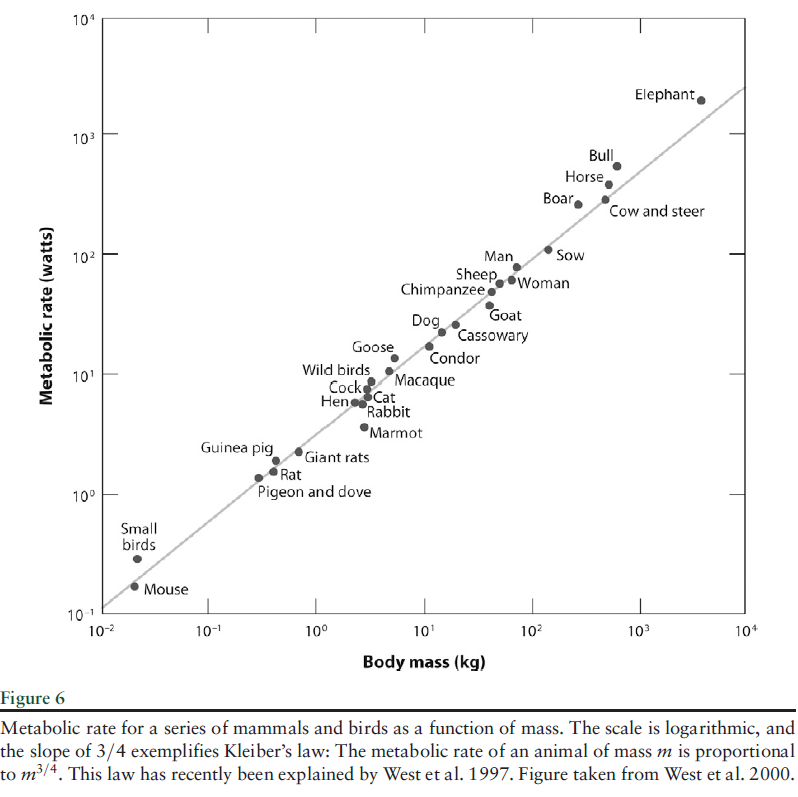
For example, the

..energy that an animal of mass M requires to live is proportional to M3/4. This empirical regularity… has been explained only recently .. along the following lines: If one wants to design an optimal vascular system to send nutrients to the animal, one designs a fractal system, and maximum efficiency exactly delivers the M3/4 law. In explaining the relationship between energy needs and mass, one should not become distracted by thinking about the specific features of animals, such as feathers and fur. Simple and deep principles underlie the regularities.

AnimalMassPL

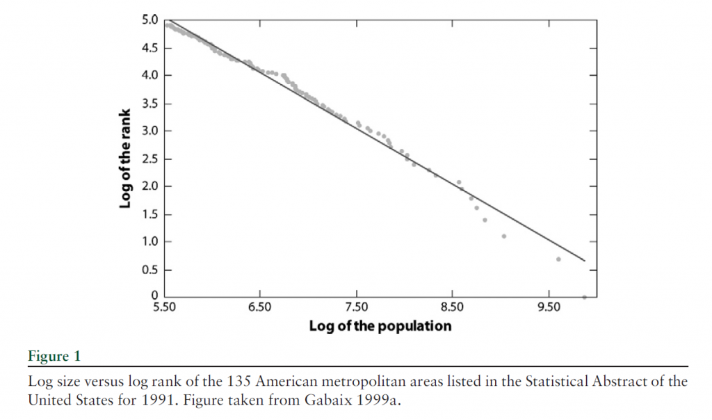
This type of relationship between variables also characterizes city population and rank, income and wealth distribution, visits to Internet blogs and blog rank, and many other phenomena.

Here is the graph of the power law for city size, developed much earlier by Gabaiux.

CitySizeVSRank

There are many valuable sections in Gabaix’s review article.

However, surely one of the most interesting is the inverse cubic law distribution of stock price fluctuations.

The tail distribution of short-term (15 s to a few days) returns has been analyzed in a series of studies on data sets, with a few thousands of data points (Jansen & de Vries 1991, Lux 1996, Mandelbrot 1963), then with an ever increasing number of data points: Mantegna& Stanley (1995) used 2 million data points, whereas Gopikrishnan et al. (1999) used over 200 million data points. Gopikrishnan et al. (1999) established a strong case for an inverse cubic PL of stock market returns. We let rt denote the logarithmic return over a time interval.. Gopikrishnan et al. (1999) found that the distribution function of returns for the 1000 largest U.S. stocks and several major international indices is

CubicPowerLaw

This relationship holds for positive and negative returns separately.

There is also an inverse half-cubic power law distribution of trading volume.

All this is fascinating, and goes beyond a sort of bestiary of weird social regularities. The holy grail here is, as Gabaix says, robust, detail-independent economic laws.

So with this goal in mind, we don’t object to the intricate details of the aggregation of power laws, or their potential genesis in proportional random growth. I was not aware, for example, that power laws are sustained through additive, multiplicative, min and max operations, possibly explaining why they are so widespread. Nor was I aware that randomly assigning multiplicative growth factors to a group of cities, individuals with wealth, and so forth can generate a power law, when certain noise elements are present.

And Gabaix is also aware that stock market crashes display many attributes that resolve or flow from power laws – so eventually it’s possible general mathematical principles could govern bubble dynamics, for example, somewhat independently of the specific context.

St. Petersburg Paradox

Power laws also crop up in places where standard statistical concepts fail. For example, while the expected or mean earnings from the St. Petersburg paradox coin flipping game does not exist, the probability distribution of payouts follow a power law.

Peter offers to let Paul toss a fair coin an indefinite number of times, paying him 2 coins if it comes up tails on the first toss, 4 coins if the first head comes up on the second toss, and 2n, if the first head comes up on the nth toss.

The paradox is that, with a fair coin, it is possible to earn an indefinitely large payout, depending on how long Paul is willing to flip coins. At the same time, behavioral experiments show that “Paul” is not willing to pay more than a token amount up front to play this game.

The probability distribution function of winnings is described by a power law, so that,

There is a high probability of winning a small amount of money. Sometimes, you get a few TAILS before that first HEAD and so you win much more money, because you win $2 raised to the number of TAILS plus one. Therefore, there is a medium probability of winning a large amount of money. Very infrequently you get a long sequence of TAILS and so you win a huge jackpot. Therefore, there is a very low probability of winning a huge amount of money. These frequent small values, moderately often medium values, and infrequent large values are analogous to the many tiny pieces, some medium sized pieces, and the few large pieces in a fractal object. There is no single average value that is the characteristic value of the winnings per game.

And, as Liebovitch and Scheurle illustrate with Monte Carlo simulations, as more games were played, the average winnings per game of the fractal St. Petersburg coin toss game …increase without bound.

So, neither the expected earnings nor the variance of average earnings exists as computable mathematical entities. And yet the PDF of the earnings is described by the formula Ax-α  where α is near 1.

Closing Thoughts

One reason power laws are so pervasive in the real world is that, mathematically, they aggregate over addition and multiplication. So the sum of two variables described by a power law also is described by a power law, and so forth.

As far as their origin or principle of generation, it seems random proportional growth can explain some of the city size, wealth and income distribution power laws. But I hesitate to sketch the argument, because it seems somehow incomplete, requiring “frictions” or weird departures from a standard limit process.

In any case, I think those of us interested in forecasting should figure ways to integrate these unusual regularities into predictions.

Random Subspace Ensemble Methods (Random Forest™ algorithm)

As a term, random forests apparently is trademarked, which is, in a way, a shame because it is so evocative – random forests, for example, are comprised of a large number of different decision or regression trees, and so forth.

Whatever the name we use, however, the Random Forest™ algorithm is a powerful technique. Random subspace ensemble methods form the basis for several real world applications, such as Microsoft’s Kinect, facial recognition programs in cell phone and other digital cameras, and figure importantly in many Kaggle competitions, according to Jeremy Howard, formerly Kaggle Chief Scientist.

I assemble here a Howard talk from 2011 called “Getting In Shape For The Sport Of Data Science” and instructional videos from a data science course at the University of British Columbia (UBC). Watching these involves a time commitment, but it’s possible to let certain parts roll and then to skip ahead. Be sure and catch the last part of Howard’s talk, since he’s good at explaining random subspace ensemble methods, aka random forests.

It certainly helps me get up to speed to watch something, as opposed to reading papers on a fairly unfamiliar combination of set theory and statistics.

By way of introduction, the first step is to consider a decision tree. One of the UBC videos notes that decision trees faded from popularity some decades ago, but have come back with the emergence of ensemble methods.

So a decision tree is a graph which summarizes the classification of multi-dimensional points in some space, usually based on creating rectangular areas with reference to the coordinates. The videos make this clearer.

So this is nice, but decision trees of this sort tend to over-fit; they may not generalize very well. There are methods of “pruning” or simplification which can help generalization, but another tactic is to utilize ensemble methods. In other words, develop a bunch of decision trees classifying some set of multi-attribute items.

Random forests simply build such decision trees with a randomly selected group of attributes, subsets of the total attributes defining the items which need to be classified.

The idea is to build enough of these weak predictors and then average to arrive at a modal or “majority rule” classification.

Here’s the Howard talk.

Then, there is an introductory UBC video on decision trees

This video goes into detail on the method of constructing random forests.

Then the talk on random subspace ensemble applications.

Granger Causality

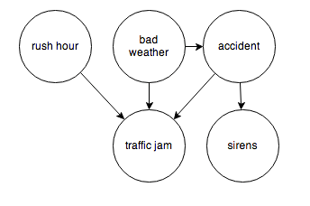
After review, I have come to the conclusion that from a predictive and operational standpoint, causal explanations translate to directed graphs, such as the following:

causegraph

And I think it is interesting the machine learning community focuses on causal explanations for “manipulation” to guide reactive and interactive machines, and that directed graphs (or perhaps a Bayesian networks) are a paramount concept.

Keep that thought, and consider “Granger causality.”

This time series concept is well explicated in C.W.J. Grangers’ 2003 Nobel Prize lecture – which motivates its discovery and links with cointegration.

An earlier concept that I was concerned with was that of causality. As a postdoctoral student in Princeton in 1959–1960, working with Professors John Tukey and Oskar Morgenstern, I was involved with studying something called the “cross-spectrum,” which I will not attempt to explain. Essentially one has a pair of inter-related time series and one would like to know if there are a pair of simple relations, first from the variable X explaining Y and then from the variable Y explaining X. I was having difficulty seeing how to approach this question when I met Dennis Gabor who later won the Nobel Prize in Physics in 1971. He told me to read a paper by the eminent mathematician Norbert Wiener which contained a definition that I might want to consider. It was essentially this definition, somewhat refined and rounded out, that I discussed, together with proposed tests in the mid 1960’s.

The statement about causality has just two components: 1. The cause occurs before the effect; and 2. The cause contains information about the effect that that is unique, and is in no other variable.

A consequence of these statements is that the causal variable can help forecast the effect variable after other data has first been used. Unfortunately, many users concentrated on this forecasting implication rather than on the original definition. At that time, I had little idea that so many people had very fixed ideas about causation, but they did agree that my definition was not “true causation” in their eyes, it was only “Granger causation.” I would ask for a definition of true causation, but no one would reply. However, my definition was pragmatic and any applied researcher with two or more time series could apply it, so I got plenty of citations. Of course, many ridiculous papers appeared.

When the idea of cointegration was developed, over a decade later, it became clear immediately that if a pair of series was cointegrated then at least one of them must cause the other. There seems to be no special reason why there two quite different concepts should be related; it is just the way that the mathematics turned out

In the two-variable case, suppose we have time series Y={y1,y2,…,yt} and X = {x1,..,xt}. Then, there are, at the outset, two cases, depending on whether Y and X are stationary or nonstationary. The classic case is where we have an autoregressive relationship for yt,

yt = a0+a1yt-1+..+akyt-k

and this relationship can be shown to be a weaker predictor than


yt = a0+a1yt-1+..+akyt-k + b0+b1xt-1+..+bmxt-m

In this case, we say that X exhibits Granger causality with respect to Y.

Of course, if Y and X are nonstationary time series, autoregressive predictive equations make no sense, and instead we have the case of cointegration of time series, where in the two-variable case,

yt=φxt-1+ut

and the series of residuals ut are reduced to a white noise process.

So these cases follow what good old Wikipedia says,

A time series X is said to Granger-cause Y if it can be shown, usually through a series of t-tests and F-tests on lagged values of X (and with lagged values of Y also included), that those X values provide statistically significant information about future values of Y.

There are a number of really interesting extensions of this linear case, discussed in a recent survey paper.

Stern points out that the main enemies or barriers to establishing causal relations are endogeneity and omitted variables.

So I find that margin loans and the level of the S&P 500 appear to be mutually interrelated. Thus, it is forecasts of the S&P 500 can be improved with lagged values of margin loans, and you can improve forecasts of the monthly total of margin loans with lagged values of the S&P 500 – at least over broad ranges of time and in the period since 2008. The predictions of the S&P 500 with lagged values of margin loans, however, are marginally more powerful or accurate predictions.

Stern gives a colorful example where an explanatory variable is clearly exogenous and appears to have a significant effect on the dependent variable and yet theory suggests that the relationship is spurious and due to omitted variables that happen to be correlated with the explanatory variable in question.

Westling (2011) regresses national economic growth rates on average reported penis lengths and other variables and finds that there is an inverted U shape relationship between economic growth and penis length from 1960 to 1985. The growth maximizing length was 13.5cm, whereas the global average was 14.5cm. Penis length would seem to be exogenous but the nature of this relationship would have changed over time as the fastest growing region has changed from Europe and its Western Offshoots to Asia. So, it seems that the result is likely due to omitted variables bias.

Here Stern notes that Westling’s data indicates penis length is lowest in Asia and greatest in Africa with Europe and its Western Offshoots having intermediate lengths.

There’s a paper which shows stock prices exhibit Granger causality with respect to economic growth in the US, but vice versa does not obtain. This is a good illustration of the careful ste-by-step in conducting this type of analysis, and how it is in fact fraught with issues of getting the number of lags exactly right and avoiding big specification problems.

Just at the moment when it looks as if the applications of Granger causality are petering out in economics, neuroscience rides to the rescue. I offer you a recent article from a journal in computation biology in this regard – Measuring Granger Causality between Cortical Regions from Voxelwise fMRI BOLD Signals with LASSO.

Here’s the Abstract:

Functional brain network studies using the Blood Oxygen-Level Dependent (BOLD) signal from functional Magnetic Resonance Imaging (fMRI) are becoming increasingly prevalent in research on the neural basis of human cognition. An important problem in functional brain network analysis is to understand directed functional interactions between brain regions during cognitive performance. This problem has important implications for understanding top-down influences from frontal and parietal control regions to visual occipital cortex in visuospatial attention, the goal motivating the present study. A common approach to measuring directed functional interactions between two brain regions is to first create nodal signals by averaging the BOLD signals of all the voxels in each region, and to then measure directed functional interactions between the nodal signals. Another approach, that avoids averaging, is to measure directed functional interactions between all pairwise combinations of voxels in the two regions. Here we employ an alternative approach that avoids the drawbacks of both averaging and pairwise voxel measures. In this approach, we first use the Least Absolute Shrinkage Selection Operator (LASSO) to pre-select voxels for analysis, then compute a Multivariate Vector AutoRegressive (MVAR) model from the time series of the selected voxels, and finally compute summary Granger Causality (GC) statistics from the model to represent directed interregional interactions. We demonstrate the effectiveness of this approach on both simulated and empirical fMRI data. We also show that averaging regional BOLD activity to create a nodal signal may lead to biased GC estimation of directed interregional interactions. The approach presented here makes it feasible to compute GC between brain regions without the need for averaging. Our results suggest that in the analysis of functional brain networks, careful consideration must be given to the way that network nodes and edges are defined because those definitions may have important implications for the validity of the analysis.

So Granger causality is still a vital concept, despite its probably diminishing use in econometrics per se.

Let me close with this thought and promise a future post on the Kaggle and machine learning competitions on identifying the direction of causality in pairs of variables without context.

Correlation does not imply causality—you’ve heard it a thousand times. But causality does imply correlation.

Rhino and Tapers in the Room – Janet Yellen’s Menagerie

Michael Hirsh highlights Janet Yellen as an “old school progressive economist” in a recent piece in the National Journal. Her personal agenda supposedly includes serious concern with increasing employment and regulatory control of Wall Street.

But whether she can indulge these “personal passions” in the face of the extraordinary strategic situation of the current Fed is another question.

There is, for example, the taper – with apologies to my early English teachers who would admonish me there is a “i” rather than “e” at the end of that word.

tapir

After testing the waters mid-year 2013 and then pulling back, when initial reaction seemed over-the-top, the Federal Reserve announced onset of a program to “taper” bond purchases December 2013. So far, there have been two reductions by $10 billion a month, leaving bond purchases running $65 billion a month. This relatively modest pace, however, has been fingered as a prime cause of precipitous currency impacts by problem emerging countries (India, for example).

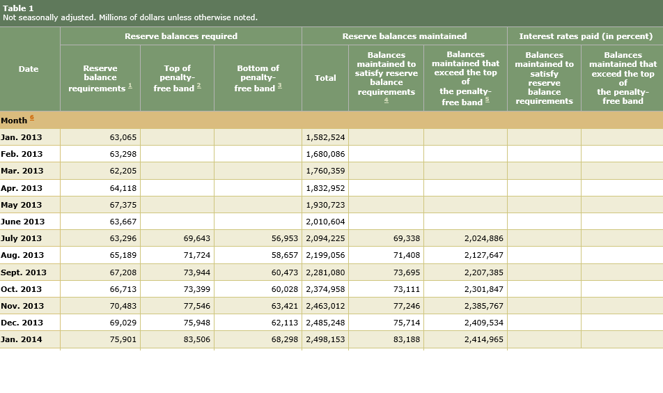
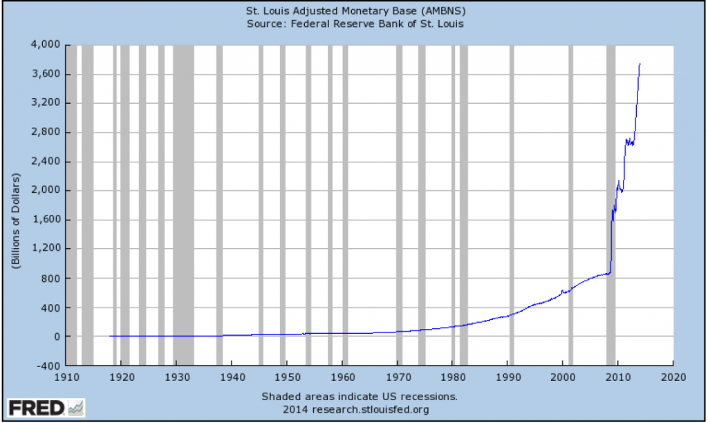
But taper (or tapir) not-withstanding, the real rhino in the room is the Fed balance sheet with its sort of crystalized excess reserve balances of US banks.

Currently US banks hold about $2.5 trillion in excess reserves. Here’s a Treasury Department table which shows how these excess reserves continue to skyrocket, and the level of reserves required by Fed authorities as security for the level of bank deposits.

FedReserveTableSo excess reserves held in the Fed have surged by $1 trillion over the last year, and required reserves are more than an order of magnitude less than these excess reserves.

The flip side of these excess reserves is expansion in the US monetary base.

StLouisAdjMonBase

The monetary base series above shows total bank reserves and the currency stock, plus adjustments. This is what Milton Friedman often called “high powered money,” since it is available immediately for bank loans.

But there have been few loans, and that is one important point.

Barry Ritholz has been following this dramatic surge in the US money supply and bank excess reserves. See, for example, his post from mid-2013 81.5% of QE Money Is Not Helping the Economy, where he writes,

We’ve repeatedly pointed out that the Federal Reserve has been intentionally discouraged banks from lending to Main Street – in a misguided attempt to curb inflation – which has increased unemployment and stalled out the economy.

Ritholz backs this claim with careful research into and citation of Fed documents and other pertinent materials.

Bottom line – there is strong evidence the new Fed policy of paying interest on bank reserves is a deliberate attempt to create a firewall between the impacts of quantitative easing and inflation. The only problem is that all this new money that has been created misses Main Street, for the most part, but fuels financial speculation here and abroad.

Some Credit Where Credit Is Due

Admittedly, though, the Federal Reserve has done a lot of heavy lifting since the financial crises in 2008.

Created in 1913, the Federal Reserve Bank is a “bank of banks,” whose primary depositors are commercial banks. The Fed is charged with maintaining stable prices and employment, objectives not always in synch with each other.

Under the previous Chairman, Ben Bernacke, the Fed led the way into new policy responses to problems such as potential global financial collapse and high, persisting levels of unemployment.

The core innovation has been purchase of assets apart from conventional US Treasury securities – formerly the policy core of Open Market Operations. With the threat of global financial collapse surrounding the bankruptcies of Bear Stearns and then Lehman Brothers in 2008, the Treasury and the Fed swung into action with programs like the TARP and the bailout of AIG, a giant insurance concern which made a lot of bad bets (mainly credit default swaps) and was “too big to fail.”

Other innovations followed, such as payment of interest by the Fed on reserve deposits of commercial banks, as well as large purchases of mortgage securities, bolstering the housing market and tamping down long term interest rates.

The Fed has done this in a political context generally unfavorable to the type of fiscal stimulus which might be expected, given the severity of the unemployment problems. The new Chair, Janet Yellen, for example, has noted that cutbacks at the state level following on the recession of 2008-2009 might well have been the occasion for more ambitious federal economic stimulus. This, however, was blocked by Congress.

As a result, the Fed has borne a disproportionate share of the burden of rebuilding the balance sheets of US banks, stabilizing housing markets, and pushing forward at least some type of economic recovery.

This is not to lionize the Fed, since many criticisms can be made.

The Rhino

In terms of forecasting, however, the focus must be on the rhino in the room growing bigger all the time. Can it be led peaceably outside to pasture, for a major weight reduction to something like a pony, again?

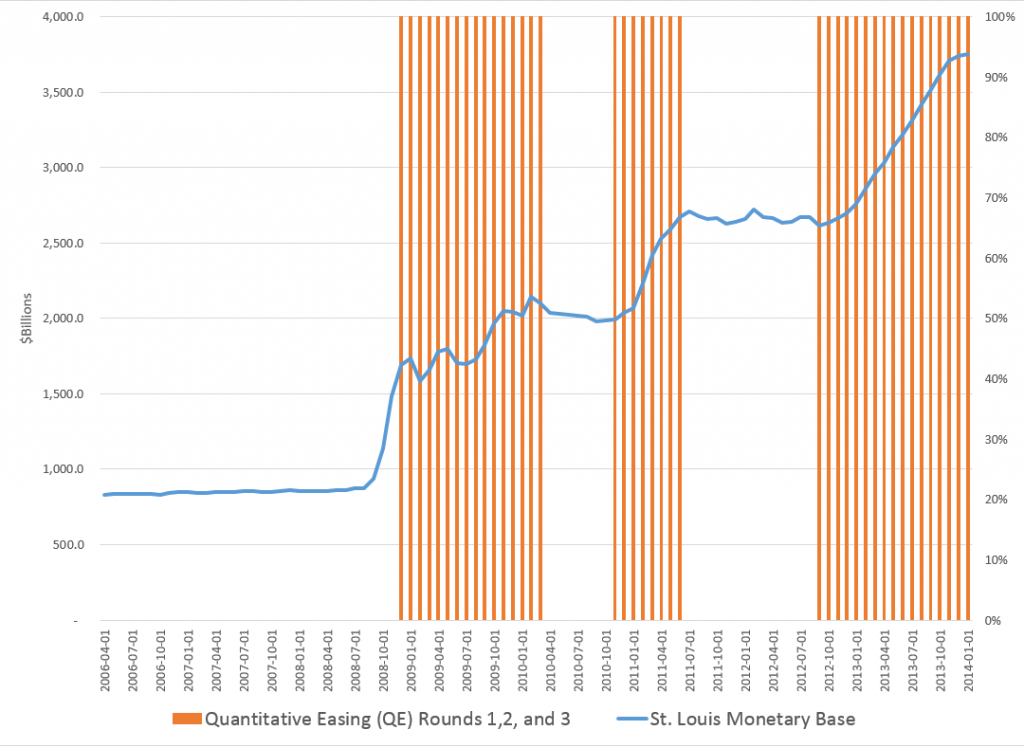
With apologies for mixed metaphors, the following chart highlights the issue.

FedMBandQEgraph

This shows the total of the “monetary base” dating from the beginning of 2006. The red shaded areas of the graph indicate the time windows in which the various “Quantitative Easing” (QE) policies have been in effect – now three QE’s, QE1, QE2, and QE3.

Another problem concerns the composition of the Fed holdings which balance off against these reserves. The Fed has invested and is investing heavily in mortgage-backed securities, and has other sorts of non-traditional assets in its portfolio. In fact, given the lack-luster growth and employment in the US economy since 2008, the Fed has been one of the primary forces supporting “recovery” and climbing prices in the housing market.

So there are really two problems. First, the taper. Then, the “winding down” of Fed positions in these assets.

Chairperson Yellen has her hands full – and this is not even to mention the potential hair-rending that would unfold, were another recession to start later this year or in 2015 – perhaps due to political wars over the US debt limit, upheavals in emerging markets, or further self-defeating moves by the “leadership” of the EU.

Sayings of the Top Macro Forecasters

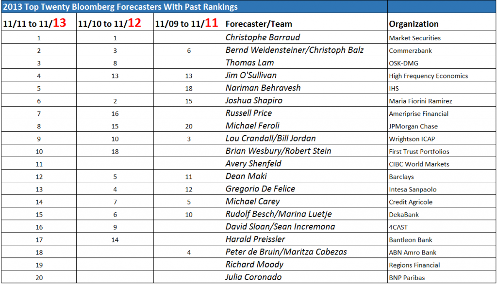
Yesterday, I posted the latest Bloomberg top twenty US macroeconomic forecaster rankings, also noting whether this current crop made it into the top twenty in previous “competitions” for November 2010-November 2012 or November 2009-November 2011.

It turns out the Bloomberg top twenty is relatively stable. Seven names or teams on the 2014 list appear in both previous competitions. Seventeen made it into the top twenty at least twice in the past three years.

But who are these people and how can we learn about their forecasts on a real-time basis?

Well, as you might guess, this is a pretty exclusive club. Many are Chief Economists and company Directors in investment advisory organizations serving private clients. Several did a stint on the staff of the Federal Reserve earlier in their career. Their public interface is chiefly through TV interviews, especially Bloomberg TV, or other media coverage.

I found a couple of exceptions, however – Michael Carey and Russell Price.

Michael Carey and Crédit Agricole

Michael Carey is Chief Economist North America Crédit Agricole CIB. He ranked 14, 7, and 5, based on his average scores for his forecasts of the key indicators in these three consecutive competitions. He apparently is especially good on employment forecasts.

MikeCarey

Carey is a lead author for a quarterly publication from Crédit Agricole called Prospects Macro.

The Summary for the current issue (1st Quarter 2014) caught my interest –

On the economic trend front, an imperfect normalisation seems to be getting underway. One may talk about a normalisation insofar as – unlike the two previous financial years – analysts have forecast a resumption of synchronous growth in the US, the Eurozone and China. US growth is forecast to rise from 1.8% in 2013 to 2.7%; Eurozone growth is slated to return to positive territory, improving from -0.4% to +1.0%; while Chinese growth is forecast to dip slightly, from 7.7% to 7.2%, which does not appear unwelcome nor requiring remedial measures. The imperfect character of the forecast normalisation quickly emerges when one looks at the growth predictions for 2015. In each of the three regions, growth is not gathering pace, or only very slightly. It is very difficult to defend the idea of a cyclical mechanism of self-sustaining economic acceleration. This observation seems to echo an ongoing academic debate: growth in industrialised countries seems destined to be weak in the years ahead. Partly, this is because structural growth drivers seem to be hampered (by demographics, debt and technology shocks), and partly because real interest rates seem too high and difficult to cut, with money-market rates that are already virtually at zero and low inflation, which is likely to last. For the markets, monetary policies can only be ‘reflationist’. Equities prices will rise until they come upagainst the overvaluation barrier and long-term rates will continue to climb, but without reaching levels justified by growth and inflation fundamentals.

I like that – an “imperfect normalization” (note the British spelling). A key sentence seems to be “It is very difficult to defend the idea of a cyclical mechanism of self-sustaining economic acceleration.”

So maybe the issue is 2015.

The discussion of emerging markets prospects is well-worth quoting also.

At 4.6% (and 4.2% excluding China), average growth in 2013 across all emerging countries seems likely to have been at its lowest since 2002, apart from the crisis year of 2009. Despite the forecast slowdown in China (7.2%, after 7.7%), the overall pace of growth for EMs is likely to pick up slightly in 2014 (to 4.8%, and 4.5% excluding China). The trend is likely to continue through 2015. This modest rebound, despite the poor growth figures expected from Brazil, is due to the slightly improved performance of a few other large emerging economies such as India, and above all Mexico, South Korea and some Central European countries. As regards the content of this growth, it is investment that should improve, on the strength of better growth prospects in the industrialised countries…

The growth differential with the industrialised countries has narrowed to around 3%, whereas it had stood at around 5% between 2003 and 2011…

This situation is unlikely to change radically in 2014. Emerging markets should continue to labour under two constraints. First off, the deterioration in current accounts has worsened as a result of fairly weak external demand, stagnating commodity prices, and domestic demand levels that are still sticky in many emerging countries…Commodity-exporting countries and most Asian exporters of manufactured goods are still generating surpluses, although these are shrinking. Conversely, large emerging countries such as India, Indonesia, Brazil, Turkey and South Africa are generating deficits that are in some cases reaching alarming proportions – especially in Turkey. These imbalances could restrict growth in 2014-15, either by encouraging governments to tighten monetary conditions or by limiting access to foreign financing.

Secondly, most emerging countries are now paying the price for their reluctance to embrace reform in the years of strong global growth prior to the great global financial crisis. This price is today reflected in falling potential growth levels in some emerging countries, whose weaknesses are now becoming increasingly clear. Examples are Russia and its addiction to commodities; Brazil and its lack of infrastructure, low savings rate and unruly inflation; India and its lack of infrastructure, weakening rate of investment and political dependence of the Federal state on the federated states. Unfortunately, the less favourable international situation (think rising interest rates) and local contexts (eg, elections in India and Brazil in 2014) make implementing significant reforms more difficult over the coming quarters. This is having a depressing effect on prospects for growth

I’m subscribing to notices of updates to this and other higher frequency reports from Crédit Agricole.

Russell Price and Ameriprise

Russell Price, younger than Michael Carey, was Number 7 on the current Bloomberg list of top US macro forecasters, ranking 16 the previous year. He has his own monthly publication with Ameriprise called Economic Perspectives.

RussellPrice

The current issue dated January 28, 2014 is more US-centric, and projects a “modest pace of recovery” for the “next 3 to 5 years.” Still, the current issue warns that analyst projections of company profits are probably “overly optimistic.”

I need to read one or two more of the issues to properly evaluate, but Economic Perspectives is definitely a cut above the average riff on macroeconomic prospects.

Another Way To Tap Into Forecasts of the Top Bloomberg Forecasters

The Wall Street Journal’s Market Watch is another way to tap into forecasts from names and teams on the top Bloomberg lists.

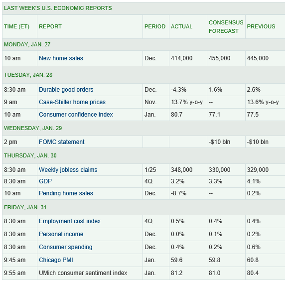
The Market Watch site publishes weekly median forecasts based on the 15 economists who have scored the highest in our contest over the past 12 months, as well as the forecasts of the most recent winner of the Forecaster of the Month contest.

The economists in the Market Watch consensus forecast include many currently or recently in the top twenty Bloomberg list – Jim O’Sullivan of High Frequency Economics, Michael Feroli of J.P. Morgan, Paul Edelstein of IHS Global Insight, Brian Jones of Société Générale, Spencer Staples of EconAlpha, Ted Wieseman of Morgan Stanley, Jan Hatzius’s team at Goldman Sachs, Stephen Stanley of Pierpont Securities, Avery Shenfeld of CIBC, Maury Harris’s team at UBS, Brian Wesbury and Robert Stein of First Trust, Jeffrey Rosen of Briefing.com, Paul Ashworth of Capital Economics, Julia Coronado of BNP Paribas, and Eric Green’s team at TD Securities.

And I like the format of doing retrospectives on these consensus forecasts, in tables such as this:
MarketWatchTable

So what’s the bottom line here? Well, to me, digging deeper into the backgrounds of these top ranked forecasters, finding access to their current thinking is all part of improving competence.

I can think of no better mantra than Malcolm Gladwell’s 10,000 Hour Rule –

Top Bloomberg Macro Forecaster Rankings for 2014

Bloomberg compiles global rankings for forecasters of US macro variables, based on their forecasts of a range of key monthly indicators. The rankings are based on performance over two year periods, ending November in the year the rankings are announced.

Here is a summary sheet for the past three years for the top twenty US macroeconomic forecasters or forecasting teams, with their organizational affiliation (click to enlarge).

Top Bloomberg rankings

SOURCES: http://www.christophe-barraud.com/wp-content/uploads/2014/01/Classement-Bloomberg-janvier-20141.pdf, http://www.bloomberg.com/bb/avfile/r5M7ODl4WNms, https://www.economy.com/home/products/samples/2012-01-20-Bloomberg.pdf

The list of top forecasters for the US economy has been fairly stable recently. At least seventeen out of the top twenty forecasters for the US are listed twice; six forecasters or forecasting teams made the top list in all three periods.

Interestingly, European forecasters have recently taken the lead. Bloomberg News notes Number One – Christophe Barraud is only 27 years old, and developed an interest in forecasting, apparently, as a teenager, when he and his dad bet on horses at tracks near Nice, France.

In the most recent ranking, key indicators include CPI, Durable Goods Orders, Existing Home Sales, Housing Starts, IP, ISM Manufacturing, ISM Nonmanufacturing, New Home Sales, Nonfarm Payrolls, Personal Income, Personal Spending, PPI, Retail Sales, Unemployment and GDP. A total of 68 forecasters or forecasting teams qualified for and participated in the ranking exercise.

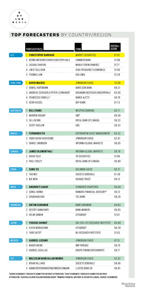
Bloomberg Markets also announced other regional rankings, shown in this infographic

Bloombergmarkets And as a special treat this Friday, for the collectors among readers, here is the Ben Bernacke commemorative baseball card, developed at the Fed as a going away present.

Bernacke

Didier Sornette – Celebrity Bubble Forecaster

Professor Didier Sornette, who holds the Chair in Entreprenuerial Risks at ETH Zurich, is an important thinker, and it is heartening to learn the American Association for the Advancement of Science (AAAS) is electing Professor Sornette a Fellow.

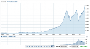
It is impossible to look at, say, the historical performance of the S&P 500 over the past several decades, without concluding that, at some point, the current surge in the market will collapse, as it has done previously when valuations ramped up so rapidly and so far.

S&P500recent

Sornette focuses on asset bubbles and has since 1998, even authoring a book in 2004 on the stock market.

At the same time, I think it is fair to say that he has been largely ignored by mainstream economics (although not finance), perhaps because his training is in physical science. Indeed, many of his publications are in physics journals – which is interesting, but justified because complex systems dynamics cross the boundaries of many subject areas and sciences.

Over the past year or so, I have perused dozens of Sornette papers, many from the extensive list at http://www.er.ethz.ch/publications/finance/bubbles_empirical.

This list is so long and, at times, technical, that videos are welcome.

Along these lines there is Sornette’s Ted talk (see below), and an MP4 file which offers an excellent, high level summary of years of research and findings. This MP4 video was recorded at a talk before the International Center for Mathematical Sciences at the University of Edinburgh.

Intermittent criticality in financial markets: high frequency trading to large-scale bubbles and crashes. You have to download the file to play it.

By way of précis, this presentation offers a high-level summary of the roots of his approach in the economics literature, and highlights the role of a central differential equation for price change in an asset market.

So since I know everyone reading this blog was looking forward to learning about a differential equation, today, let me highlight the importance of the equation,

dp/dt = cpd

This basically says that price change in a market over time depends on the level of prices – a feature of markets where speculative forces begin to hold sway.

This looks to be a fairly simple equation, but the solutions vary, depending on the values of the parameters c and d. For example, when c>0 and the exponent d  is greater than one, prices change faster than exponentially and within some finite period, a singularity is indicated by the solution to the equation. Technically, in the language of differential equations this is called a finite time singularity.

Well, the essence of Sornette’s predictive approach is to estimate the parameters of a price equation that derives, ultimately, from this differential equation in order to predict when an asset market will reach its peak price and then collapse rapidly to lower prices.

The many sources of positive feedback in asset pricing markets are the basis for the faster than exponential growth, resulting from d>1. Lots of empirical evidence backs up the plausibility and credibility of herd and imitative behaviors, and models trace out the interaction of prices with traders motivated by market fundamentals and momentum traders or trend followers.

Interesting new research on this topic shows that random trades could moderate the rush towards collapse in asset markets – possibly offering an alternative to standard regulation.

The important thing, in my opinion, is to discard notions of market efficiency which, even today among some researchers, result in scoffing at the concept of asset bubbles and basic sabotage of research that can help understand the associated dynamics.

Here is a TED talk by Sornette from last summer.

Simulating the SPDR SPY Index

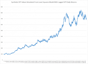
Here is a simulation of the SPDR SPY exchange traded fund index, using an autoregressive model estimated with maximum likehood methods, assuming the underlying distribution is not normal, but is instead a Student t distribution.

SimulatedSPY

The underlying model is of the form

SPYRRt=a0+a1SPYRRt-1…a30SPYRRt-30

Where SPYRR is the daily return (trading day to trading day) of the SPY, based on closing prices.

This is a linear model, and an earlier post lists its exact parameters or, in other words, the coefficients attached to each of the lagged terms, as well as the value of the constant term.

This model is estimated on a training sample of daily returns from 1993 to 2008, and, is applied to out-of-sample data from 2008 to the present. It predicts about 53 percent of the signs of the next-day-returns correctly. The model generates more profits in the 2008 to the present period than a Buy & Hold strategy.

The simulation listed above uses the model equation and parameters, generating a series of 4000 values recursively, adding in randomized error terms from the fit of the equation to the training or estimation data.

This is work-in-progress. Currently, I am thinking about how to properly incorporate volatility. Obviously, any number of realizations are possible. The chart shows one of them, which has an uncanny resemblance to the actual historical series, due to the fact that volatility is created over certain parts of the simulation, in this case by chance.

To review, I set in motion the following process:

  1. Predict a xt = f(xt-1,..,xt-30) based on the 30 coefficients and a constant term from the autoregressive model, applied to 30 preceding values of xt generated by this process (The estimation is initialized with the first 30 actual values of the test data).
  2. Randomly select a residual for this xt based on the empirical distribution of errors from the fit of the predictive relationship to the training set.
  3. Iterate.

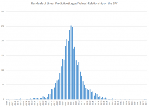
The error distribution looks like this.

MLresidualsSPY

This is obviously not a normal distribution, since “too many” predictive errors are concentrated around the zero error line.

For puzzles and problems, this is a fertile area for research, and you can make money. But obviously, be careful.

In any case, I think this research, in an ultimate analysis, converges to the work being done by Didier Sornette and his co-researchers and co-authors. Sornette et al develop an approach through differential equations, focusing on critical points where a phase shift occurs in trading with a rapid collapse of an asset bubble. 

This approach comes at similar, semi-periodic, logarithmically increasing values through linear autoregressive equations, which, as is well known, have complex dynamics when analyzed as difference equations.

The prejudice in economics and econometrics that “you can’t predict the stock market” is an impediment to integrating these methods. 

While my research on modeling stock prices is a by-product of my general interest in forecasting and quantitative techniques, I may have an advantage because I will try stuff that more seasoned financial analysts may avoid, because they have been told it does not work.

So I maintain it is possible, at least in the era of quantitative easing (QE), to profit from autoregressive models of daily returns on a major index like the SPY. The models are, admittedly, weak predictors, but they interact with the weird error structure of SPY daily returns in interesting ways. And, furthermore, it is possible for anyone to verify my claims simply by calculating the predictions for the test period from 2008 to the present and then looking at what a Buy & Hold Strategy would have done over the same period.

In this post, I reverse the process. I take one of my autoregressive models and generate, by simulation, time series that look like historical SPY daily values.

On Sornette, about which I think we will be hearing more, since currently the US stock market seems to be in correction model, see – Turbulent times ahead: Q&A with economist Didier Sornette. Also check http://www.er.ethz.ch/presentations/index.

Sales and new product forecasting in data-limited (real world) contexts