Some Comments on Forecasting High and Low Stock Prices

I want to pay homage to Paul Erdős, the eccentric Hungarian-British-American-Israeli mathematician, whom I saw lecture a few years before his death. Erdős kept producing work in mathematics into his 70’s and 80’s – showing this is quite possible. Of course, he took amphetamines and slept on people’s couches while he was doing this work in combinatorics, number theory, and probability.

erdos

In any case, having invoked Erdős, let me offer comments on forecasting high and low stock prices – a topic which seems to be terra incognita, for the most part, to financial research.

First, let’s take a quick look at a chart showing the maximum prices reached by the exchange traded fund QQQ over a critical period during the last major financial crisis in 2008-2009.

MaxHighChart

The graph charts five series representing QQQ high prices over periods extending from 1 day to 40 days.

The first thing to notice is that the variability of these time series decreases as the period for the high increases.

This suggests that forecasting the 40 day high could be easier than forecasting the high price for, say, tomorrow.

While this may be true in some sense, I want to point out that my research is really concerned with a slightly different problem.

This is forecasting ahead by the interval for the maximum prices. So, rather than a one-day-ahead forecast of the 40 day high price (which would include 39 known possible high prices), I forecast the high price which will be reached over the next 40 days.

This problem is better represented by the following chart.

Sampled5Highs

This chart shows the high prices for QQQ over periods ranging from 1 to 40 days, sampled at what you might call “40 day frequencies.”

Now I am not quite going to 40 trading day ahead forecasts yet, but here are results for backtests of the algorithm which produces 20-trading-day-ahead predictions of the high for QQQ.

20Dayforecast

The blue lines shows the predictions for the QQQ high, and the orange line indicates the actual QQQ highs for these (non-overlapping) 20 trading day intervals. As you can see, the absolute percent errors – the grey bars – are almost all less than 1 percent error.

Random Walk

Now, these results are pretty good, and the question arises – what about the random walk hypothesis for stock prices?

Recall that a simple random walk can be expressed by the equation xt=xt-1 + εt where εt is conventionally assumed to be distributed according to N(0,σ) or, in other words, as a normal distribution with zero mean and constant variance σ.

An interesting question is whether the maximum prices for a stock whose prices follow a random walk also can be described, mathematically, as a random walk.

This is elementary, when we consider that any two observations in a time series of random walks can be connected together as xt+k = xt + ω where ω is distributed according to a Gaussian distribution but does not necessarily have a constant variance for different values of the spacing parameter k.

From this it follows that the methods producing these predictions or forecasts of the high of QQQ over periods of several trading days also are strong evidence against the underlying QQQ series being a random walk, even one with heteroskedastic errors.

That is, I believe the predictability demonstrated for these series are more than cointegration relationships.

Where This is Going

While demonstrating the above point could really rock the foundations of finance theory, I’m more interested, for the moment, in exploring the extent of what you can do with these methods.

Very soon I’m going to post on how these methods may provide signals as to turning points in stock market prices.

Stay tuned, and thanks for your comments and questions.

Erdős picture from Encyclopaedia Britannica

Update and Extension – Weekly Forecasts of QQQ and Other ETF’s

Well, the first official forecast rolled out for QQQ last week.

It did relatively well. Applying methods I have been developing for the past several months, I predicted the weekly high for QQQ last week at 108.98.

In fact, the high price for QQQ for the week was 108.38, reached Monday, April 13.

This means the forecast error in percent terms was 0.55%.

It’s possible to look more comprehensively at the likely forecast errors with my approach with backtesting.

Here is a chart showing backtests for the “proximity variable method” for the QQQ high price for five day trading periods since the beginning of 2015.

QQQupdate

The red bars are errors, and, from their axis on the right, you can see most of these are below 0.5%.

This is encouraging, and there are several adjustments which may improve forecasting performance beyond this level of accuracy I want to explore.

So here is the forecast of the high prices that will be reached by QQQ and SPY for the week of April 20-24.

ForecastTab1

As you can see, I’ve added SPY, an ETF tracking the S&P500.

I put this up on Businessforecastblog because I seek to make a point – namely, that I believe methods I have developed can produce much more accurate forecasts of stock prices.

It’s often easier and more compelling to apply forecasting methods and show results, than it is to prove theoretically or otherwise argue that a forecasting method is worth its salt.

Disclaimer –  These forecasts are for informational purposes only. If you make investments based on these numbers, it is strictly your responsibility. Businessforecastblog is not responsible or liable for any potential losses investors may experience in their use of any forecasts presented in this blog.

Well, I am working on several stock forecasts to add to projections for these ETF’s – so will expand this feature in forthcoming Mondays.

Predicting the High Reached by the SPY ETF 30 Days in Advance – Some Results

Here are some backtests of my new stock market forecasting procedures.

Here, for example, is a chart showing the performance of what I call the “proximity variable approach” in predicting the high price of the exchange traded fund SPY over 30 day forward periods (click to enlarge).

3oDaySPY

So let’s be clear what the chart shows.

The proximity variable approach- which so far I have been abbreviating as “PVar” – is able to identify the high prices reached by the SPY in the coming 30 trading days with forecast errors mostly under 5 percent. In fact, the MAPE for this approximately ten year period is 3 percent. The percent errors, of course, are charted in red with their metric on the axis to the right.

The blue line traces out the predictions, and the grey line shows the actual highs by 30 trading day period.

These results far surpass what can be produced by benchmark models, such as the workhorse No Change model, or autoregressive models.

Why not just do this month-by-month?

Well, months have varying numbers of trading days, and I have found I can boost accuracy by stabilizing the number of trading days considered in the algorithm.

Comments

Realize, of course, that a prediction of the high price that a stock or ETF will reach in a coming period does not tell you when the high will be reached – so it does not immediately translate to trading profits. The high in question could come with the opening price of the period, for example, leaving you out of the money, if you hear there is this big positive prediction of growth and then jump in the market.

However, I do think that market participants react to anticipated increases or decreases in the high or low of a security.

You might explain these results as follows. Traders react to fairly simple metrics predicting the high price which will be reached in the next period – and let this concept be extensible from a day to a month in this discussion. In so reacting, these traders tend to make such predictive models self-fulfilling.

Therefore, daily prices – the opening, the high, the low, and the closing prices – encode a lot more information about trader responses than is commonly given in the literature on stock market forecasting.

Of course, increasingly, scholars and experts are chipping away at the “efficient market hypothesis” and showing various ways in which stock market prices are predictable, or embody an element of predictability.

However, combing Google Scholar and other sources, it seems almost no one has taken the path to modeling stock market prices I am developing here. The focus in the literature is on closing prices and daily returns, for example, rather than high and low prices.

I can envision a whole research program organized around this proximity variable approach, and am drawn to taking this on, reporting various results on this blog.

If any readers would like to join with me in this endeavor, or if you know of resources which would be available to support such a project – feel free to contact me via the Comments and indicate, if you wish, whether you want your communication to be private.

Let’s Get Real Here – QQQ Stock Price Forecast for Week of April 13-17

The thing I like about forecasting is that it is operational, rather than merely theoretical. Of course, you are always wrong, but the issue is “how wrong?” How close do the forecasts come to the actuals?

I have been toiling away developing methods to forecast stock market prices. Through an accident of fortune, I have come on an approach which predicts stock prices more accurately than thought possible.

After spending hundreds of hours over several months, I am ready to move beyond “backtesting” to provide forward-looking forecasts of key stocks, stock indexes, and exchange traded funds.

For starters, I’ve been looking at QQQ, the PowerShares QQQ Trust, Series 1.

Invesco describes this exchange traded fund (ETF) as follows:

PowerShares QQQ™, formerly known as “QQQ” or the “NASDAQ- 100 Index Tracking Stock®”, is an exchange-traded fund based on the Nasdaq-100 Index®. The Fund will, under most circumstances, consist of all of stocks in the Index. The Index includes 100 of the largest domestic and international nonfinancial companies listed on the Nasdaq Stock Market based on market capitalization. The Fund and the Index are rebalanced quarterly and reconstituted annually.

This means, of course, that QQQ has been tracking some of the most dynamic elements of the US economy, since its inception in 1999.

In any case, here is my forecast, along with tracking information on the performance of my model since late January of this year.

QQQForecast

The time of this blog post is the morning of April 13, 2015.

My algorithms indicate that the high for QQQ this week will be around $109 or, more precisely, $108.99.

So this is, in essence, a five day forecast, since this high price can occur in any of the trading days of this week.

The chart above shows backtests for the algorithm for ten weeks. The forecast errors are all less than 0.65% over this history with a mean absolute percent error (MAPE) of 0.34%.

So that’s what I have today, and count on succeeding installments looking back and forward at the beginning of the next several weeks (Monday), insofar as my travel schedule allows this.

Also, my initial comments on this post appear to offer a dig against theory, but that would be unfair, really, since “theory” – at least the theory of new forecasting techniques and procedures – has been very important in my developing these algorithms. I have looked at residuals more or less as a gold miner examines the chat in his pan. I have considered issues related to the underlying distribution of stock prices and stock returns – NOTE TO THE UNINITIATED – STOCK PRICES ARE NOT NORMALLY DISTRIBUTED. There is indeed almost nothing about stocks or stock returns which is related to the normal probability distribution, and I think this has been a huge failing of conventional finance, the Black Scholes Theorem, and the like.

So theory is important. But you can’t stop there.

This should be interesting. Stay tuned. I will add other securities in coming weeks, and provide updates of QQQ forecasts.

Readers interested in the underlying methods can track back on previous blog posts (for example, Pvar Models for Forecasting Stock Prices or Time-Varying Coefficients and the Risk Environment for Investing).

Perspectives

Blogging gets to be enjoyable, although demanding. It’s a great way to stay in touch, and probably heightens personal mental awareness, if you do it enough.

The “Business Forecasting” focus allows for great breadth, but may come with political constraints.

On this latter point, I assume people have to make a living. Populations cannot just spend all their time in mass rallies, and in political protests – although that really becomes dominant at certain crisis points. We have not reached one of those for a long time in the US, although there have been mobilizations throughout the Mid-East and North Africa recently.

Nate Silver brought forth the “hedgehog and fox” parable in his best seller – The Signal and the Noise. “The fox knows many things, but the hedgehog knows one big thing.”

My view is that business and other forecasting endeavors should be “fox-like” – drawing on many sources, including, but not limited to quantitative modeling.

What I Think Is Happening – Big Picture

Global dynamics often are directly related to business performance, particularly for multinationals.

And global dynamics usually are discussed by regions – Europe, North America, Asia-Pacific, South Asia, the Mid-east, South American, Africa.

The big story since around 2000 has been the emergence of the People’s Republic of China as a global player. You really can’t project the global economy without a fairly detailed understanding of what’s going on in China, the home of around 1.5 billion persons (not the official number).

Without delving much into detail, I think it is clear that a multi-centric world is emerging. Growth rates of China and India far surpass those of the United States and certainly of Europe – where many countries, especially those along the southern or outer rim – are mired in high unemployment, deflation, and negative growth since just after the financial crisis of 2008-2009.

The “old core” countries of Western Europe, the United States, Canada, and, really now, Japan are moving into a “post-industrial” world, as manufacturing jobs are outsourced to lower wage areas.

Layered on top of and providing support for out-sourcing, not only of manufacturing but also skilled professional tasks like computer programming, is an increasingly top-heavy edifice of finance.

Clearly, “the West” could not continue its pre-World War II monopoly of science and technology (Japan being in the pack here somewhere). Knowledge had to diffuse globally.

With the GATT (General Agreement on Tariffs and Trade) and the creation of the World Trade Organization (WTO) the volume of trade expanded with reduction on tariffs and other barriers (1980’s, 1990’s, early 2000’s).

In the United States the urban landscape became littered with “Big Box stores” offering shelves full of clothing, electronics, and other stuff delivered to the US in the large shipping containers you see stacked hundreds of feet high at major ports, like San Francisco or Los Angeles.

There is, indeed, a kind of “hollowing out” of the American industrial machine.

Possibly it’s only the US effort to maintain a defense establishment second-to-none and of an order of magnitude larger than anyone elses’ that sustains certain industrial activities shore-side. And even that is problematical, since the chain of contracting out can be complex and difficult and costly to follow, if you are a US regulator.

I’m a big fan of post-War Japan, in the sense that I strongly endorse the kinds of evaluations and decisions made by the Japanese Ministry of International Trade and Investment (MITI) in the decades following World War II. Of course, a nation whose industries and even standing structures lay in ruins has an opportunity to rebuild from the ground up.

In any case, sticking to a current focus, I see opportunities in the US, if the political will could be found. I refer here to the opportunity for infrastructure investment to replace aging bridges, schools, seaport and airport facilities.

In case you had not noticed, interest rates are almost zero. Issuing bonds to finance infrastructure could not face more favorable terms.

Another option, in my mind – and a hat-tip to the fearsome Walt Rostow for this kind of thinking – is for the US to concentrate its resources into medicine and medical care. Already, about one quarter of all spending in the US goes to health care and related activities. There are leading pharma and biotech companies, and still a highly developed system of biomedical research facilities affiliated with universities and medical schools – although the various “austerities” of recent years are taking their toll.

So, instead of pouring money down a rathole of chasing errant misfits in the deserts of the Middle East, why not redirect resources to amplify the medical industry in the US? Hospitals, after all, draw employees from all socioeconomic groups and all ethnicities. The US and other national populations are aging, and will want and need additional medical care. If the world could turn to the US for leading edge medical treatment, that in itself could be a kind of foreign policy, for those interested in maintaining US international dominance.

Tangential Forces

While writing in this vein, I might as well offer my underlying theory of social and economic change. It is that major change occurs primarily through the impact of tangential forces, things not fully seen or anticipated. Perhaps the only certainty about the future is that there will be surprises.

Quite a few others subscribe to this theory, and the cottage industry in alarming predictions of improbable events – meteor strikes, flipping of the earth’s axis, pandemics – is proof of this.

Really, it is quite amazing how the billions on this planet manage to muddle through.

But I am thinking here of climate change as a tangential force.

And it is also a huge challenge.

But it is a remarkably subtle thing, not withstanding the on-the-ground reality of droughts, hurricanes, tornados, floods, and so forth.

And it is something smack in the sweet spot of forecasting.

There is no discussion of suitable responses to climate change without reference to forecasts of global temperature and impacts, say, of significant increases in sea level.

But these things take place over many years and, then, boom a whole change of regime may be triggered – as ice core and other evidence suggests.

Flexibility, Redundancy, Avoidance of Over-Specialization

My brother (by a marriage) is a priest, formerly a tax lawyer. We have begun a dialogue recently where we are looking for some basis for a new politics and new outlook, really that would take the increasing fragility of some of our complex and highly specialized systems into account – creating some backup systems, places, refuges, if you will.

I think there is a general principle that we need to empower people to be able to help themselves – and I am not talking about eliminating the social safety net. The ruling groups in the United States, powerful interests, and politicians would be well advised to consider how we can create spaces for people “to do their thing.” We need to preserve certain types of environments and opportunities, and have a politics that speaks to this, as well as to how efficiency is going to be maximized by scrapping local control and letting global business from wherever come in and have its way – no interference allowed.

The reason Reid and I think of this as a search for a new politics is that, you know, the counterpoint is that all these impediments to getting the best profits possible just result in lower production levels, meaning then that you have not really done good by trying to preserve land uses or local agriculture, or locally produced manufactures.

I got it from a good source in Beijing some years ago that the Chinese Communist Party believes that full-out growth of production, despite the intense pollution, should be followed for a time, before dealing with that problem directly. If anyone has any doubts about the rationality of limiting profits (as conventionally defined), I suggest they spend some time in China during an intense bout of urban pollution somewhere.

Maybe there are abstract, theoretical tools which could be developed to support a new politics. Why not, for example, quantify value experienced by populations in a more comprehensive way? Why not link achievement of higher value differently measured with direct payments, somehow? I mean the whole system of money is largely an artifact of cyberspace anyway.

Anyway – takeaway thought, create spaces for people to do their thing. Pretty profound 21st Century political concept.

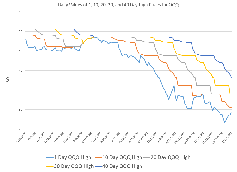
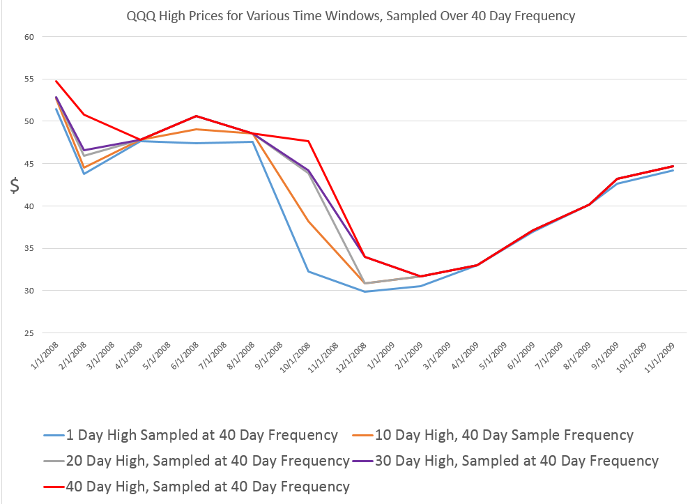
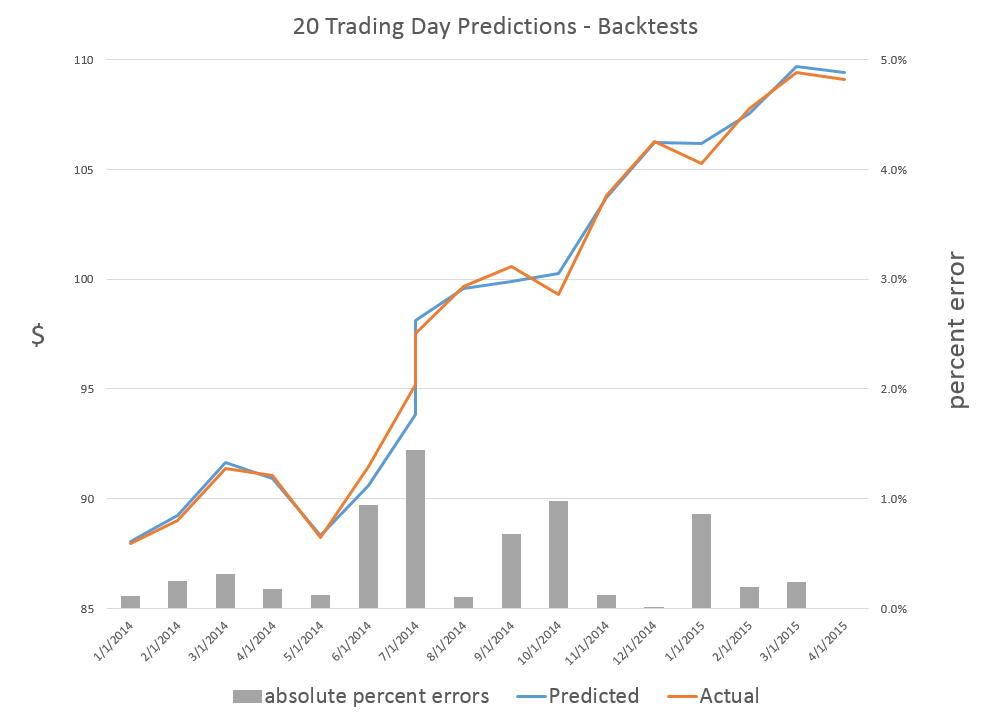
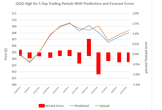
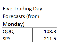
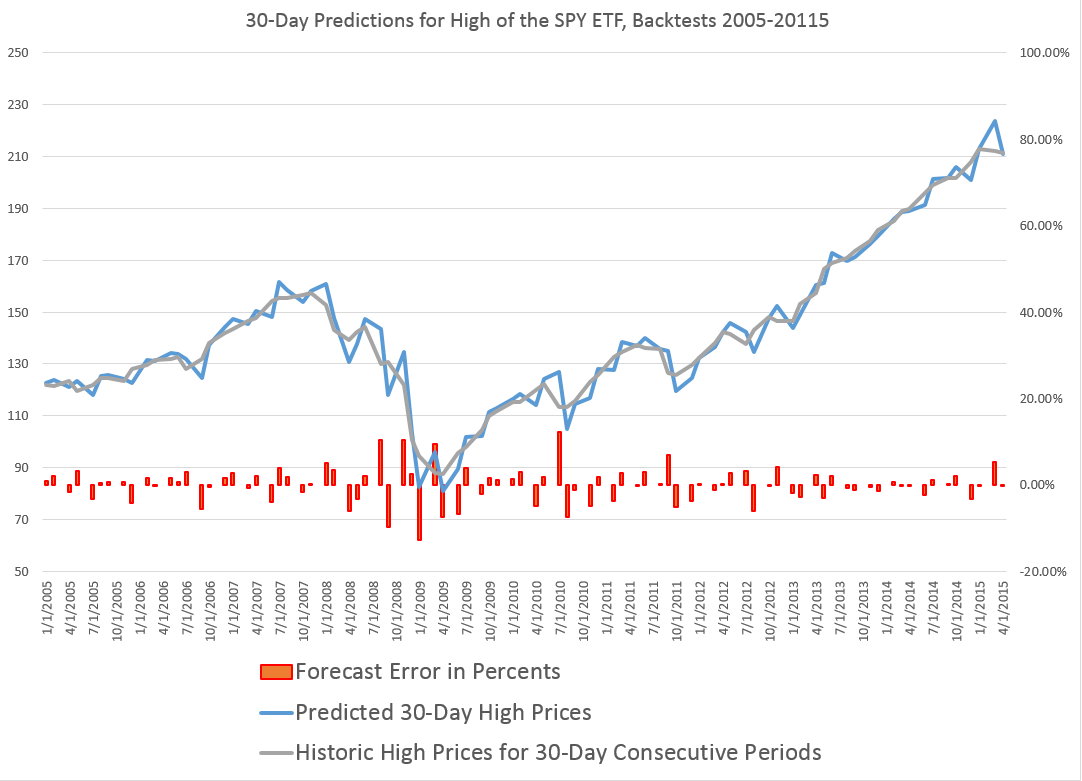
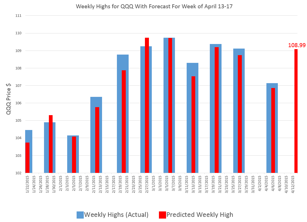
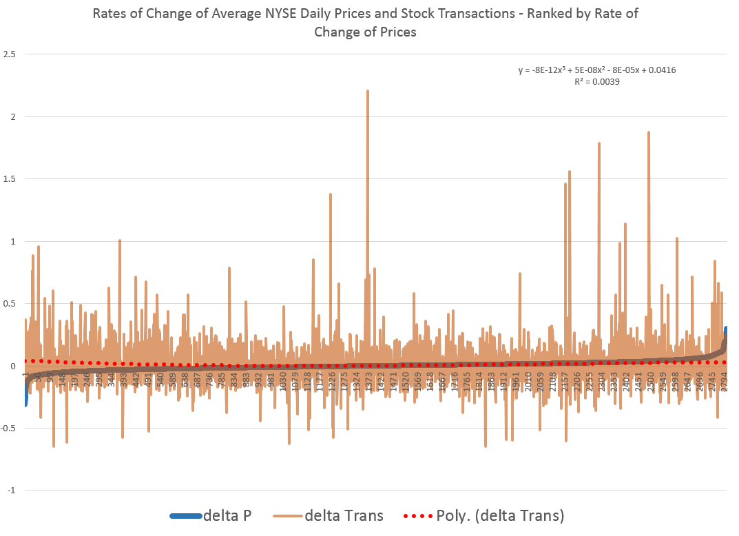
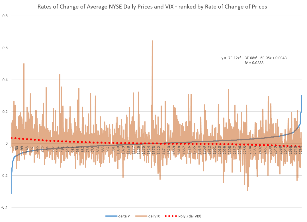
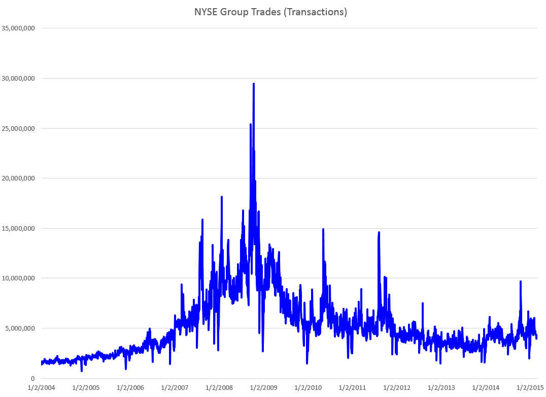
Coming attractions here – more on predicting the stock market (a new approach), summaries of outlooks for the year by major sources (banks, government agencies, leading economists), megatrends, forecasting controversies.

Top picture from FIREBELLY marketing

Links – Data Science

I’ve always thought the idea of “data science” was pretty exciting. But what is it, how should organizations proceed when they want to hire “data scientists,” and what’s the potential here?

Clearly, data science is intimately associated with Big Data. Modern semiconductor and computer technology make possible rich harvests of “bits” and “bytes,” stored in vast server farms. Almost every personal interaction can be monitored, recorded, and stored for some possibly fiendish future use, along with what you might call “demographics.” Who are you? Where do you live? Who are your neighbors and friends? Where do you work? How much money do you make? What are your interests, and what websites do you browse? And so forth.

As Edward Snowden and others point out, there is a dark side. It’s possible, for example, all phone conversations are captured as data flows and stored somewhere in Utah for future analysis by intrepid…yes, that’s right…data scientists.

In any case, the opportunities for using all this data to influence buying decisions, decide how to proceed in business, to develop systems to “nudge” people to do the right thing (stop smoking, lose weight), and, as I have recently discovered – do good, are vast and growing. And I have not even mentioned the exploding genetics data from DNA arrays and its mobilization to, for example, target cancer treatment.

The growing body of methods and procedures to make sense of this extensive and disparate data is properly called “data science.” It’s the blind man and the elephant problem. You have thousands or millions of rows of cases, perhaps with thousands or even millions of columns representing measurable variables. How do you organize a search to find key patterns which are going to tell your sponsors how to do what they do better?

Hiring a Data Scientist

Companies wanting to “get ahead of the curve” are hiring data scientists – from positions as illustrious and mysterious as Chief Data Scientist to operators in what are almost now data sweatshops.

But how do you hire a data scientist if universities are not granting that degree yet, and may even be short courses on “data science?”

I found a terrific article – How to Consistently Hire Remarkable Data Scientists.

It cites Drew Conway’s data science Venn Diagram suggesting where data science falls in these intersecting areas of knowledge and expertise.

DataScienceVenn

This article, which I first found in a snappy new compilation Data Elixir also highlights methods used by Alan Turing to recruit talent at Benchley.

In the movie The Imitation Game, Alan Turing’s management skills nearly derail the British counter-intelligence effort to crack the German Enigma encryption machine. By the time he realized he needed help, he’d already alienated the team at Bletchley Park. However, in a moment of brilliance characteristic of the famed computer scientist, Turing developed a radically different way to recruit new team members.

To build out his team, Turing begins his search for new talent by publishing a crossword puzzle in The London Daily Telegraph inviting anyone who could complete the puzzle in less than 12 minutes to apply for a mystery position. Successful candidates were assembled in a room and given a timed test that challenged their mathematical and problem solving skills in a controlled environment. At the end of this test, Turing made offers to two out of around 30 candidates who performed best.

In any case, the recommendation is a six step process to replace the traditional job interview –

SixStageHiringTest

Doing Good With Data Science

Drew Conway, the author of the Venn Diagram shown above, is associated with a new kind of data company called Data Kind.

Here’s an entertaining video of Conway, an excellent presenter, discussing Big Data as a movement and as something which can be used for social good.

For additional detail see http://venturebeat.com/2014/08/21/datakinds-benevolent-data-science-projects-arrive-in-5-more-cities/

Portfolio Analysis

Greetings again. Took a deep dive into portfolio analysis for a colleague.

Portfolio analysis, of course, has been deeply influenced by Modern Portfolio Theory (MPT) and the work of Harry Markowitz and Robert Merton, to name a couple of the giants in this field.

Conventionally, investment risk is associated with the standard deviation of returns. So one might visualize the dispersion of actual returns for investments around expected returns, as in the following chart.

investmentrisk

Here, two investments have the same expected rate of return, but different standard deviations. Viewed in isolation, the green curve indicates the safer investment.

More directly relevant for portfolios are curves depicting the distribution of typical returns for stocks and bonds, which can be portrayed as follows.

stocksbonds

Now the classic portfolio is comprised of 60 percent stocks and 40 percent bonds.

Where would its expected return be? Well, the expected value of a sum of random variables is the sum of their expected values. There is an algebra of expectations to express this around the operator E(.). So we have E(.6S+.4B)=.6E(S)+.4E(B), since a constant multiplied into a random variable just shifts the expectation by that factor. Here, of course, S stands for “stocks” and B “bonds.”

Thus, the expected return for the classic 60/40 portfolio is less than the returns that could be expected from stocks alone.

But the benefit here is that the risks have been reduced, too.

Thus, the variance of the 60/40 portfolio usually is less than the variance of a portfolio composed strictly of stocks.

One of the ways this is true is when the correlation or covariation of stocks and bonds is negative, as it has been in many periods over the last century. Thus, high interest rates mean slow to negative economic growth, but can be associated with high returns on bonds.

Analytically, this is because the variance of the sum of two random variables is the sum of their variances, plus their covariance multiplied by a factor of 2.

Thus, algebra and probability facts underpin arguments for investment diversification. Pick investments which are not perfectly correlated in their reaction to events, and your chances of avoiding poor returns and disastrous losses can be improved.

Implementing MPF

When there are more than two assets, you need computational help to implement MPT portfolio allocations.

For a general discussion of developing optimal portfolios and the efficient frontier see http://faculty.washington.edu/ezivot/econ424/portfoliotheorymatrixslides.pdf

There are associated R programs and a guide to using Excel’s Solver with this University of Washington course.

Also see Package ‘Portfolio’.

These programs help you identify the minimum variance portfolio, based on a group of assets and histories of their returns. Also, it is possible to find the minimum variance combination from a designated group of assets which meet a target rate of return, if, in fact, that is feasible with the assets in question. You also can trace out the efficient frontier – combinations of assets mapped in a space of returns and variances. These assets in each case have expected returns on the curve and are minimum variance compared with all other combinations that generate that rate of return (from your designated group of assets).

One of the governing ideas is that this efficient frontier is something an individual investor might travel along as they age – going from higher risk portfolios when they are younger, to more secure, lower risk portfolios, as they age.

Issues

As someone who believes you don’t really know something until you can compute it, it interests me that there are computational issues with implementing MPT.

I find, for example, that the allocations are quite sensitive to small changes in expected returns, variances, and the underlying covariances.

One of the more intelligent, recent discussions with suggested “fixes” can be found in An Improved Estimation to Make Markowitz’s Portfolio Optimization Theory Users Friendly and Estimation Accurate with Application on the US Stock Market Investment.

The more fundamental issue, however, is that MPT appears to assume that stock returns are normally distributed, when everyone after Mandelbrot should know this is hardly the case.

Again, there is a vast literature, but a useful approach seems to be outlined in Modelling in the spirit of Markowitz portfolio theory in a non-Gaussian world. These authors use MPT algorithms as the start of a search for portfolios which minimize value-at-risk, instead of variances.

Finally, if you want to cool off and still stay on point, check out the 2014 Annual Report of Berkshire Hathaway, and, especially, the Chairman’s Letter. That’s Warren Buffett who has truly mastered an old American form which I believe used to be called “cracker barrel philosophy.” Good stuff.

Peer-to-Peer Lending – Disruptive Innovation

Today, I chatted with Emmanuel Marot, CEO and Co-founder at LendingRobot.

We were talking about stock market forecasting, for the most part, but Marot’s peer to peer (P2P) lending venture is fascinating.

LRspread

According to Gilad Golan, another co-founder of LendingRobot, interviewed in GeekWire Startup Spotlight May of last year,

With over $4 billion in loans issued already, and about $500 million issued every month, the peer lending market is experiencing phenomenal growth. But that’s nothing compared to where it’s going. The market is doubling every nine months. Yet it is still only 0.2 percent of the overall consumer credit market today.

And, yes, P2P lending is definitely an option for folks with less-than-perfect credit.

In addition to lending to persons with credit scores lower than currently acceptable to banks (700 or so), P2P lending can offer lower interest rates and larger loans, because of lower overhead costs and other efficiencies.

LendIt USA is scheduled for April 13-15, 2015 in New York City, and features luminaries such as Lawrence Summers, former head of the US Treasury, as well as executives in some leading P2P lending companies (only a selection shown).

Speakers

Lending Club and OnDeck went public last year and boast valuations of $9.5 and $1.5 billion, respectively.

Topics at the Lendit USA Conference include:

◾ State of the Industry: Today and Beyond

◾ Lending to Small Business

◾ Buy Now! Pay Later! – Purchase Finance meets P2P

◾ Working Capital for Companies through invoice financing

◾ Real Estate Investing: Equity, Debt and In-Between

◾ Big Money Talks: the institutional investor panel

◾ Around the World in 40 minutes: the Global Lending Landscape

◾ The Giant Overseas: Chinese P2P Lending

◾ The Support Network: Service Providers for a Healthy Ecosystem

Peer-to-peer lending is small in comparison to the conventional banking sector, but has the potential to significantly disrupt conventional banking with its marble pillars, spacious empty floors, and often somewhat decorative bank officers.

By eliminating the need for traditional banks, P2P lending is designed to improve efficiency and unnecessary frictions in the lending and borrowing processes. P2P lending has been recognised as being successful in reducing the time it takes to process these transactions as compared to the traditional banking sector, and also in many cases costs are reduced to borrowers. Furthermore in the current extremely low interest-rate environment that we are facing across the globe, P2P lending provides investors with easy access to alternative venues for their capital so that their returns may be boosted significantly by the much higher rates of return available on the P2P projects on offer. The P2P lending and investing business is therefore disrupting, albeit moderately for the moment, the traditional banking sector at its very core.

Peer-to-Peer Lending—Disruption for the Banking Sector?

Top photo of LendingRobot team from GeekWire.

Stock Trading – Volume and Volatility

What about the relationship between the volume of trades and stock prices? And while we are on the topic, how about linkages between volume, volatility, and stock prices?

These questions have absorbed researchers for decades, recently drawing forth very sophisticated analysis based on intraday data.

I highlight big picture and key findings, and, of course, cannot resolve everything. My concern is not to be blindsided by obvious facts.

Relation Between Stock Transactions and Volatility

One thing is clear.

From a “macrofinancial” perspective, stock volumes, as measured by transactions, and volatility, as measured by the VIX volatility index, are essentially the same thing.

This is highlighted in the following chart, based on NYSE transactions data obtained from the Facts and Figures resource maintained by the Exchange Group.

VIXandNYSETrans

Now eyeballing this chart, it is possible, given this is daily data, that there could be slight lags or leads between these variables. However, the greatest correlation between these series is contemporaneous. Daily transactions and the closing value of the VIX move together trading day by trading day.

And just to bookmark what the VIX is, it is maintained by the Chicago Board Options Exchange (CBOE) and

The CBOE Volatility Index® (VIX®) is a key measure of market expectations of near-term volatility conveyed by S&P 500 stock index option prices. Since its introduction in 1993, VIX has been considered by many to be the world’s premier barometer of investor sentiment and market volatility. Several investors expressed interest in trading instruments related to the market’s expectation of future volatility, and so VIX futures were introduced in 2004, and VIX options were introduced in 2006.

Although the CBOE develops the VIX via options information, volatility in conventional terms is a price-based measure, being variously calculated with absolute or squared returns on closing prices.

Relation Between Stock Prices and Volume of Transactions

As you might expect, the relation between stock prices and the volume of stock transactions is controversial

It seems reasonable there should be a positive relationship between changes in transactions and price changes. However, shifts to the downside can trigger or be associated with surges in selling and higher volume. So, at the minimum, the relationship probably is asymmetric and conditional on other factors.

The NYSE data in the graph above – and discussed more extensively in the previous post – is valuable, when it comes to testing generalizations.

Here is a chart showing the rate of change in the volume of daily transactions sorted or ranked by the rate of change in the average prices of stocks sold each day on the New York Stock Exchange (click to enlarge).

delPdelT

So, in other words, array the daily transactions and the daily average price of stocks sold side-by-side. Then, calculate the day-over-day growth (which can be negative of course) or rate of change in these variables. Finally, sort the two columns of data, based on the size and sign of the rate of change of prices – indicated by the blue line in the above chart.

This chart indicates the largest negative rates of daily change in NYSE average prices are associated with the largest positive changes in daily transactions, although the data is noisy. The trendline for the rate of transactions data is indicated by the trend line in red dots.

The relationship, furthermore, is slightly nonlinear,and weak.

There may be more frequent or intense surges to unusual levels in transactions associated with the positive side of the price change chart. But, if you remove “outliers” by some criteria, you colud find that the average level of transactions tends to be higher for price drops, that for price increases, except perhaps for the highest price increases.

As you might expect from the similarity of the stock transactions volume and VIX series, a similar graph can be cooked up showing the rates of change for the VIX, ranked by rates of change in daily average prices of stock on the NYSE.

delPdelVIX

Here the trendline more clearly delineates a negative relationship between rates of change in the VIX and rates of change of prices – as, indeed, the CBOE site suggests, at one point.

Its interesting a high profile feature of the NYSE and, presumably, other exchanges – volume of stock transactions – has, by some measures, only a tentative relationship with price change.

I’d recommend several articles on this topic:

The relation between price changes and trading volume: a survey (from the 1980’s, no less)

Causality between Returns and Traded Volumes (from the late 1990’)

The bivariate GARCH approach to investigating the relation between stock returns, trading volume, and return volatility (from 2011)

The plan is to move on to predictability issues for stock prices and other relevant market variables in coming posts.

Trading Volume- Trends, Forecasts, Predictive Role

The New York Stock Exchange (NYSE) maintains a data library with historic numbers on trading volumes. Three charts built with some of this data tell an intriguing story about trends and predictability of volumes of transactions and dollars on the NYSE.

First, the number of daily transactions peaked during the financial troubles of 2008, only showing some resurgence lately.

transvol

This falloff in the number of transactions is paralleled by the volume of dollars spent in these transactions.

dollartrans

These charts are instructive, since both highlight the existence of “spikes” in transaction and dollar volume that would seem to defy almost any run-of-the-mill forecasting algorithm. This is especially true for the transactions time series, since the spikes are more irregularly spaced. The dollar volume time series suggests some type of periodicity is possible for these spikes, particularly in recent years.

But lower trading volume has not impacted stock prices, which, as everyone knows, surged past 2008 levels some time ago.

A raw ratio between the value of trades and NYSE stock transactions gives the average daily price per transaction.

vluepershare

So stock prices have rebounded, for the most part, to 2008 levels. Note here that the S&P 500 index stocks have done much better than this average for all stocks.

Why has trading volume declined on the NYSE? Some reasons gleaned from the commentariat.

  1. Mom and Pop traders largely exited the market, after the crash of 2008
  2. Some claim that program trading or high frequency trading peaked a few years back, and is currently in something of a decline in terms of its proportion of total stock transactions. This is, however, not confirmed by the NYSE Facts and Figures, which shows program trading pretty consistently at around 30 percent of total trading transactions..
  3. Interest has shifted to options and futures, where trading volumes are rising.
  4. Exchange Traded Funds (ETF’s) make up a larger portion of the market, and they, of course, do not actively trade.
  5. Banks have reduced their speculation in equities, in anticipation of Federal regulations

See especially Market Watch and Barry Ritholtz on these trends.

But what about the impact of trading volume on price? That’s the real zinger of a question I hope to address in coming posts this week.

Sales and new product forecasting in data-limited (real world) contexts